1 EJ populations are minority and low-income populations. The minority population includes people who identify as Black or African American, Asian, American Indian or Alaskan Native, or Native Hawaiian or Pacific Islanders, and/or Hispanic/Latino/a. A person with low income is one whose family income is less than or equal to 200 percent of the federal poverty level.
ES.3 Summary of Destination Access Inequities Results
We report the analysis results for each of our eight metrics in two different ways:
- The total number of opportunitieseach demographic group can access
- A comparison of opportunities accessible per person between equity and non-equity populations that indicates whether access is equitable
While both analyses provide useful information, we focused on the second—a comparison of access per person—as our indicator of whether an equity population has inequitable access to that destination. To indicate when—for a given metric, travel mode, and CT—the minority population, low-income population, or zero-vehicle households have less access than their non-equity counterparts, we assigned “equity flags” where that is the case.
An ”equity flag” is a comparison ratio between access for the equity and non-equity population—the lower the ratio, the less equitable access to the destination is. For example, for the metric access to all parks, the ratios for walk trips are:
- Minority population: 0.728
- Low-income population: 0.956
- Zero-vehicle households: 1.206
Although both the minority and the low-income populations have walk- and bike-trip equity flags, the ratios for the minority population are lower because access is more inequitable. Planners, policymakers, and advocates can use this information to help prioritize investments that reduce these inequalities.
We did not find any inequities for any of the metrics we analyzed for the Boston Region MPO area . However, when we analyzed metrics for each CT we found inequitable access across all of the metrics. Table ES-2 summarizes these instances.
Table ES-2
Destination Access Metrics
Equity Flag Summary
| Equity Indicator Metric |
Number of Equity Flags |
|---|---|
| Access to Jobs |
7 |
| Access to Higher Education |
10 |
| Access to Emergency Healthcare |
14 |
| Access to Non-Emergency Healthcare |
8 |
| Access to Essential Places |
9 |
| Access to All Parks |
16 |
| Access to Large Parks |
13 |
| Access to Off-street Paths |
9 |
Key Findings
After reviewing the results, we identified three key findings from the destination access analyses:
- Density does not always ensure equitable access. Even though they are on opposite ends of the density spectrum, Metro Core Communities and Country Suburbs CTs rival each other for the most equity flags. In Metro Core Communities, this suggests that although equity populations have access to the public transit network in general, compared to non-equity populations, that access is much more limited in terms of the destinations we analyzed.
- There is a lack of access to parks of every kind throughout the Boston region. The access to all parks metric has the most equity flags of any metric. Again, Metro Core Communities have the most with four apiece in each of the three park metrics. The results point to across-the-board disparities in the ability for equity populations to access—whether by car, public transit, walking, or bicycling—open space and recreation that has proven so critical to well-being, as demonstrated so clearly during the COVID-19 pandemic.
- Income is the greatest demographic indicator of inequitable access. Of all the equity demographics, the low-income population was the least likely to have equitable access, when compared to the non-low-income population, to any of the destinations we analyzed. This result was observed for all modes and most of the equity indicators and in most CTs. The only CTs where the minority population had more equity flags was in the Metro Core Communities and the Subregional Urban Centers.
ES.4 Summary of Transportation Cost Analysis Results
We also examined several transportation cost metrics for the Boston region. Because more work is needed to determine the best approach to analyzing cost inequities, we approached these analyses in an exploratory fashion to better understand the data that is available and the suitability of a range of metrics to MPO work. These metrics are as follows:
- Household transportation expenditures, which estimates the percent of total household income spent on transportation in the Boston-Cambridge-Newton, MA-NH metropolitan statistical area
- Housing and transportation (H&T) index, which measures combined transportation and housing costs for households by census tract
- Value of travel time (VTT), which compares the perceived costs of individual trips between driving and transit modes
For maps showing the H&T Index and VTT in the Boston region, please visit the study’s online application: http://shinyapps.ctps.org/ExistingInequities/.
Data on household expenditures shows that public transit is a much more affordable way to travel than driving, which has bearing on the finding of poverty shifting into the suburbs and rural areas where there are fewer public transit options. However, this dataset does not provide specific data on the affordability of different transportation travel modes in the Boston area or how the burden of transportation costs varies throughout the region.
Housing and transportation costs are often inversely related (the more people spend on housing, the less they often spend on transportation and vice versa). So, we turned to data from the Center for Neighborhood Technology’s H&T Index to assess housing and transportation costs in the Boston region’s census tracts. The analysis supports that conclusion, overall. Interestingly, we see that the highest transportation and housing costs are in the band of suburban municipalities just beyond the urban core. This has implications for equity as we have seen that increasingly EJ populations are moving into suburban locations in the Boston region.
Finally, we used Conveyal to identify the travel times of trip components, which we used to compare the value of travel time (VTT) for public transit and driving trips between the same origins and destinations. VTT is based on perceived travel time, which combines the trip’s clock time, as well as trip quality, such as station comfort, congestion, and crowding, to calculate trip cost in terms of the value of a trip to a person. 2 (We used perceived VTT factors developed by the Victoria Transport Policy Institute.) Once again, the results demonstrate the dearth of public transit options outside of the urban core. The differentials in VTT between travel by driving and public transit between the same origins and destinations are consistently highest outside of the urban core, regardless of the destination. In addition, when we looked at trips ending in municipalities toward the edge of the Boston region, such as Framingham, we found that some towns that were geographically nearby were impossible to reach at all by public transit.
ES. 5 Conclusion
This report shows the results of several destination access and transportation cost metrics selected to measure equity in the transportation network in the Boston region. The goal of the study was to establish an initial set of indicator metrics that the Boston Region MPO can build on as it continues efforts to identify and mitigate transportation inequities in the Boston region through its policies and investments.
This study is an early step in that process. By providing extensive documentation of our work, it lays the groundwork for efforts to further develop and institutionalize these analyses as part of regular equity work at the MPO. It also provides transparency to help stakeholders and the public understand and contribute to the MPO’s work in this area. We expect the analyses in this study to be refined and others added in the future so that the MPO board, staff, and the public can track the state of transportation equity in the Boston region.
2 For the purposes of the VTT analysis, driving and public transit in-vehicle times assume a Level of Service (LOS) D. The quality of stations stops (part of the waiting and transfer penalty components) are considered average. Public transit passengers are assumed to be standing adults.
Chapter 1—Study Purpose and Background
In 2022, the Boston Region Metropolitan Planning Organization (MPO) undertook a study to develop an initial set of baseline equity indicator metrics that assess existing transportation inequities in the Boston region, focusing on destination access and transportation cost metrics. The analyses focused on measuring inequities for environmental justice (EJ) populations and households without access to a personal vehicle (“zero-vehicle households”).3 Collectively, they are referred to as “equity populations.” The goals of the study were four-fold:
- Develop a set of initial metrics for which to develop baseline equity indicators
- Create a replicable analysis process and documentation for these metrics
- Lay the groundwork for forming a larger suite of metrics to help the MPO measure progress toward improving transportation outcomes
- Provide a baseline with which to compare metrics analyzed as part of the MPO’s Disparate Impact and Disproportionate Burden (DI/DB) analysis conducted for the Long-Range Transportation Plan (LRTP)
This report is one of three work products that resulted from this study:
- Report. For readers looking for an in-depth discussion of the study process and metric results, with a general overview of the methodology.
- Web Application. For readers to explore the various iterations of the study metrics and compare the results between demographic groups and Community Types within the Boston region. (See http://shinyapps.ctps.org/ExistingInequities/.)
- GitHub Repository. For readers looking for an in-depth explanation of the study methodology or who wish to replicate or expand the analyses for their own work. (See https://github.com/CTPSSTAFF/existing-inequities.)
1.1 Research In Context: A Brief History of Systemic Discrimination in Transportation
The inequitable transportation outcomes experienced by people of color and low-income communities has been powerfully shaped by past decisions. This review of some of the extensive literature on transportation equity highlights some of the key historical issues, decisions, and investments that have contributed to today’s transportation system and the disparities they have caused, and thus shows why efforts like this study are critical to creating a transportation system that serves all people.
Project and Location Selection
The selection of individual transportation projects, the way they connect the transportation system as networks, and their locations have long-standing social and economic impacts. For example, cities divided by railroad tracks laid out in the 19th century are more racially segregated, the income and educational outcomes for Black residents of those cities are worse, and the overall economic fortunes of those cities are worse than less physically divided peers. Even though the railroads may not have been developed with this intent, the way they physically divided cities became a tool for long-term segregation.4
In many cases, though, transportation infrastructure was intentionally planned and constructed to facilitate discriminatory purposes. Legal scholar Deborah Archer documented several cases in which highways were intentionally routed to destroy Black and/or low-income neighborhoods. Sometimes those highways created a sharp “boundary effect,” and in many cases, worse than that observable with railroads, creating “Hyper-Racial Segregation and Concentrated Poverty.”5 This roadway-enforced segregation worsened long-term outcomes for Black individuals and communities, while the new highways facilitated and accelerated the flight of white urban residents to newly built suburbs that were themselves highly segregated, white communities.
The Boston region is no exception. The Boston Region MPO is itself one of the outcomes of the conflict over highway building within the core of the Boston area. As documented by Karilyn Crockett in her book People Before Highways, in the late 1960s a multiracial, cross-class activist coalition stopped plans to build two expressways through parts of Boston, Cambridge, and Somerville that would have destroyed large swaths of poor and working-class neighborhoods. This movement was followed by a moratorium on new highways within Route 128 and the implementation of fundamental planning reforms, including the eventual designation of the Boston Region MPO.
Legal and Planning Structures
One outcome of the era of highway revolts in the United States was a recognition that transportation decisions can lead to real racial and economic disparities, whether it is loss of job opportunities, excessive commute times, or exposure to harmful pollution. In many cases, the transportation system, after decades of investing heavily in roadways and less in transit, imposes a large economic burden on low-income individuals. To quote one paper,
Auto access is the starkest transportation disparity in most of the United States. People without automobiles cannot access employment, complete errands, or generally move around in the same manner as the vast majority of their fellow residents.6
Against this backdrop, and particularly as planners consider undoingthe physical damage wrought by existing transportation infrastructure, “traditional legal tools are insufficient to redress the structural racism that shaped the interstate highway system and continues to threaten communities of color as the highways are rebuilt.”7 Indeed, as has been recognized by EJ advocates in the Boston region, conventional Title VI protections focus only on preventing future discrimination, not redressing or mitigating existing inequities that are a result of these past investment decisions.
The Transportation and Land Use Intersection
Many of the inequities that transportation planners and policymakers can influence have emerged around the intersection of transportation and land use. Though transportation is often funded independent of land use considerations, their intersection directly impacts transportation outcomes, including, most fundamentally, the ability of people to access destinations that are critical to health, economic, and social well-being.
For example, “spatial mismatch”—where “low-income residents live far from available jobs, and employers cannot find people to fill open positions”8 —is a result of both land use and transportation decisions. Spatial mismatch posits that as jobs in retail and other low-wage jobs have proliferated in suburban areas, they have become relatively scarce in urban areas—and many lower-income Americans have been unable or unwilling to follow those jobs to the suburbs. This geographic “mismatch” results in long commutes for those who do seek work far from their homes and leaves many workers dependent on cars. A recent MPO study analyzed certain “reverse” commutes and determined that many such patterns are extremely difficult to serve efficiently with transit.9 This concept can be extended to other destinations as well—some of the same pressures that cause people to have to live far from potential jobs may also lead to them being unable to access other destinations.
While this discussion only touches on some of the causes of transportation inequities and its outcomes, it highlights the pressing need for addressing them. This study focused on destination access and transportation costs, two particularly critical equity concerns where the MPO can play an important role in redressing and mitigating harmful impacts. This study is an important step in the MPO’s efforts to improve outcomes for EJ and other underserved populations and in ensuring that transportation ceases to discriminately burden certain residents and instead meets its promise of improving well-being for all people.
1.2 Who Lives in the Boston Region?
More than one-third (36.5 percent) of the population in the Boston region identifies as a minority according to the 2020 Census, which represents more than a 10-percentage point increase since the 2010 Census.10 At the same time, the percent of people who have low incomes (living at or below 200 percent of the poverty level) has decreased several points to 19 percent. An analysis of census data show that while overall the percent of the population with low incomes declined in the Boston region, there was also a geographic shift in where low-income populations live: the low-income population declined less in the suburban areas during the previous decade than in the urban municipalities.11 Though it is unclear whether this shift is due to families in poverty moving to these areas or to more families falling into poverty, the result is the same—lower income families who would benefit most from an affordable public transit system often live beyond the reach of one that is concentrated in and immediately around an increasingly unaffordable Boston.12
The series of maps in Figures 1 through 3 show the shift in where the minority population, low-income population, and people in zero-vehicle households lived in the Boston region throughout the last decade. Today, all three populations are more likely to live in the urban core; but, as described above, there has been a clear shift of the low-income and minority populations into the suburbs. (We were not able to determine the minority population with low incomes as they are defined for this study due to differences in data sources.)
While there may be several reasons for this shift, housing costs and the cost of living, in general, in the Boston metropolitan area are among the highest in the country and undoubtedly play a factor.13 This trend is concerning from a transportation funding perspective as more affordable public transit options are less available and convenient in suburban and rural areas. As this report will show, inequities in access in suburban and rural areas are frequent and sometimes exceed those in the urban core on a per-person basis.
3 EJ populations are minority and low-income populations. The minority population includes people who identify as Black or African American, Asian, American Indian or Alaskan Native, or Native Hawaiian or Pacific Islanders, and/or Hispanic/Latino/a. A person with low income is one whose family income is less than or equal to 200 percent of the federal poverty level.
4 Elizabeth Oltmans Ananat, “The Wrong Side(s) of the Tracks: The Causal Effects of Racial Segregation on Urban Poverty and Inequality,” American Economic Journal: Applied Economics 3 (April 2011): 34–66, http://www.aeaweb.org/articles.php?doi=10.1257/app.3.2.34.
5 Deborah N. Archer, “White Men's Roads through Black Men's Homes”: Advancing Racial Equity through Highway Reconstruction, 73 Vanderbilt Law Review 72 (2020): 1259, https://scholarship.law.vanderbilt.edu/vlr/vol73/iss5/1.
6 David A. King, Michael J. Smart, and Michael Manville, “The Poverty of the Carless: Toward Universal Auto Access,” Journal of Planning Education and Research 42, no. 3 (February 2019): 464-481, https://doi.org/10.1177/0739456X18823252.
7 Archer, “White Men's Roads through Black Men's Homes,” 1259.
8 Christina Stacy, Brady Meixell, and Serena Lei, “Too Far from Jobs: Spatial Mismatch and Hourly Workers,” The Urban Institute, February 21, 2019, https://www.urban.org/features/too-far-jobs-spatial-mismatch-and-hourly-workers.
9 Thomas J. Humphrey, “Reverse Commute Areas Analysis,” Boston Region MPO, 2019, https://www.bostonmpo.org/reverse-commute-areas-analysis.
10 2010 and 2020 Decennial Censuses, Table P2, generated by CTPS on August 31, 2022.
11 2010 and 2020 Decennial Censuses, Table P2, and 2010–14 and 2016–20 American Community Surveys, Table C17002, generated by CTPS on August 31, 2022. The low-income population estimates are controlled to the relevant 2010 and 2020 Census counts. Suburban towns were identified use MAPC’s Community Types definitions (any towns that were not Streetcar Suburbs, Metro Core Communities, or Subregional Urban Centers).
12 See, for example, Katie Johnston, “More families are struggling with poverty in Boston’s affluent suburbs,” Boston Globe, February 18, 2017,
13 “Cost of Living Index for Major Metropolitan Area Cities,” Minnesota Employment and Economic Development, accessed August 29, 2022, https://mn.gov/deed/data/economic-analysis/compare/compare-metro/quality/cost-living.jsp.
Figure 1a
2010 Minority Population
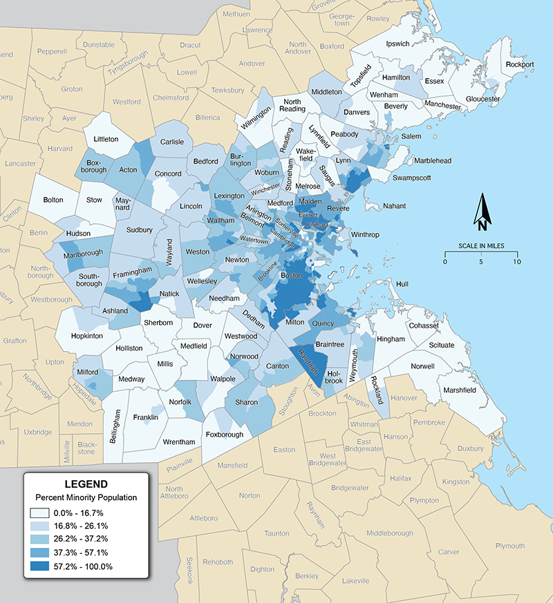
Source: 2010 Decennial Census Redistricting Data (P.L. 94-171), Table P2, www.data.census.gov.
Figure 1b
2020 Minority Population
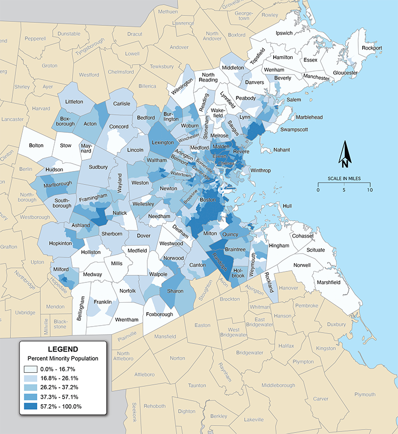
Source: 2020 Decennial Census Redistricting Data (P.L. 94-171), Table P2, www.data.census.gov.
Figure 2a
2010 Low-income Population
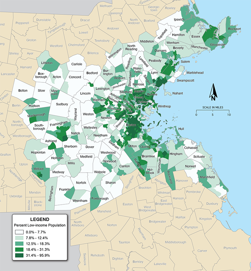
Source: 2010–14 American Community Survey and 2010 Decennial Census Redistricting Data (P.L. 94-171), Tables C17002 and P2, www.data.census.gov.
Figure 2b
2020 Low-income Population
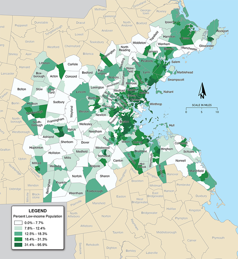
Source: 2016–20 American Community Survey and 2020 Decennial Census Redistricting Data (P.L. 94-171), Tables C17002 and P2, www.data.census.gov.
Figure 3a
2010 Zero-vehicle Households
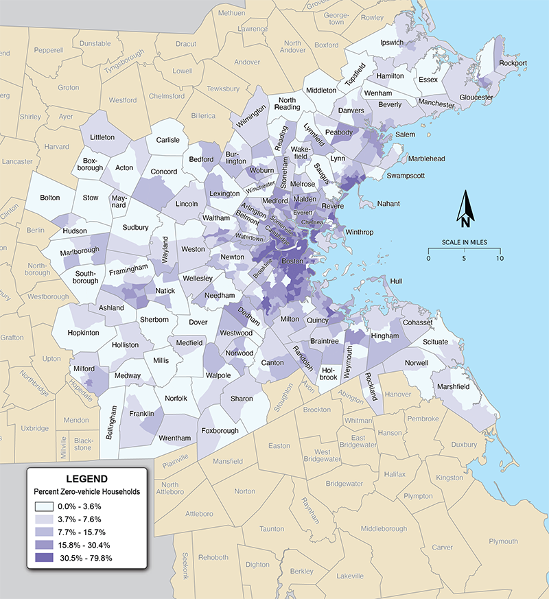
Source: 2010–14 American Community Survey and 2010 Decennial Census Redistricting Data (P.L. 94-171), Tables B08201 and P2, www.data.census.gov.
Figure 3b
2020 Zero-vehicle Households
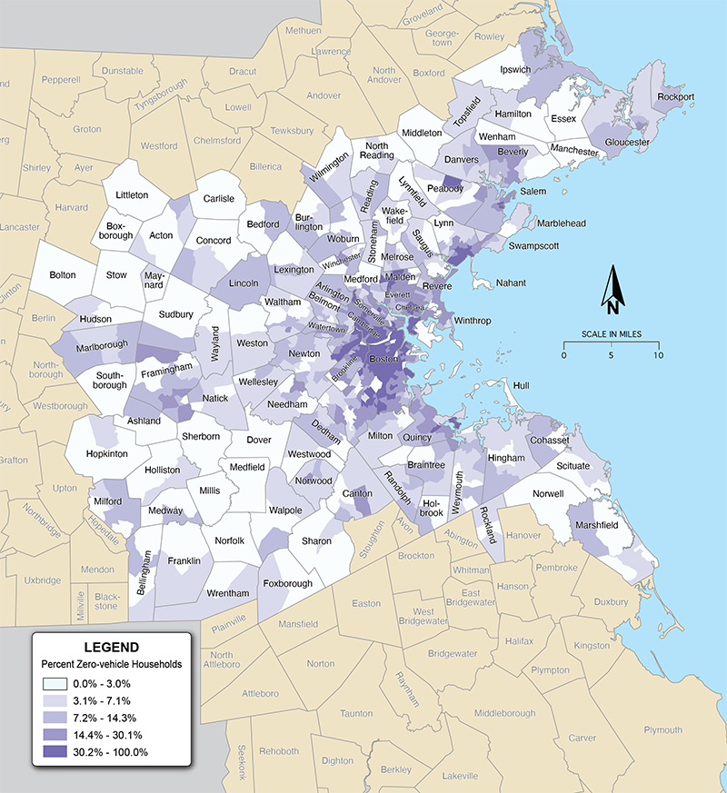
Source: 2016–20 American Community Survey and 2020 Decennial Census Redistricting Data (P.L. 94-171), Tables B08201 and P2, www.data.census.gov.
Chapter 2—Developing Transportation Equity Baseline Metrics
We undertook a multi-pronged effort to select metrics before settling on destination access and transportation cost metrics:
- A review of the state of current practice in the Boston region and at MPOs across the country
- Interviews with stakeholders who work with or represent underserved populations
- Assessment of the metrics used in the DI/DB analysis
2.1 State of the Current Practice
We reviewed equity-related analyses done by other organizations in the Boston region to ensure that this study did not duplicate similar efforts. We also reviewed similar initiatives to analyze transportation outcomes for existing inequities at MPOs across the country. (The full review can be found in Appendix B.)
These reviews revealed several important points. First, while several organizations in the Boston region have analyzed various transportation metrics, we did not find any that use multiple regionwide metrics to provide a comprehensive look at outcomes for equity populations and that compare those outcomes to those of non-equity counterparts. As a regional agency with access to high quality data and sophisticated analysis tools, the MPO is uniquely positioned to conduct these kinds of analyses.
Additionally, MPOs of all sizes have done analyses to better understand the inequities that exist in their regions and to inform project programming decisions. Most analyses include metrics related to access to various types of destinations. Other commonly analyzed metrics include public health metrics, including both ones that look at individual health outcomes and active transportation, in addition to traditional air quality analyses.
2.2 Stakeholder Conversations
Although this study sought to identify specific metrics for evaluating existing inequities, it exists within a broader context of public engagement around EJ and transportation planning in the Boston region. Of relevance to this study was the MPO’s development of a DI/DB Policy. Between 2017 and 2020, the MPO undertook a comprehensive process to develop a DI/DB policy for the LRTP. The DI/DB Policy guides the MPO in identifying potential disparate impacts and disproportionate burdens on minority and low-income populations that may result from projects programmed in the LRTP, in the aggregate. Stakeholders expressed during that process that the DI/DB policy, which is designed specifically to address federal requirements focused on preventing discrimination, does not address existing transportation inequities. Further, they said that without additional policies that do so, transportation outcomes for equity populations could worsen.
Along with comments from the public received during the LRTP needs assessments and other engagement activities, this input revealed a strong desire for the MPO to address existing inequities in its policy and investment decision-making processes. That feedback was a genesis for this study. With that context in mind, the following section describes the public engagement activities conducted for this study and key themes that emerged that supported the selection of metrics to assess existing transportation inequities in the region.
Purpose and Approach
The goal of public engagement for this study was to hear directly from transit equity, community action, and EJ-focused organizations and advocates about their thoughts on a draft list of metrics that could be analyzed in this study. We sought to engage stakeholders representing a range of community sizes. Some stakeholders had participated in previous MPO studies and were familiar with the metrics used in the MPO’s DI/DB analysis, while other stakeholders engaged with the MPO on this topic for the first time. We held eight engagement meetings and attended two Regional Coordinating Council (RCC) meetings between February and May of 2022.
Themes from Stakeholder Conversations
When conducting one-on-one meetings with stakeholders, we prepared a series of questions related to the proposed metrics, analysis methods, and strategies for reporting findings. During our interviews, several broad themes emerged, some of which we incorporated into the study and others that pointed to areas of potential future exploration for the MPO. The range of feedback from different parts of the Boston region also highlighted the importance of continued analysis on a subregional level to understand differences in connectivity across different communities in the region.
Access to Jobs
Access to jobs was one of the metrics most frequently suggested by stakeholders. One oft-mentioned concern was the difficulty low-income residents have accessing jobs, which were cited as disproportionately hourly, in-person jobs that often begin or end outside of nine-to-five hours and are accessible via few—and sometimes unreliable—transit options. For stakeholders outside of the urban core, having to use multiple transit services and often pay multiple fares for a single trip to work was a major challenge, along with issues of first- and last-mile connectivity. Another related challenge was the distinction many stakeholders made between trips between the suburbs and the urban core, which are generally more transit-accessible, versus trips between suburban communities with varying levels of geographic isolation. The RCC staff we spoke with, for example, highlighted the lack of adequate and accessible inter- or intra-town service options for residents traveling between towns outside of the urban core for work.
Affordability and Reliability
The affordability and reliability of transit services was a recurring theme across all stakeholder conversations and was frequently cited as an obstacle to accessing jobs, health care, and other opportunities. Common challenges discussed included high costs associated with making multiple transfers or paying multiple fares on a single trip and relying on transit services with overcrowding and unpredictable headways. These issues were particularly prevalent in EJ communities and communities with fewer overall transit options, and they were cited as compounding factors to other inequities, such as job insecurity and loss of time and income due to longer and less reliable commutes to work.
Access to “Non-Essential” Opportunities
Several stakeholders mentioned that though destination access often focuses on what are traditionally considered “essential” destinations (such as jobs and health care), “non-essential” destinations (such as outdoor recreation space and cultural enrichment opportunities) also merit attention because of their impact on community cohesion and quality of life. Some stakeholders also suggested that the MPO staff consider comparisons across neighborhood and community types, along with historical comparisons of access and changes over time.
COVID-19 Impacts
Stakeholder engagement was conducted in spring of 2022, when many of the worst effects of the COVID-19 pandemic had receded but many patterns the pandemic created, such as remote work and lower overall transit ridership, remained. Many of our conversations with stakeholders reflected the public health impacts and economic inequities that COVID-19 created and compounded. For example, food insecurity that was generated or worsened by the pandemic was cited as a major intersecting inequity with transportation access to food.
Environmental and Climate Impacts
Many stakeholders also discussed issues of climate and air quality in relation to transportation and access. Stakeholders encouraged us to further explore the EJ impacts of ultrafine particulates and poor air quality, particularly in the context of exposure to traffic congestion and proximity to highways and heavy industry. Feedback provided during this study and past engagement for the LRTP Needs Assessment and other MPO programs and processes highlights the necessity of future research on the effects of air quality, pollution, and climate change more broadly on transportation equity in the region.
Results Reporting and Engagement Approaches
All the conversations we had with stakeholders touched on the reporting and presentation of the study results and underscored the importance of a deliberate and ongoing equity-focused approach to public engagement. We heard a strong desire for thoughtful framing of results, particularly in terms of the engagement process and how feedback was used. Stakeholders urged us to be clear about how advocates and communities can benefit from this work and to ensure that they have the tools to continuously and meaningfully engage.
Stakeholder input helped us identify multiple methods for presenting the results of this study, which include this report, interactive maps, and an open-source data repository. There was also interest in MPO staff facilitating ongoing conversations about the evaluation and reporting of results through public forums, as well as by providing tools for communities to independently conduct self-assessments using the metrics this study identified. Stakeholders were especially interested in the continuous nature of this work, including regular analysis and reporting, ongoing engagement, and the incorporation of results into more of the MPO’s planning processes.
Stakeholders also provided suggestions about effective strategies to present and disseminate the study results, which would demonstrate that participants’ voices are heard and their input is meaningfully included. Their feedback is evident in both the development of multiple work products (see Chapter 1) that meet the needs of different audiences and the intentional framework we developed to build off the results and methods developed through the study. In addition, the feedback has informed analyses in the LRTP Needs Assessment that is currently ongoing, with a particular emphasis on expanding environmental and air quality analyses, which have frequently been raised in our conversations with advocates. We hope to continue conversations with stakeholders and other members of the public about the results of this study and as we build on the equity indicator metrics in this study. We also will continue to pursue opportunities for doing so through the MPO’s transportation equity and public engagement programs.
2.3 Selecting Metrics
The metrics we selected for the destination access and transportation cost analyses were informed by the stakeholder interviews, data availability, and the desire to maintain consistency as feasible with the metrics analyzed the MPO’s LRTP DI/DB analysis. (The DI/DB analysis results from the last LRTP, Destination 2040, can be found here.14 The MPO’s next LRTP, Destination 2050, is expected to be completed in summer 2023, and will use new and updated metrics for the DI/DB analysis.) We considered other metrics, but given the time needed to develop and document our methodologies, we limited the study to destination access and transportation cost metrics.
Destination Access Metrics
Destination access offers many advantages over conventional metrics such as travel time and congestion. It measures what people value—the ability of transportation to get them where they want to go. It is multidimensional in that it accounts for speed, distance, level of service, and infrastructure and/or public transit availability. As a product of land use, as well as transportation, it can provide information about the relationship between the two. The same methodology can also be used to measure access by different transportation modes, allowing comparisons between modes.15
In the context of the MPO’s work, this study was an opportunity to test and develop processes for running Conveyal, a web-based destination access analysis tool that the MPO recently acquired with support from the Massachusetts Department of Transportation. Conveyal is one of a growing suite of tools that complement the MPO’s travel demand model (TDM). It is more flexible, easier to set up, faster to run, and can assess the impacts of small-scale changes to the transportation network that the TDM cannot.
We selected eight destination access metrics, shown in Table 1. For each metric, we analyzed access for each of the three equity populations and their non-equity counterparts by two different modes, either walking and bicycling or driving and public transit. (Zero-vehicle household results are not reported for driving trips.)
Table 1
Destination Access Equity Metrics
| Category |
Equity Metric |
Travel Modes Analyzed |
Travel Time Thresholds |
|---|---|---|---|
| Jobs |
Access to Jobs |
Driving and public transit |
45 minutes |
| Education |
Access to Higher Education |
Driving and public transit |
45 minutes |
| Healthcare |
Access to Emergency Healthcare |
Driving and public transit |
45 minutes |
|
|
Access to Non-emergency Healthcare |
Driving and public transit |
45 minutes |
| Essential Places |
Access to Essential Places |
Walking and bicycling |
15 minutes |
| Access to Parks |
Access to All Parks |
Walking and bicycling |
15 minutes |
|
|
Access to Large Parks (greater than 124 acres) |
Driving and public transit |
45 minutes |
|
|
Access to Off-street Paths |
Walking and bicycling |
15 minutes |
Transportation Cost Metrics
Analyzing transportation costs was one of the initial study goals and it was identified as a priority in conversations with the MPO board and stakeholders. We explored three different metrics to understand how costs vary throughout the Boston region. They are listed below and described in Chapter 4.
- Household transportation expenditures
- Housing and transportation (H&T) index
- Value of travel time (VTT)
2.4 Developing the Analyses
We used Conveyal to run destination access analyses on our eight metrics. We ran analyses for both the Boston region as well as for eight aggregation areas, which are smaller geographic subsets of the region. Aggregation areas are Community Types (CT) from the Metropolitan Area Planning Council, as shown in Figure 4. (We did not include CTs that are not found in the Boston region.) They are defined based on land use, housing patterns, population density, growth trends, and projected development patterns. (For more information on Community Types, see this page.)16
14 https://www.bostonmpo.org/data/pdf/plans/LRTP/destination/Destination-2040-LRTP-20191030.pdf#page=243.
15 Eric Sundquist, Chris McCahill, and Logan Dredske, “Accessibility in Practice: A guide for transportation and land use decision making,” State Smart Transportation Initiative and the Virginia Office of Intermodal Planning and Investment, October 2107, https://cows.org/wp-content/uploads/sites/1368/2021/01/Accessibility_Guide_Final.pdf.
16 https://www.mapc.org/wp-content/uploads/2017/09/Massachusetts-Community-Types-Summary-July_2008.pdf.
Figure 4
Definition Community Types in the Boston Region
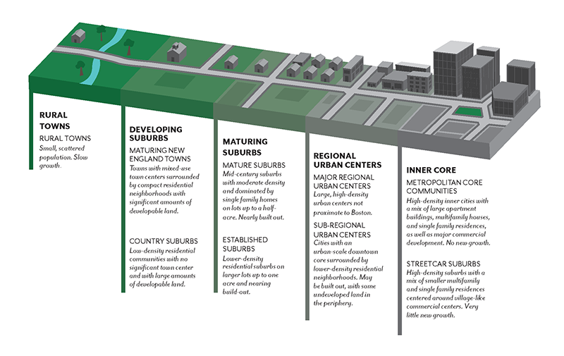
Source: Graphic by Central Transportation Planning Staff. Community type definition from the Metropolitan Area Planning Council.
Analyzing access in CTs allowed us to see how transportation access varies across the region by controlling for land use and population density. Aggregating data to a MPO regionwide level suppresses differences between communities that may be due to those characteristics. Therefore, analyzing access for each CT controls for differences in land use and population density and helps identify inequities patterns based on transportation access. Figure 5 shows the seven CTs that are in the Boston region.
Figure 5
Map of Community Types in the Boston Region
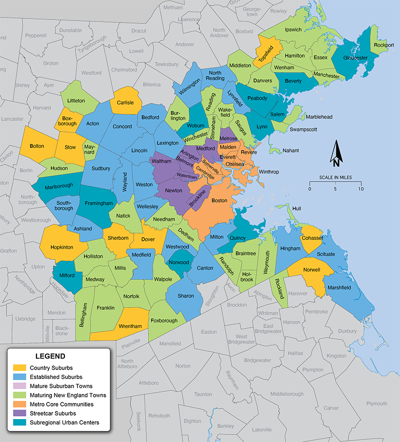
Source: Map by Central Transportation Planning Staff. Community type from the Metropolitan Area Planning Council.
For readers interested in the details of how we ran the destination access analyses and about destination access in general, see Appendix A. Additionally, readers may view and download the data and scripts used to run the analyses at the study’s Github data repository.
Chapter 3—Summary of Destination Access Analysis Results
We report the analysis results for each of our eight metrics in two different ways:
- The total number of destinationseach demographic group can access
- A comparison of access per person between equity and non-equity populations that indicates whether access is equitable. This is done by dividing the number of destinations accessible per person for the equity population by the number of destinations accessible per person for their respective non-equity population counterparts. A result that is less than one indicates that the equity population has less access on a per-person basis.
While both analyses provide useful information, we focused on the second—a comparison of access per person—as our indicator of whether a population has equitable access. To indicate when—for a given metric, travel mode, and CT—the minority population, low-income population, or zero-vehicle households have less access than their non-equity counterparts, we assigned “equity flags” where that is the case.
3.1 Analysis Results
Tables 2, 3, and 4 summarize the number of equity flags by equity population, travel mode, and CT. (To see them broken out by metric, see Section 4.) For example, in the Metro Core Communities there are twenty-two equity flags. We can use the online application to filter equity flags by metric, and we see that four of the twenty-two are for access to all parks. The application also reports the comparison ratio between access for the equity and non-equity population—the lower the ratio, the less equitable access to the destination is. For access to all parks, the ratios that are less than one are as follows:
- Minority population, for bike trips: 0.752
- Minority population, for walk trips: 0.728
- Low-income population, for bike trips: 0.923
- Low-income population, for walk trips: 0.956
Although both the minority and the low-income populations have walk and bike trip equity flags, the ratios for the minority population are lower because access is more inequitable. Planners, policymakers, and advocates can use this information to help prioritize investments that reduce these inequalities.
Of the four travel modes, driving trips have the most equity flags. The low-income population has the most equity flags, while the CTs with the most equity are, perhaps surprisingly, the densest and the least dense: Metro Core Communities and Country Suburbs. This suggests that although Metro Core Communities have a lot of transportation access, these areas are highly segregated in terms of where equity populations live. The best transportation infrastructure—particularly public transit—is located in wealthier and whiter neighborhoods.
Table 2
Equity Flags by Equity Population
Equity Population |
Number of Equity Flags |
Minority Population |
33 |
Low-income Population |
43 |
Zero-Vehicle Households |
10 |
Total Equity Flags |
86 |
Total Possible Equity Flags |
344 |
Source: CTPS.
Table 3
Equity Flags by Community Type
Community Type |
Number of Equity Flags |
Country Suburbs |
21 |
Maturing New England Towns |
15 |
Metro Core Communities |
22 |
Streetcar Suburbs1 |
0 |
Established Suburbs |
8 |
Mature Suburban Towns |
17 |
Subregional Urban Centers |
3 |
Total Equity Flags |
86 |
Total Possible Equity Flags |
344 |
1 Streetcar Suburbs was the only Community Type without any equity flags across every metric.
Source: CTPS.
Table 4
Equity Flags by Travel Mode
Travel Mode |
Number of Equity Flags |
Driving |
27 |
Public Transit |
25 |
Walking |
18 |
Bicycling |
16 |
Total Equity Flags |
86 |
Total Possible Equity Flags |
344 |
Source: CTPS.
To better understand the distribution and characteristics of equity flags, we further summarized them in several other ways—by equity population and transportation mode (Figure 6), by equity population and CT (Figure 7), and by transportation mode and CT (Figure 8).
In Figure 6, we see that equity flags for driving and public transit trips are present for all three equity populations and that zero-vehicle households do not have any bicycle or walk-trip equity flags. Interestingly, the drive-trip equity flags are more prevalent for the low-income population, which aligns with census data that showed that people with low incomes are increasingly likely to live in suburban areas. These areas have less public transit service, so residents rely on driving more.
Figure 6
Equity Flags by Mode, as a Percent of Total Equity Population Flags

* Streetcar Suburbs do not have any equity flags
Source: CTPS.
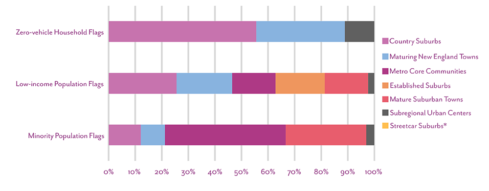
In Figure 7, we see equity flags in each CT as a percent of the total number of flags for each equity population. Streetcar Suburbs is the only CT without any equity flags. This is likely due to both the density of the destinations and the quality and coverage of the transportation system in those municipalities. Interestingly, Country Suburbs have the majority of the zero-vehicle household flags. This suggests that the public transit service that does serve Country Suburbs does not serve these households as well as households that do have cars, even though presumably there is more demand for public transit among households without cars. Additionally, equity flags in Metro Core Communities make up the highest share of flags for the minority population. Again, this reflects the residential segregation within these communities and that transportation service and infrastructure is not as robust as it is in whiter neighborhoods.
Figure 7
Equity Flags in Community Types, as a Percent of Total Equity Population Flags
* Streetcar Suburbs do not have any equity flags.
Source: CTPS.
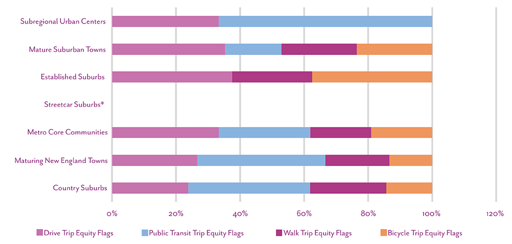
In Figure 8, we see equity flags by travel mode as a percentage of the total flags in each CT. In general, travel-mode equity flags are fairly evenly distributed across CTs. Subregional Urban Centers are the only CTs without walking or bicycling equity flags (besides Streetcar Suburbs, which have no equity flags at all).
Figure 8
Equity Flags by Travel Mode, as a Percent of Total Community Type Flags
* Streetcar Suburbs do not have any equity flags.
Source: CTPS.
3.2 Key Findings
We identified three key findings from the destination access analyses:
- Density does not always ensure equitable access. Even though they are on opposite ends of the density spectrum, the Metro Core Communities and Country Suburbs CTs rival each other for the greatest number of equity flags. In Metro Core Communities, this suggests that though the population in general has access to the public transit network, compared to non-equity populations, this access is much more limited in terms of the destinations we analyzed.
- There is a lack of access to parks of every kind throughout the Boston region. The access to all parks metric has the most equity flags of any metric. Again, Metro Core Communities have the most with four apiece in each of the three parks indicators. The results point to across-the-board disparities in the ability for equity populations to access—whether by car, public transit, walking, or bicycling—open space and recreation areas. Access to these areas has proven so critical to well-being as was demonstrated during the COVID-19 pandemic.
- Income is the greatest demographic indicator of inequitable access. Of all the equity demographics, low-income populations were the least likely to have equitable access to any of the destinations. This was observed across all modes and most of the metrics and in most CTs. The only CTs where the minority population had more equity flags was in the Metro Core Communities and the Subregional Urban Centers.
A final takeaway to bear in mind with all of these results is that this analysis only determines whether access between equity and non-equity population groups is equitable. It does not evaluate whether transportation infrastructure or public transit service meets the needs of equity or non-equity populations. There may be instances where we have not identified an inequity but where, for example, public transit service or bicycle infrastructure is equally insufficient to meet the needs of both population groups.
Chapter 4—Equity Baseline Indicator Metric Results: Destination Access
In this chapter, the analysis results for each equity indicator metric are shown. The results focus on the two analyses described in Chapter 3:
- The total number of opportunitieseach demographic group can access, which is shown on maps that indicate the number of places people in the region, can access based on where they live.
- A comparison of opportunities accessible per person between equity and non-equity populations that indicates whether access is equitable, which includes the number of equity flags for each of the three equity populations. An equity flag is present when the ratio is less than one: when access per person is greater for the non-equity population than the equity population.
For additional context, the discussion for each metric also includes the following:
- The locations of destinations that were analyzed
- A summary of findings from the analysis
Destination access is a function of both the transportation network and land use. While the analysis results are in part due to destination location, they should not be assumed to be simply a land use problem. It might also be tempting to explain the results by the fact that some areas simply have more equity populations than others. While this is true, weighting the results by population shows us that, per person, equity populations in some cases have access to disproportionately fewer destinations. It is this metric that is the true indicator of destination access inequity.
When we look at the total number of destinations each demographic group can access, the equity population in some cases has access to more destinations than their respective non-equity population. However, when access is population-weighted, we see that for some metrics the outcome is reversed: per person, the equity population has less access. This difference is not a discrepancy—it is simply a different way of looking at destination access, which is why we chose to show our results both ways.
4.1 Regionwide Analysis
When we analyzed the eight metrics for the Boston region, we did not find any equity flags for any of the metrics. However, as the results show below, when we analyzed each CT, we found equity flags across all metrics. Because regionwide analyses will always produce an average, they tend to suppress inequities locally that only become visible when the analysis area is subregional.
To explore the full suite of results for all modes and for all Community Types, visit the study’s web application.
4.2 Equity Indicator Metric 1: Access to Jobs
How many job opportunities can people access?
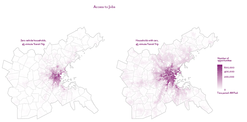
This analysis tracked the total number of job opportunities people have access to within a 45-minute public transit trip or drive. Figures 9, 10, and 11 show the total number of jobs accessible to equity and non-equity populations.
Figure 9
Number of Job Opportunities Accessible within a 45-minute Drive or Public Transit Trip, by Minority Status
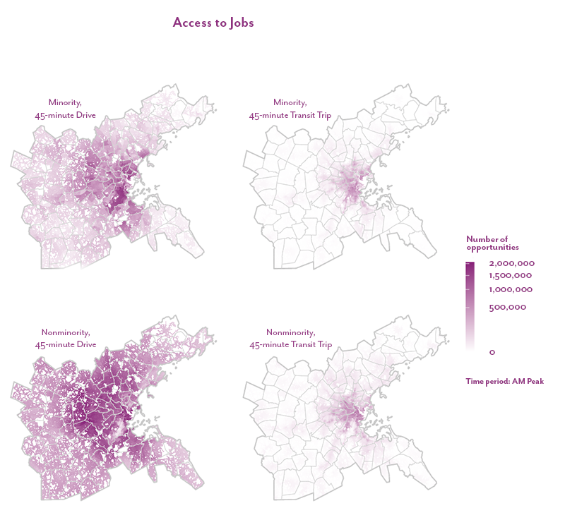
Figure 10
Number of Job Opportunities Accessible within a 45-minute Drive or Public Transit Trip, by Income
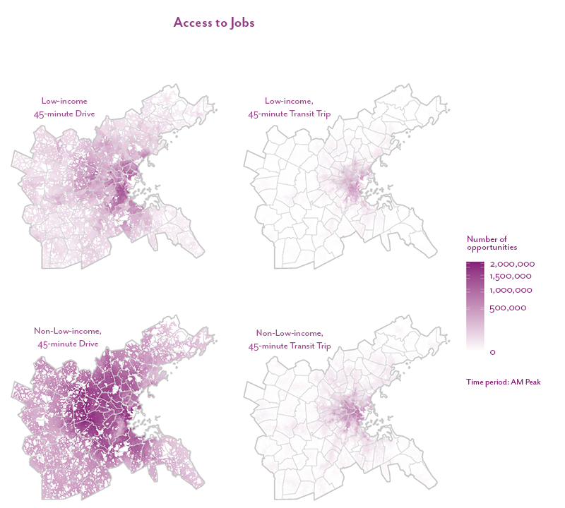
Figure 11
Number of Job Opportunities Accessible within a 45-minute Public Transit Trip, by Vehicle Availability
How does access compare between equity and non-equity populations?
This analysis tracked the average number of job opportunities accessible per person for equity populations and their respective non-equity populations.
Analysis Takeaways
- The access to jobs metric has seven equity flags, the least of any metric. Five are for driving and two are for public transit. This result may be due to the large number of employment destinations that are spread out across the region, as well as possible service gaps.
- None of the equity flags are for zero-vehicle households, which may be a function of these households prioritizing living near their jobs.
- Metro Core Communities have the most equity flags, indicating longer travel times for both public transit and driving trips for minority and low-income populations. This pattern can be seen across most of the metrics: even though equity populations are more likely to live in these towns and even though the transportation network is built-out, disparities exist in access to reliable, fast transportation that allows these populations to access the destinations we looked at compared to that which is available to non-equity populations.
Future Updates
This analysis does not account for whether people are qualified for or want certain jobs. Future analyses could examine access to different types of jobs, such as night-shift jobs or jobs in certain industries, as well as identify particular locations or service gaps that could be driving the inequities.
4.3 Equity Indicator Metric 2: Access to Higher Education
How many higher education opportunities can people access?
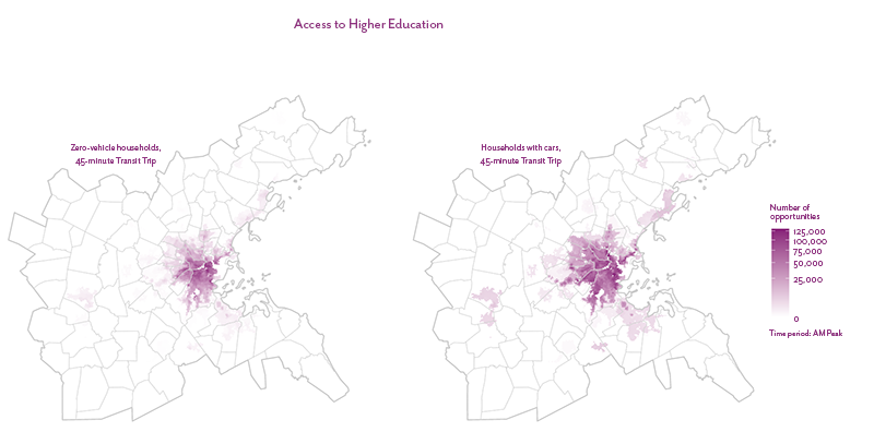
This analysis tracked the total number of higher education opportunities available within a 45-minute public transit ride or drive. Figure 12 shows the locations of higher education institutions in the Boston region, categorized by enrollment. Access was weighted by enrollment so that each available “seat” was treated as a destination.
Figure 12
Location of and Enrollment at Institutes of Higher Education
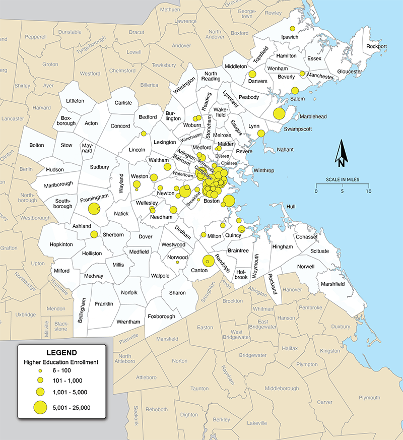
Note: Enrollment is for the 2020–21 academic year and is for accredited institutions at which at least 50 percent of the undergraduate study body lives off campus, and/or there is a graduate student population
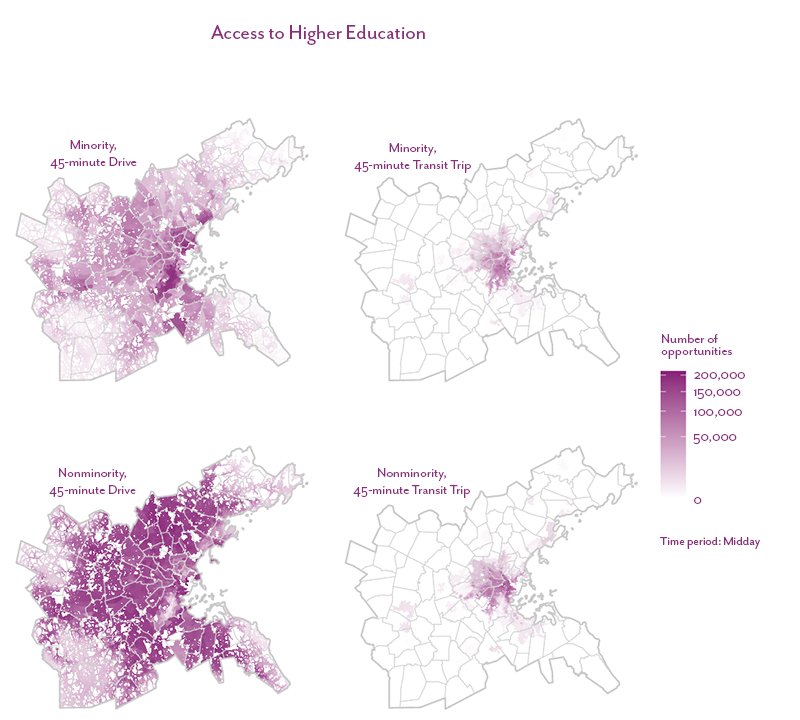
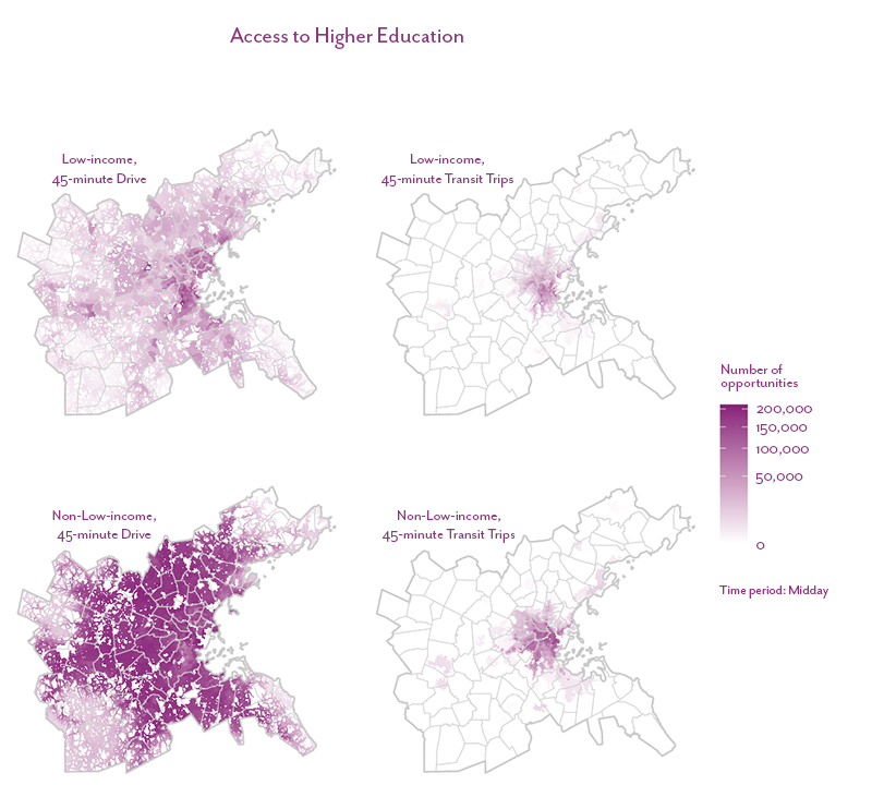
Figures 13, 14, and 15 show the total number of higher education opportunities that are accessible to each demographic group by driving and public transit. For both modes, the minority and low-income populations have access to fewer educational opportunities than the nonminority and non-low-income populations, respectively, while households with a vehicle have access to a greater number of schools by public transit than those that do not.
Figure 13
Number of Higher Education Opportunities Accessible within a 45-minute Drive or Public Transit Trip, by Minority Status
Sources: MassGIS, National Center for Education Statistics, US News and World Report, and College Board.
Figure 14
Number of Higher Education Opportunities Accessible within a 45-minute Drive or Public Transit Trip, by Income
Sources: MassGIS, National Center for Education Statistics, US News and World Report, and College Board.
Figure 15
Number of Higher Education Opportunities Accessible within a 45-minute Public Transit Trip, by Vehicle Availability
Sources: MassGIS, National Center for Education Statistics, US News and World Report, and College Board.
How does access compare between equity and non-equity populations?
This analysis tracked the average number of higher education opportunities, weighted by enrollment, accessible per person for equity populations and their respective non-equity populations.
Analysis Takeaways
- There are a total of ten equity flags across the region’s CTs, six of which are for public transit. The low-income population has the most, four, split evenly between driving and public transit.
- As might be expected, CTs with lower densities all have equity flags, as fewer schools are in these areas. However, Metro Core Communities are tied with the most, three. This result is particularly surprising because higher education institutions tend to be located in these communities as are equity populations, suggesting that the transportation network does not provide the same level of service for these populations compared to non-equity populations.
Future Updates
This analysis did not look at access by walking and bicycling, which could be useful since students may choose to live close by their college or university and, therefore, frequently walk or bike to and from campus. We could also look at access to primary and secondary schools.
4.4 Equity Indicator Metric 3: Access to Emergency Healthcare
How many emergency healthcare opportunities can people access?
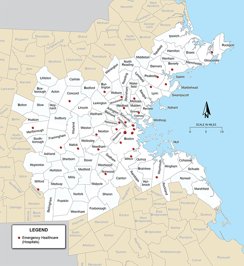
This analysis tracked the total number of emergency healthcare opportunities (represented as hospitals) within a 45-minute public transit ride or drive. Figure 16 shows the locations of hospitals in the Boston region. Destinations were not weighted by capacity and each hospital was treated as one destination.
Figure 16
Emergency Healthcare Destinations in the Boston Region
Source: MassGIS.
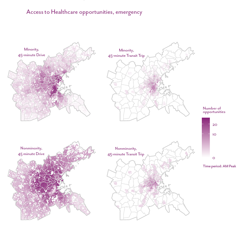
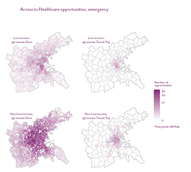
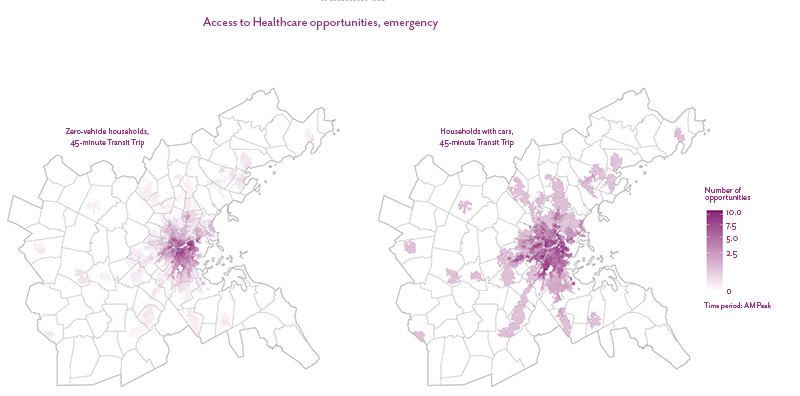
Figures 17, 18, and 18 show the total number of hospitals that are accessible to each demographic group. All demographic groups have access to fewer hospitals by public transit than by driving. For both modes, the minority and low-income populations have access to fewer hospitals than the nonminority and non-low-income populations, respectively. Additionally, households with a vehicle have access to a greater number of hospitals by public transit than those that do not.
Figure 17
Number of Emergency Healthcare Opportunities Accessible within a 45-minute Drive or Public Transit Trip, by Minority Status
Source: MassGIS.
Figure 18
Number of Emergency Healthcare Opportunities Accessible within a 45-minute Drive or Public Transit Trip, by Income
Source: MassGIS.
Figure 19
Number of Emergency Healthcare Opportunities Accessible within a 45-minute Public Transit Trip, by Vehicle Availability
Source: MassGIS.
How does access compare between equity and non-equity populations?
This analysis tracked the average number of emergency healthcare opportunities accessible per person for equity populations and their respective non-equity populations.
Analysis Takeaways
- There are a total of fourteen equity flags, eight of which are for public transit. The low-income population has the most with seven, three of which are for public transit trips.
- Equity flags are distributed fairly evenly across the region, with only Streetcar Suburbs having none, suggesting that even though the region as a whole does not show inequities locally, accessing hospitals is more difficult for equity populations than for non-equity populations.
Future Updates
Because of time limitations and data-quality concerns, we did not weight hospitals by their capacity, such that every hospital was treated as one destination regardless of how many people it can serve. Future work could continue to explore data sources that might allow this type of weighting, while ensuring the data is accurate and can easily be updated.
4.5 Equity Indicator Metric 4: Access to Non-Emergency Healthcare
How many non-emergency healthcare opportunities can people access?
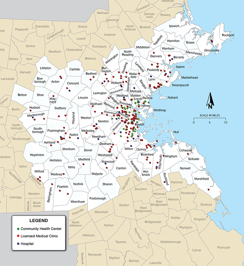
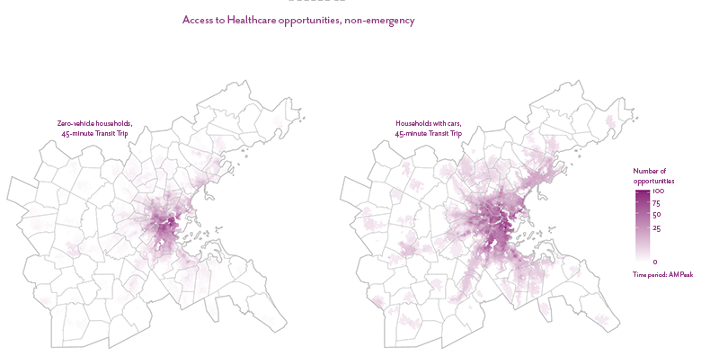
This analysis tracked the total number of non-emergency healthcare opportunities within a 45-minute public transit ride or drive. Figure 20 shows the locations of medical clinics, community health centers (CHCs), and acute care hospitals in the Boston region. Destinations were not weighted, and each facility was treated as one destination.
Figure 20
Non-emergency Healthcare Destinations
Source: MassGIS and Massachusetts Department of Public Health.
Figures 21, 22, and 23 show the total number of non-emergency healthcare opportunities that are accessible to each demographic group by driving and public transit. For both modes, the minority and low-income populations have access to fewer healthcare facilities than the nonminority and non-low-income populations, respectively, while households with a vehicle have access to a greater number of healthcare facilities by public transit than those that do not.
Figure 21
Number of Non-emergency Healthcare Opportunities Accessible within a 45-minute Drive or Public Transit Trip, by Minority Status
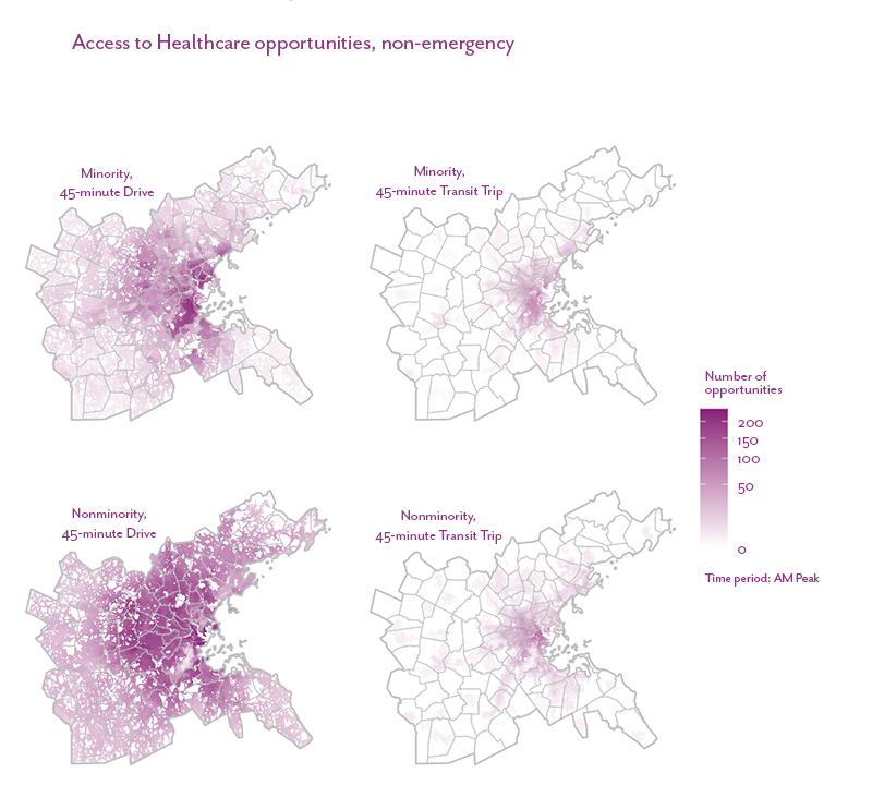
Figure 22
Number of Non-emergency Healthcare Opportunities Accessible within a 45-minute Drive or Public Transit Trip, by Income
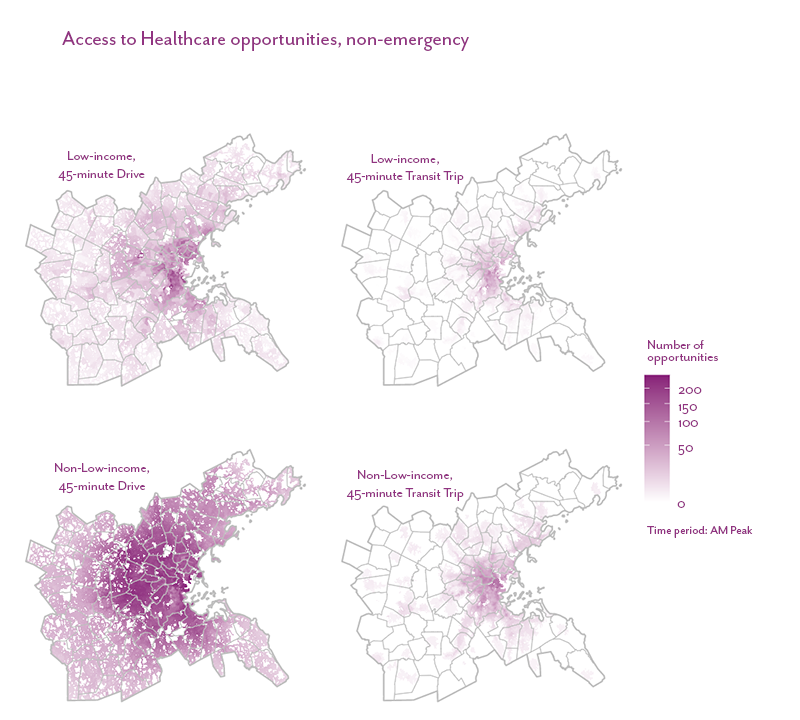
Figure 23
Number of Non-emergency Healthcare Opportunities Accessible within a 45-minute Public Transit Trip, by Vehicle Availability
How does access compare between equity and non-equity populations?
This analysis tracked the average number of non-emergency healthcare opportunities accessible per person for equity populations and their respective non-equity populations.
Analysis Takeaways
- There are a total of eight equity flags—this result is tied for the least of any of the metrics. Three flags are for public transit and five are for driving. The minority population has the most, five, and three of the equity flags are for public transit.
- Metro Core Communities and Mature Suburban Towns have the most equity flags, three each, which is different from the pattern seen in other metrics where less dense CTs tend to have more equity flags.
- Only three of the eight equity flags are for public transit, indicating perhaps that one of the barriers is significant congestion on routes to healthcare facilities and/or that the facilities are located far from where equity populations live.
Future Updates
This analysis treats every healthcare facilities as one destination, regardless of its patient capacity. Future updates could explore options for weighting each destination by capacity. Additionally, CHCs, medical clinics, and acute care hospitals do not cover all non-emergency healthcare destinations, and we could explore adding other datasets for a more complete picture of access.
4.6 Equity Indicator Metric 5: Access to Essential Places
How many essential places can people access?
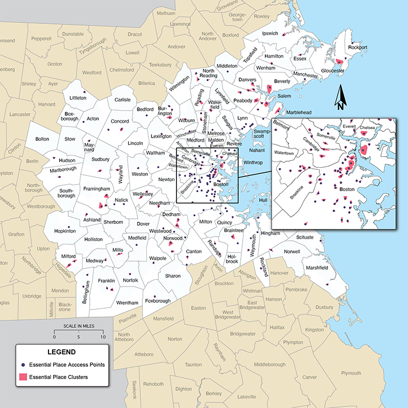
This analysis tracked the total number of essential place opportunities within a 15-minute walk or bicycle ride. The concept of essential places was developed in response to the COVID-19 pandemic to reflect jobs that were considered “essential” during the pandemic and to reflect the basic needs that the public require access to on a regular basis. Nine “essential destinations” were chosen and fall within three categories: healthcare, civic, and food destinations. An “essential place” is a cluster of destinations that contains at least two destination types and where there are at least five destinations. Figure 24 shows the locations of essential places using this method. (For more details on the methodology used to identify essential places, see the study’s Github page.)
Figure 24
Essential Places in the Boston Region
Sources: MassGIS, Massachusetts Department of Public Health, Metropolitan Area Planning Council, and the United States Postal Service.
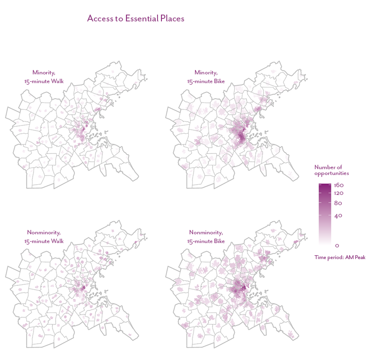
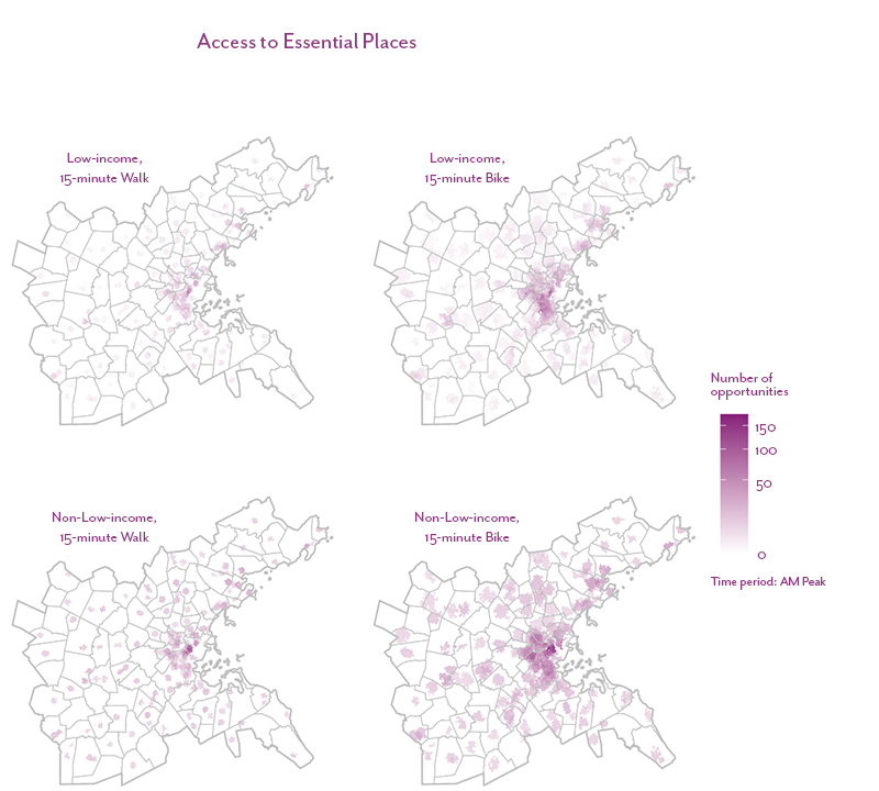
The maps in Figures 25, 26, and 27 show the total number of essential places that are accessible to each demographic group. Overall, there is slightly less access by walking to essential places than by bicycling, but that may be a function of bicycling being faster.
Figure 25
Number of Essential Place Opportunities Accessible within a 15-minute Bicycle or Walk Trip, by Minority Status
Sources: MassGIS, Massachusetts Department of Public Health, Metropolitan Area Planning Council, and the United States Postal Service.
Figure 26
Number of Essential Place Opportunities Accessible within a 15-minute Bicycle or Walk Trip, by Minority Status
Sources: MassGIS, Massachusetts Department of Public Health, Metropolitan Area Planning Council, and the United States Postal Service.
Figure 27
Number of Essential Place Opportunities Accessible within a 15-minute Bicycle or Walk Trip, by Vehicle Availability
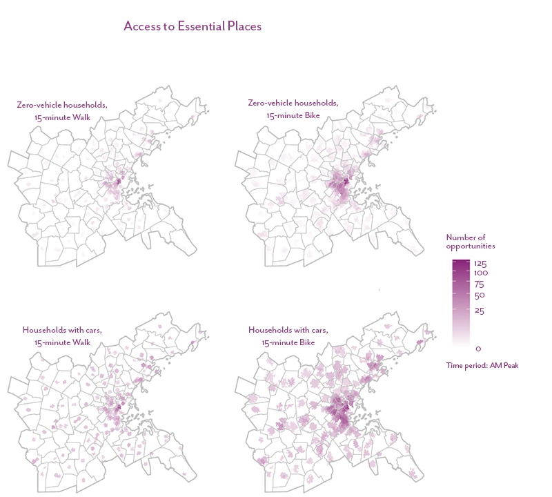
Sources: MassGIS, Massachusetts Department of Public Health, Metropolitan Area Planning Council, and the United States Postal Service.
How does access compare between equity and non-equity populations?
This analysis tracked the average number of essential place opportunities accessible per person for equity populations and their respective non-equity populations.
Analysis Takeaways
- There are a total of nine equity flags, five of which are for public transit. The minority population has the most with seven, four of which are for walking, while zero-vehicle households have none. These households are more likely to live within walking distance of these types of destinations and, given the denser nature of these locations, these destinations are more likely to be accessible by bicycling and walking.
- Equity flags are evenly distributed between the CTs, with most having two. The more urban CTs—Subregional Urban Centers, Streetcar Suburbs, and Metro Core Communities—have the fewest, likely due to the bicycle and pedestrian network being more built out in these communities, as well as there being more essential places. Of note, in Country Suburbs access to essential places for both bike and walk trips for the minority population is about half of that of the non-minority population, suggesting that in these towns the minority population overall lives further from essential places or does not have sufficient sidewalks or safe bicycle routes.
Future Updates
Future avenues for research could include exploring other clustering methods or adding other datasets to include in essential place clusters.
4.7 Equity Indicator Metric 6: Access to All Parks
How many outdoor recreation opportunities can people access?
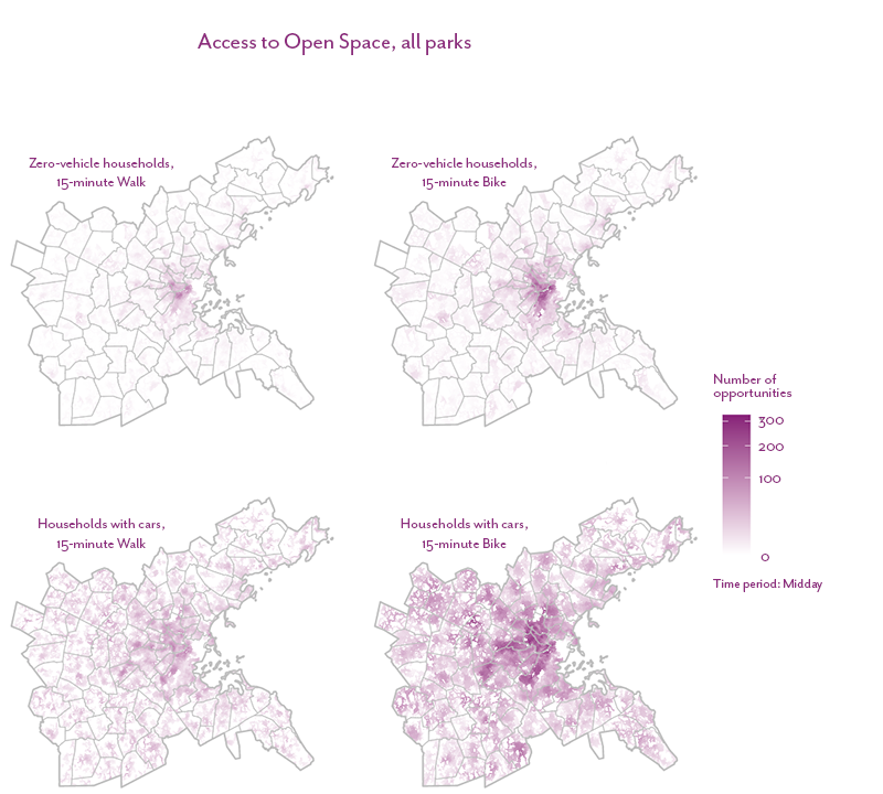
This analysis tracked the total number of outdoor recreation opportunities within a 15-minute walk or bicycle ride. Destinations include any park that is at least partly in the Boston region and that has an area greater than a half-acre. Figure 28 shows the locations of parks in the Boston region; destinations were routed to points where the park and the walkable or bikeable roadway networks intersect.
Figure 28
Park Locations and Access Points in the Boston Region
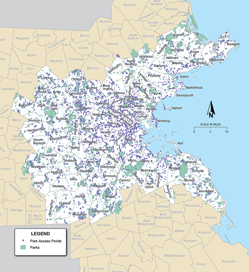
Source: MassGIS.
The maps in Figures 29, 30, and 31 show the total number of parks that are accessible to each demographic group. All demographic groups have access to fewer parks by walking than by bicycling, which again is likely due to the fact that bicycling is faster. For both modes, the minority and low-income populations have access to slightly fewer parks than the nonminority and non-low-income populations, respectively. This is in part due to the location of parks and the fact that safe bicycling and walking infrastructure may not be present in minority and low-income communities. Additionally, households with a vehicle have slightly more access to parks by walking, but significantly more by bicycling. This result suggests a lack of safe routes for bicycling in neighborhoods where there are zero-vehicle households.
Figure 29
Number of Outdoor Recreation Opportunities Accessible within a 15-minute Bicycle or Walk Trip, by Minority Status
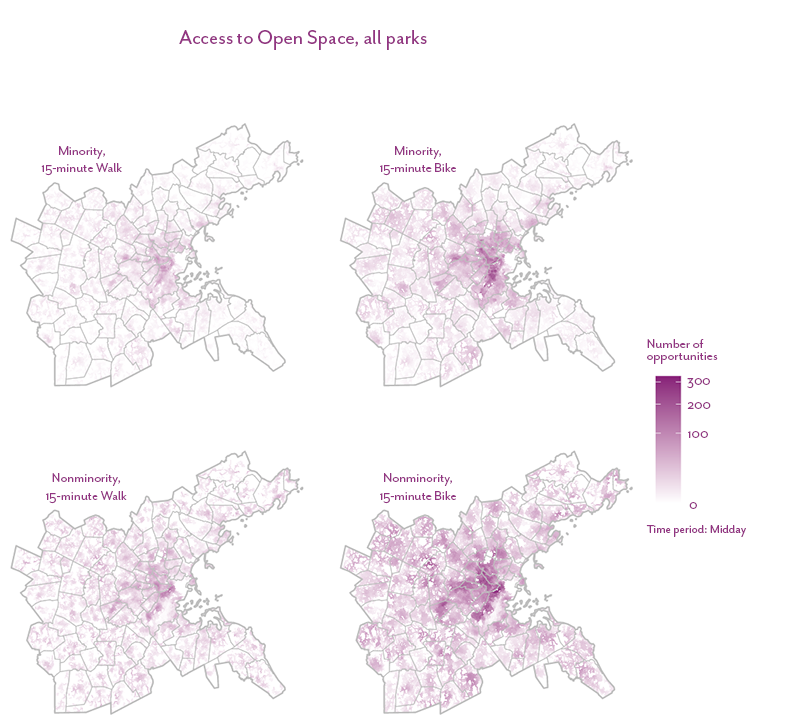
Source: MassGIS.
Figure 30
Number of Outdoor Recreation Opportunities Accessible within a 15-minute Bicycle or Walk Trip, by Income
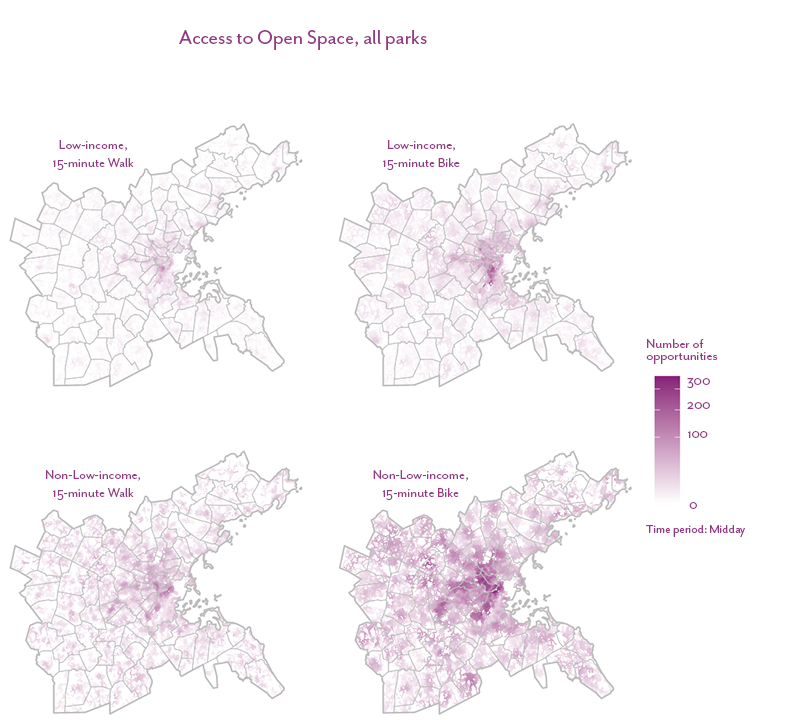
Source: MassGIS.
Figure 31
Number of Outdoor Recreation Opportunities Accessible within a 15-minute Bicycle or Walk Trip, by Vehicle Availability
Source: MassGIS.
How does access compare between equity and non-equity populations?
This analysis tracked the average number of outdoor recreation opportunities accessible per person for equity populations and their respective non-equity populations.
Analysis Takeaways
- There are a total of sixteen equity flags, the most of any metric. This is particularly surprising since parks are widely distributed across CTs. While some of this may be due to where people can choose and afford to live, the results also point to a lack of safe walking and bicycling infrastructure that allow equity populations to safely access parks.
- Equity flags are largely split evenly between walking and bicycle modes. Many roads that have sidewalks also have slow enough speeds that they are considered bikeable by Conveyal’s routing engine.
- The low-income population has the most flags, nine, and five are for walking. This suggests income is a strong predictor of either the proximity of a park in terms of walking and biking distance or the presence of safe walking and bicycling infrastructure in cases where a park may be nearby.
- Mature Suburban Towns and Metro Core Communities have the most equity flags with four each. This suggests that the bicycle and pedestrian infrastructure that connect to parks is inequitably distributed within these towns.
Future Updates
To determine park access points, we selected the point at which they intersected with the street network. (See the study’s Github page for details about this process.) This method could result in overcounting access in urban areas and undercounting access in suburban and rural areas. There are several other methods that could be explored for identifying destination points for parks.
4.8 Equity Indicator Metric 7: Access to Large Parks
How many open space opportunities can people access?
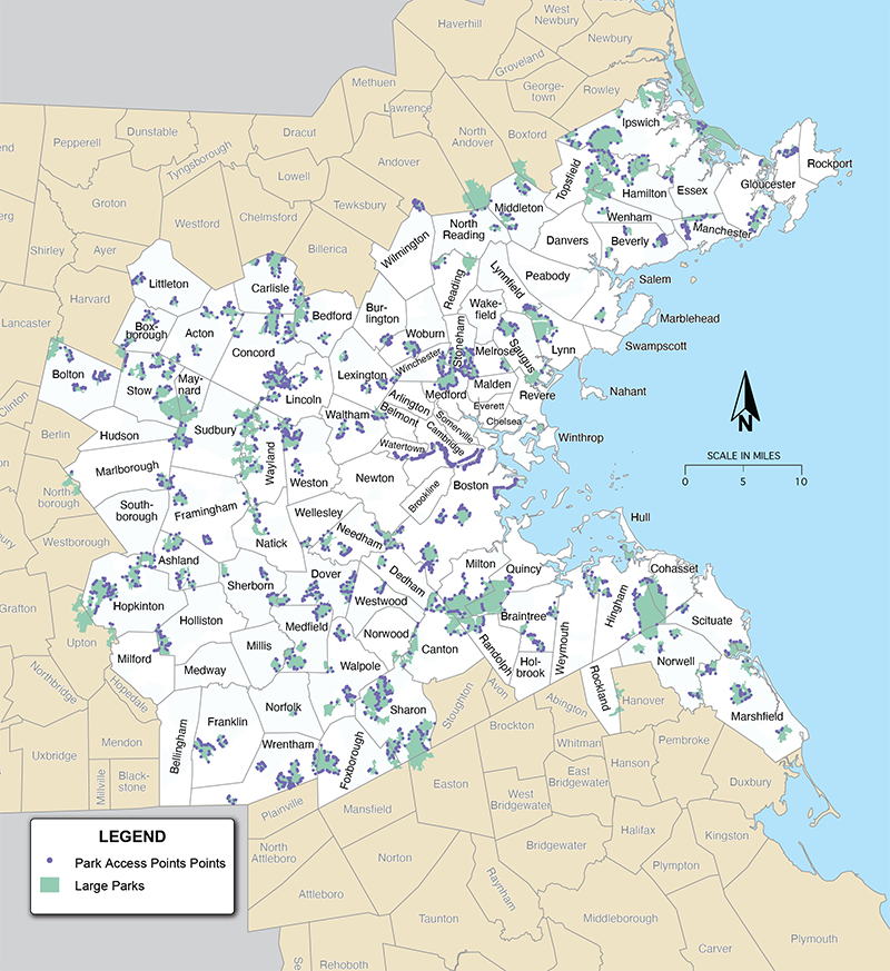
This analysis tracked the total number of open space opportunities within a 45-minute drive or public transit trip. Destinations included any park that is at least partly in the Boston region and that has an area greater than 124 acres. The metric captures access to parks that provide passive recreation, such as walking and bicycling, and that have significant areas of open space (such as woods or fields). Figure 32 shows the locations of large parks in the Boston region. Destinations were routed to points where the park and the walking or bicycling networks intersect.
Figure 32
Locations of Large Parks in the Boston Region
Source: MassGIS.
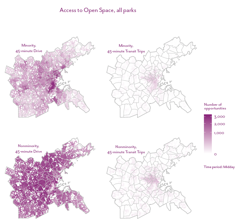
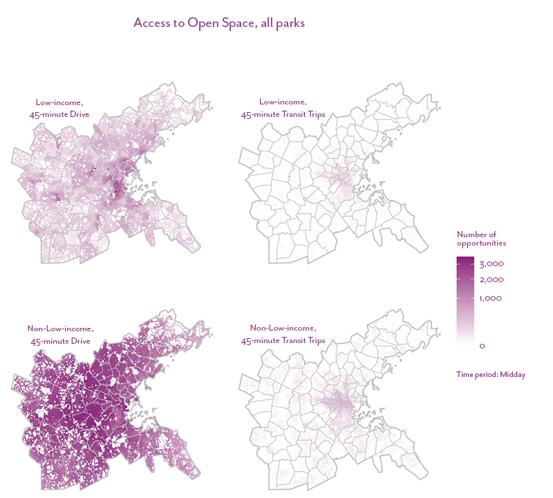
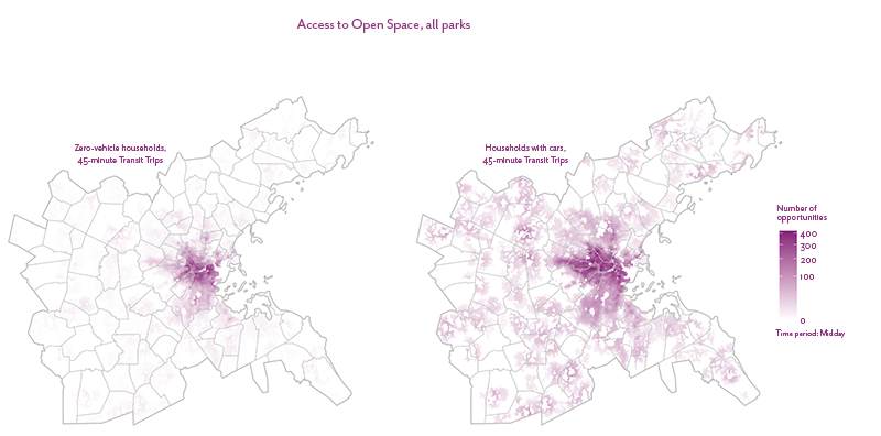
Figures 33, 34, and 35 show the total number of large parks that are accessible to each demographic group by driving and public transit. For driving, the minority and low-income populations have access to fewer parks than the nonminority and non-low-income populations, respectively. However, access by public transit appears to be similar. This may be in part due to the location of large parks outside of the urban core and that public transit simply provides very little access to these parks overall.
Figure 33
Number of Open Space Opportunities Accessible within a 45-minute Drive or Public Transit Trip, by Minority Status
Source: MassGIS.
Figure 34
Number of Open Space Opportunities Accessible within a 45-minute Drive or Public Transit Trip, by Income
Source: MassGIS.
Figure 35
Number of Open Space Opportunities Accessible within a 45-minute Drive or Public Transit Trip, by Vehicle Availability
Source: MassGIS.
How does access compare between equity and non-equity populations?
This analysis tracked the average number of open space opportunities accessible per person for equity populations and their respective non-equity populations.
Analysis Takeaways
- There are a total of thirteen equity flags, which indicates there is a significant disparity in access to parks via public transit compared to driving. This is particularly the case with the low-income population, which has the most flags, nine, three of which are for public transit trips. This suggests income is a strong predictor of whether people can access passive, recreational open space.
- Metro Core Communities have the most equity flags, four. This is likely due in part to the fact that there are both fewer large parks near equity populations and also that public transit provides better access to them for nonminority and non-low-income populations. It also indicates the need to identify transportation options to improve access to parks that are nearby, such as the Blue Hills and Middlesex Fells Reservation. However, it is not just the urban core that shows disparities; even in the more rural areas equity populations have less access, especially by public transit.
- Equity flags are largely split evenly between drive and public transit trips overall. But in the less dense CTs of Country Suburbs and Maturing New England Towns, public transit has more equity flags, suggesting that public transit in these areas does not provide equitable access to large parks.
Future Updates
Like the access to all parks metric, we could explore different ways of defining access points other than where the roadway network intersects the park. We could also explore normalizing access using park acreage.
4.9 Equity Indicator Metric 8: Access to Off-street Paths
How many off-street path opportunities can people access?
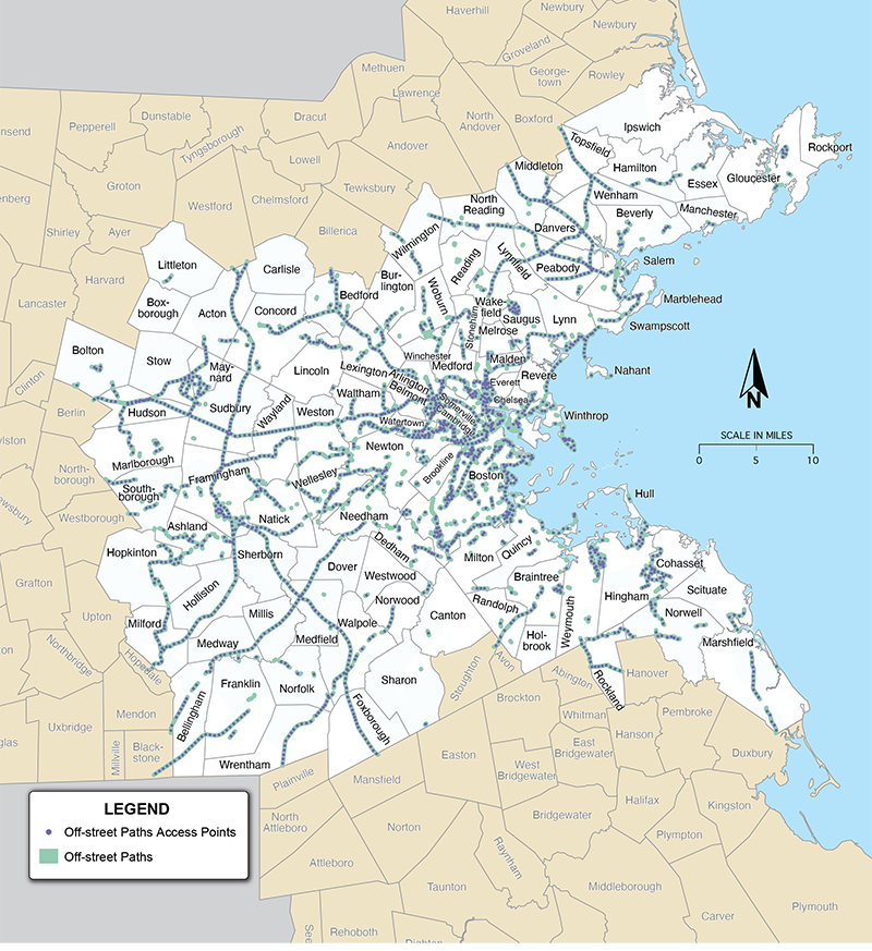
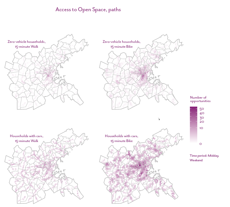
This metric tracked the total number of off-street path opportunities within a 15-minute walk or bicycle ride. Destinations consisted of any path that is at least partly in the Boston region. Figure 36 shows the locations of off-street paths in the Boston region; trips were routed to destination points every 500 feet along the path, with at least one point per path segment.
Figure 36
Locations of Off-Street Paths and Access Points in the Boston Region
Source: MassGIS.
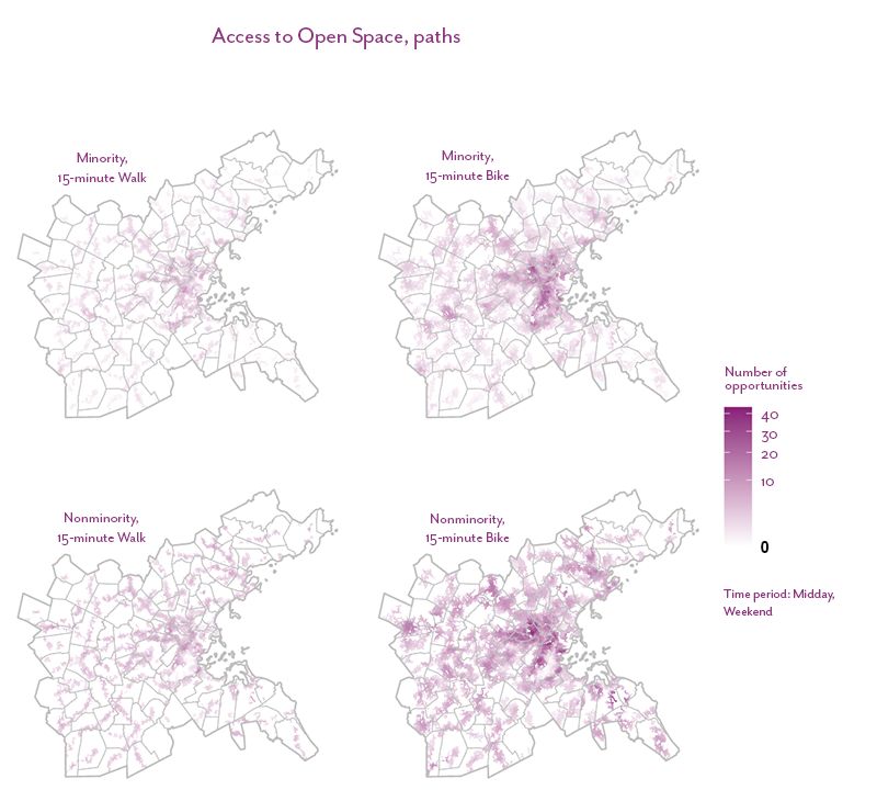
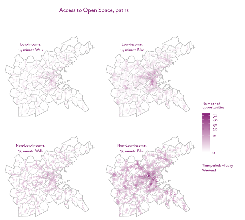
Figures 37, 38, and 39 show the total number of off-street paths that are accessible to each demographic group. All demographic groups have access to slightly fewer paths by walking than by bicycling. Equity populations overall have access to fewer off-street paths than their respective non-equity populations. This is in part due to fewer off-street paths built in these communities and because bicycle or pedestrian infrastructure to reach the paths may not be present.
Figure 37
Number of Off-street Path Opportunities Accessible within a 15-minute Bicycle or Walk Trip, by Minority Status
Source: MassGIS.
Figure 38
Number of Off-street Path Opportunities Accessible within a 15-minute Bicycle or Walk Trip, by Income
Source: MassGIS.
Figure 39
Number of Off-street Path Opportunities Accessible within a 15-minute Bicycle or Walk Trip, by Vehicle Availability
Source: MassGIS.
How does access compare between equity and non-equity populations?
This analysis tracked the average number of off-street path opportunities accessible per person for equity populations and their respective non-equity populations.
Analysis Takeaways
- There are a total of nine equity flags, split evenly between walking and bicycling. The low-income population has the most flags, four, one of which is for walking. This suggests that there is a lack of investment in off-street paths and safe streets to access them in low-income communities.
- Metro Core Communities and Country Suburbs have the most equity flags, three each. This indicates that fewer off-street paths have been built in these communities, and equity populations may have less access to bicycle and pedestrian infrastructure with which to access those paths that do exist.
Future Updates
This metric could explore different ways of defining access points, since paths may only be accessed at a few locations. We could also explore normalizing paths by their length.
Chapter 5—Equity Baseline Indicator Metric Results: Transportation Costs
This chapter discusses the analyses we conducted to examine several transportation cost metrics for the Boston region:
- Household transportation expenditures, which estimates the percent of total household income spent on transportation in the Boston-Cambridge-Newton, MA-NH metropolitan statistical area (MSA)
- Housing and transportation (H&T) index, which measures combined transportation and housing costs for households by census tract
- Value of travel time (VTT), which compares the perceived costs of individual trips between driving and transit modes
5.1 Household Transportation Expenditures
According to the United States Department of Labor, in 2019–20 households in the Boston-Cambridge-Newton, MA-NH MSA spent an average of $11,176 on transportation, or 12.2 percent of annual household expenditures. Of that amount, $914, or 8.2 percent of expenditures, was on public transit.17 This tells us that public transit is a much more affordable way to travel, which has bearing on the analysis in Chapter 1 that demonstrated the shift of poverty into the suburbs and rural areas where there are fewer public transit options.
5.2 The Housing and Transportation Index
Housing and transportation costs combined take up about half of the average household budget.18 They tend to have an inverse relationship: the lower the housing costs, the higher the costs of transportation, and vice versa. Therefore, it is useful analyze the costs together to better understand their relationship and where higher-cost locations are in the Boston region.19
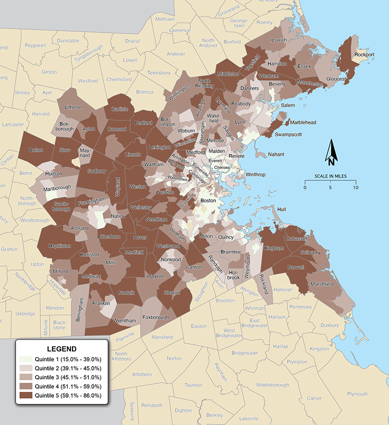
We used the Center for Neighborhood Technology’s (CNT) Housing and Transportation Index to assess housing and transportation costs in the region’s census tracts.20 Figure 40 shows housing and transportation costs as a share of the region’s average household income. Communities closer to Boston tend to have lower transportation costs, many of which are in quintiles one and two (the lowest cost quintiles). However, when combined with housing costs, the belt of communities right outside of Boston are among the most expensive in the region, in the fourth and fifth quintiles, and becoming even more expensive than communities at the edge of the region.
To explore this and other transportation cost variables in your community in an interactive application, visit http://shinyapps.ctps.org/ExistingInequities/.
17 “Table 3004. Selected northeastern metropolitan statistical areas: Average annual expenditures and characteristics, Consumer Expenditure Surveys, 2019-2020,” Bureau of Labor Statistics, https://www.bls.gov/cex/tables/geographic/mean/cu-msa-northeast-2-year-average-2020.pdf.
18 “Housing And Transportation Affordability,” U.S. Department of Transportation, last updated August 24, 2015, https://www.transportation.gov/mission/health/housing-and-transportation-affordability.
19 Pennywise Pound Fuelish, Center for Neighborhood Technology, March 2010, https://cnt.org/sites/default/files/publications/CNT_pwpf.pdf.
20 The CNT transportation model describes the relationship between three dependent variables—auto ownership, auto use, and transit use—and independent variables such as median household income, household size, commuters per household, household residential density, walkability and street connectivity, transit connectivity and access, and employment access and diversity. For more information, see https://htaindex.cnt.org/about/HTMethods_2016.pdf.
Figure 40
Housing and Transportation Costs as a Percent of Household Income in the Boston Region
Note: Income is a percent of the regional typical household, which is an average of all households in the Boston region.
Source: Center for Neighborhood Technology and US Census Bureau.
While, due to budget constraints, we were not able to research in-depth to determine which of these communities have high shares of minority, low-income, or zero-vehicle households, we can see trends when we compare these data to demographic maps. We saw, as shown in Figures 1, 2, and 3, that equity populations are increasingly living in communities outside of Boston and its immediate environs. Conducting a more detailed analysis of this overlap would be a useful follow-up analysis.
5.3 Comparing Trip Costs by Travel Mode
Another way to understand who is paying more for transportation is to calculate the cost of specific trips by different travel modes based on the value of travel time. Because there is a limited amount of time in the day, VTT can be understood as the opportunity cost of the time spent on a trip. Another way of thinking about opportunity cost is to consider how much someone would be willing to spend to decrease the time spent on their trip.21
Our analysis used perceived travel time to calculate VTT because it is a multi-dimensional measure: it calculates trip cost by factoring in the trip’s clock time and trip quality, such as station comfort, congestion, crowding, and reliability.22 Research has shown that qualitative measures affect people’s propensity for taking a given mode of transportation and, therefore, factors in to their decisions about how much they are willing to pay for the cost of the trip.23 Trip quality and trip length also affect people’s quality of life. Long commutes are associated with weight gain, less exercise, and increased stress, loneliness, and exhaustion. Trips with lots of congestion, transit trips with transfers or long wait times, and walk or bicycle trips on busy roads exacerbate these problems.24
Methodology
The VTT calculation starts by using Conveyal’s point-to-point analysis to break a trip’s travel time into its component parts (such as transfer time and in-vehicle time for a public transit trip). Then, the cost of each trip component is determined by multiplying the time in hours by the region’s prevailing wage rate. Finally, each trip component’s cost is multiplied by the relevant perceived travel-time factor to get the VTT for each trip component.25 That factor varies based on the quality of the trip component—for example, the in-vehicle portion of a public transit trip that is very crowded would have a higher travel time factor than an uncrowded trip. The resulting VTTs for each trip component are summed to produce the VTT for the trip.26
Since people with low incomes often pay a higher percent of their income toward transportation and have less discretionary income, future analyses could develop wage estimates for low-income, moderate income, and high-income workers so that VTT as a share of income can be calculated and compared across income brackets.
Table 5 shows example trips from Quincy Center to the Longwood Medical Area for driving and public transit trips at 8:00 AM on a Monday. The trip components and their associated perceived travel-time factors and VTT are also shown.27 In this example, the public transit trip both takes longer and has a higher VTT than the driving trip.
Table 5
Example VTT Calculation for Driving and Public Transit Trips from Quincy Center to the Longwood Medical Area
Mode and Trip Component |
Travel Time |
Perceived Travel-Time Factor |
Value of Travel Time |
Drive (LOS C) |
blank |
blank |
blank |
Walk to car |
2 |
50% |
$0.49 |
In-vehicle |
45 |
67% |
$14.64 |
Walk to destination |
3 |
50% |
$0.73 |
Total |
50 |
N/A |
$15.85 |
Public Transit |
blank |
blank |
blank |
Walk to stop |
5 |
70% |
$1.70 |
Wait at stop |
5 |
70% |
$1.70 |
In-vehicle (Red Line) |
26 |
35% |
$8.46 |
Transfer wait time |
5 |
70% |
$1.70 |
Transfer penalty1 |
10 |
35% |
$1.70 |
In-vehicle (Green Line) |
17 |
35% |
$5.53 |
Walk to destination |
7 |
70% |
$2.38 |
Total |
65 |
N/A |
$23.16 |
Note: The wage rate used is $56,507, which is the average for the Boston region.
1 The transfer penalty is not included in the travel time sum. A transfer penalty is imposed because transfers increase the perceived travel time above the actual length of the transfer wait time.
LOS = Level of service.
Source: Victoria Transport Policy Institute and Google Maps.
The advantage of this approach is that it reflects the tradeoffs people consider when deciding whether and by which mode to make a trip. It can also demonstrate the cost of a fractured public transit network. If, for example, this trip could be made in a one-seat, 43-minute ride (the sum of in-vehicle time on the Red and Green Lines), the value of travel time would decrease (in this case to $19.76), thereby making transit more attractive to riders. Though in this analysis we did not attempt to identify a threshold at which riders would choose to switch from driving to public transit, clearly the mere presence of a transfer imposes a significant barrier.
The analysis also highlights the importance of comfort—such as station quality and LOS—in trip valuation. And finally, it provides a standardized metric for demonstrating the travel-time burden that many people of color, low-income populations, and people without access to cars bear when they rely on public transit that is significantly less efficient than driving. It demonstrates that their time is valued less as they must endure lengthy and sometimes arduous trips even though they can least afford to do so.
Results
We expanded this analysis to the Boston region, mapping public transit and driving trips from the same origins to several destinations across the region: the Longwood Medical Area, Framingham, Quincy, Lynn, and downtown Boston. We set origins to be the center of each census tract in the region and calculated VTT for driving trips made from the tract centroid and public transit trips that could be made by walking from the centroid to the closest train, rapid transit, bus, or ferry stop. Then, we calculated the VTT for the fastest public transit and driving trips between each origin and each of the five destinations, and we mapped the difference between the two VTTs for each tract. The results for Quincy can be seen in Figure 41. As we can see, not all tracts contain a value—this is because a public transit trip as we defined it cannot be made from that origin to Quincy.
21 Todd Litman, Transportation Cost and Benefit Analysis II – Travel Time Costs, Victoria Transport Policy Institute, May 24, 2022, https://www.vtpi.org/tca/tca0502.pdf.
22 Vinn White, “Memorandum to: Secretarial Officers, Modal Administrators, U.S. Department of Transportation, September 27, 2016, https://www.transportation.gov/sites/dot.gov/files/docs/2016%20Revised%20Value%20of%20Travel%20Time%20Guidance.pdf.
Todd Litman, Valuing Transit Service Quality Improvements: Considering Comfort and Convenience in Transportation Project Evaluation, Victoria Transport Policy Institute, April 15, 2022,https://www.vtpi.org/traveltime.pdf.
23 Litman, “Valuing Transit Service Quality Improvements.”
24 Annie Lowry, “Your Commute is Killing You,” Slate, https://slate.com/business/2011/05/long-commutes-cause-obesity-neck-pain-loneliness-divorce-stress-and-insomnia.html.
Litman, “Valuing Transit Service Quality Improvements.”
25 We used perceived travel time factors developed by the Victoria Transport Policy Institute. See: https://www.vtpi.org/traveltime.pdf, pages 25 - 27.
26 Litman, “Valuing Transit Service Quality Improvements.”
27 Trip component travel times are calculated using Google Maps and are approximate. Driving and public transit in-vehicle times assume a LOS D. The quality of stations stops (part of the waiting and transfer penalty components) are considered average. Public transit passengers are assumed to be standing adults.
Figure 41
The Difference in the Value of Travel Time Between Drive and Public Transit Trips to Quincy from MPO Census Tracts
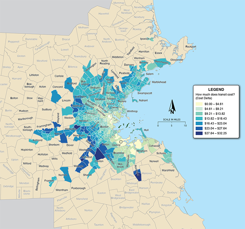
Source: US Census Bureau and Victoria Transport Policy Institute.
To explore this map and those for the other destinations in an interactive application, visit http://shinyapps.ctps.org/ExistingInequities/.
We found that every trip that could be made by public transit could be made by driving with a lower VTT. In other words, despite significant congestion in the Boston region, the opportunity cost of making trips by public transit is higher than driving.
Another notable pattern that emerges is the lack of public transit trips available between certain places in municipalities and the borders of the Boston region. For example, when we analyzed access to Framingham, we found that most public transit trips are available to take riders to towns nearest Boston. However, there are many towns northwest and south of Boston that, though they may be close by as-the-crow-flies, are not accessible to Framingham by public transit. Variations on this pattern can be seen when the destination is set as Lynn or Quincy. This result supports findings from the destination access analyses: there are major gaps in public transit particularly between municipalities in the northwest and south of Boston. Again, as demographic data show, the share of equity populations has been increasing in these outer suburbs, and a lack of public transit supporting their needs is a concerning trend.
There are a few caveats to keep in mind. Trips taken closer to Boston, and where the public transit network is built up the most, generally have a much lower difference in VTT between driving and public transit trips. This analysis does not account for actual parking costs since trips are routed as a “drop-off” style trip, which are often high in these towns, or the capital outlay and maintenance costs of car ownership. So, it may well be that in these towns the perceived cost is lower when riders take these factors into consideration. In addition, these analyses assume the same public transit quality and levels of congestion regardless of the line or roads onto which the trip is routed. In some cases, a public transit ride may cost far less in VTT—for example, a weekend commuter rail trip between Boston and Ipswich may be less costly than driving on Interstate 95 or Route 1. In other cases, the analyses may overstate the comfort afforded riders on public transit, which may be particularly true with bus trips since stops often do not have shelters or other amenities that commuter rail and rapid transit stations do.
Chapter 6—Conclusion
This report shows the results of several metrics selected to measure equity in the transportation network in the Boston region, focusing on destination access and transportation costs. The main goal of the study was to establish an initial set of metrics that the MPO can build on as it continues efforts to identify and mitigate transportation inequities in the Boston region through its policies and investments.
For the eight destination access metrics, we compared access per person between three equity populations and their respective non-equity populations: minority population/non-minority population, low-income population/non-low-income population, and zero-vehicle households/households with cars. This work demonstrates the utility and general ease of using Conveyal at regular intervals to assess whether access has improved for equity populations. Additionally, the results demonstrate the importance of doing so, especially at a subregional level, given that inequities were present within every equity metric.
For transportation costs, we examined three different ways of looking at costs: total household transportation expenditures, combined housing and transportation costs, and the value of travel time for individual public transit and driving trips. Each method offers distinct benefits and are appropriate for different purposes. The MPO could choose from the available datasets when considering various policies and infrastructure investments. In particular, Conveyal offers a novel way to calculate VTT or other trip cost calculations that may be useful on a per project basis.
This study represents not an ending, but rather a place for the MPO to build upon, whether through the MPO’s Transportation Equity Program or other programs and studies, to better understand inequities in the Boston region. Ultimately, these analyses can be used as tools to advance practices, policies, and investments that track and improve transportation outcomes for equity populations.