newest.png)
Exploring Shared-Use Mobility through Hubway Bikeshare
Project Manager
Michelle Scott
Project Principal
Annette Demchur
Data Analysts
Steven Andrews
Linghong Zou
Graphics
Steven Andrews
Jane Gillis
Kate Parker O’Toole
Linghong Zou
Cover Design
Kate Parker O’Toole
The preparation of this document was supported
by the Federal Transit Administration through
MassDOT 5303 contracts #88429 and #94643.
Central Transportation Planning Staff
Directed by the Boston Region Metropolitan
Planning Organization. The MPO is composed of
state and regional agencies and authorities, and
local governments.
Bikesharing is an example of a shared-use mobility service, which involves sharing vehicles, bicycles, or other modes of travel, and provides users with short-term access to transportation. This report on Hubway, the bikesharing system that serves Boston, Brookline, Cambridge, and Somerville, includes three components:
Staff also used a statistical model to explore factors that might encourage Hubway members to replace motor vehicle trips with Hubway trips going forward. The model showed that respondents who had been Hubway members for longer periods, continuously or intermittently, had a greater propensity to replace motor vehicle trips with Hubway trips. The results of this survey analysis could be used to inform outreach to current or prospective users or enrollment campaigns.
This information could be used to inform policies, information campaigns, or investments with potential to enhance Hubway’s ability to support first-and-last-mile connections to transit, or otherwise offer a non-single-occupant vehicle alternative. This information also could help identify locations where transit could be improved to make it a more competitive option. The analytic techniques used in this report could be applied to analyses of other shared-use mobility datasets.
1 Hubway Bikesharing Research Overview
2 Hubway Member Survey Research
2.1 Member Survey Data Overview
2.4 General Travel Characteristics of Members
Commute and Non-Commute Trips by Mode
Potential Connections to Transit
Auto Trips Replaced by Hubway Trips
2.5 Summary of Findings from the 2015 Hubway Member Survey
Choosing Bikesharing as a Travel Option
Reducing Motor Vehicle Dependence
Trip Data by Day of Week and Time of Day
3.4 Origin-Destination (O-D) Pair Data Trends
O-D Pairs by User Type, Day of the Week, and Time Period
4 Hubway’s Potential to Complement or Compete with Transit
4.1 Comparing Hubway and Transit Trip Characteristics
4.2 Tools for Comparing Travel Times
4.3 Results for Individual Trips
4.4 Results for Origin-Destination Pairs
4.5 Identifying O-D Pairs that May Complement or Compete with Transit
4.7 Results for O-D Pairs with Large Shares of Trips that are Much Slower by Transit
4.8 Results for O-D Pairs with Large Shares of Walk-Only Trips
Table of Tables
TABLE 2-1 Numeric Values Assigned to Motor Vehicle Trip-Reduction Categories
TABLE 2-3 Motor-Vehicle Trip Replacement OLS Regression Model Statistics
TABLE 3-1 Average Hubway Trips per Day by User Type and Day of Week
(High-Activity Season)
TABLE 3-2 Top-Ten Stations by 2015 Station-Visit Volume (High-Activity Season)
TABLE 3-3 Weekday Time Periods
TABLE 3-4 O-D Pairs Categorized by Trip Volume
TABLE 3-5 Stations with High Volumes of “One-Station” Trips
TABLE 4-1 Travel-Time-Ratio Categories
TABLE 4-2 O-D Pairs by Percentage of Trips that Would Have Been Faster
or Comparable by Transit
TABLE 4-3 O-D Pairs by Percentage of Trips that Would Have Been Much Slower
by Transit
TABLE 4-4 O-D Pairs by Percentage of Trips that Would Have Had Walk-Only Itineraries
TABLE 4-5 High Volume O-D Pairs with Trips Classified
by Travel-Time-Ratio Category
TABLE 4-6 Day-and-Time Periods
Table of Figures
FIGURE 2-1 2015 Survey Respondents by Recent Membership Type
FIGURE 2-2 2015 Survey Respondents by Initial Membership Year
FIGURE 2-3 2015 Survey Respondents by Gender
FIGURE 2-4 2015 Survey Respondents by Race/Ethnicity
FIGURE 2-5 2015 Survey Respondents and Population of Hubway Municipalities
by Age
FIGURE 2-6 2015 Survey Respondents and Population of Hubway Municipalities
by Education Level
FIGURE 2-7 2015 Survey Respondents and Population of Hubway Municipalities
by Household Income
FIGURE 2-8 2015 Survey Respondents by Reported Access to Select Transportation Resources
FIGURE 2-9 2015 Survey Respondents by Biking Frequency
FIGURE 2-10 2015 Survey Respondents by Distance They Are Willing to Walk to
a Hubway Station
FIGURE 2-12 2015 Survey Respondents by Purpose of Most Recent Hubway Trip
and Household Income
FIGURE 2-16 2015 Survey Respondents by Most Recent Trip by Purpose and Preferred Alternate Mode
FIGURE 2-19 Average Commute and Non-Commute Trips per Week by Mode and Bicycling Frequency Group
FIGURE 3-1 Hubway Trips per Year
FIGURE 3-2 Available Hubway Stations per Year
FIGURE 3-3 Hubway Daily Trip Volumes in 2015
FIGURE 3-4 Hubway Daily Trip Volumes by User Type in 2015
FIGURE 3-5 Hubway Trip Volumes by User Type, Day of Week, and Time of Day (High-Activity Season)
FIGURE 3-6 Hubway Station Locations and Visit Volumes
FIGURE 3-7 Top-Ten Stations by User Type, Day, and Time Period
FIGURE 3-8 Trip Volumes by Hubway O-D Pair
FIGURE 3-9 High-Volume O-D Pairs by User Type, Day, and Time Period
FIGURE 4-1 Alternatives to Hubway Trips by Travel-Time-Ratio Category
FIGURE 4-2 Alternatives to Hubway Trips by Mode
FIGURE 4-3 Transit Alternatives to Hubway Trips by Mode (Walk Trips Excluded)
FIGURE 4-4 Hubway Member Trips by Weekday Hour
FIGURE 4-5 Transit Alternatives to Hubway Trips by Travel-Time Ratio Category and Weekday Hour
FIGURE 4-6 Hubway Trips by Alternative Recommended Modes by Weekday Hour
FIGURE 4-7 Hubway Trips by Alternative Recommended Modes and Travel-Time-Ratio Category
FIGURE 4-8 Hubway Trips by Number of Transfers and Travel-Time-Ratio Category
FIGURE 4-9 Trips with Transit Itineraries by Mode and Number of Transfers
FIGURE 4-11 O-D Pairs with 1,000 or More Hubway Trips by Primary Travel-Time-Ratio Category
FIGURE 4-12 O-D Pairs That May Complement or Compete with Transit (AM and PM Peak Periods)
FIGURE 4-13 O-D Pairs that May Compete with Transit (Weekday Off-Peak and Weekend Periods)
FIGURE 4-16 Hubway Stations by Transit Modes Available within 200 Meters
FIGURE 4-17 O-D Pairs with 95 Percent or More Walk-Only Trips (Weekday AM and PM Peak Periods)
FIGURE 4-18 O-D Pairs with 95 Percent or More Walk-Only Trips (Weekday Off-Peak and Weekend Periods)
Appendixes
Appendix A: Data Used in Analysis Stages
Appendix B: Station Names, Aliases, and Visit Data
Appendix C: Adjusting Transit Travel Time Estimates to Mitigate Bias
Appendix D: Methods used to Estimate Uncomfortable Conditions
Appendix E: Details on O-D Pairs with Large Shares of Trips Faster or Comparable
by Transit
Appendix F: Details on O-D Pairs with Large Shares of Trips Much Slower
by Transit
Appendix G: Details for O-D Pairs with Large Shares of Walk-Only Trips
This analysis of Hubway bikesharing user and trip characteristics is a component of a broader research initiative concerning shared-use mobility services operating in Greater Boston. Shared-use mobility services involve sharing vehicles, bicycles, and other travel modes so that users have short-term access to transportation on an as-needed basis.1 In particular, bikesharing services enable users to access bicycles on demand from bike docking stations or free-floating fleets around the service area.2 Shared-use mobility services such as bikesharing provide flexibility on an individual-trip level and may affect longer-term mode-share and car-ownership decisions. It is important to understand the role of shared-use mobility options in the region’s transportation system for short- and long-term transportation planning.
In 2016, the Central Transportation Planning Staff (CTPS) of the Metropolitan Planning Staff (MPO) began work on a Massachusetts Department of Transportation (MassDOT)-funded study of shared-use mobility services in Greater Boston. The objectives of this study were to obtain data and provide analytical insights into
In addition to the Hubway analysis described in this report, CTPS conducted a literature review of shared-use mobility services, characteristics of their users, and impacts of these services on the transportation system.3 Because of limited available data on shared-use mobility services, CTPS focused on bikesharing when researching the study objectives.
Hubway began operating in Boston in 2011 and expanded to Cambridge, Brookline, and Somerville in 2012.4 Financial support for the system has included grants from the Federal Transit Administration’s Bus Livability grant program and the Federal Highway Administration’s Congestion Mitigation and Air Quality CMAQ program. Funding also came from the Centers for Disease Control and Prevention, the Massachusetts Executive Office of Housing and Economic Development, the Boston Public Health Commission, the Barr Foundation, and corporate sponsorships from New Balance and other local private institutions.
The system is owned by the municipal governments of Boston, Brookline, Cambridge, and Somerville. Municipal funds have provided support for the Hubway system. The Metropolitan Area Planning Council (MAPC) oversees interaction and use of the system between municipalities. Motivate, formerly Alta Bicycle Share, is the contractor that designs, deploys, operates, and manages the Hubway system. As of the end of 2015, Hubway’s system footprint covered approximately 25 square miles and included 155 stations and 1,500 bikes. 5 The Hubway system features dedicated docking stations for its bicycles and automated credit card payment. Users can sign up for either an annual or a monthly membership or purchase a 24- or 72-hour pass.
The Hubway system presents a valuable case study for exploring the characteristics of shared-use mobility. Because the service has existed for several years, people living in Greater Boston have had an opportunity to integrate Hubway into their overall travel patterns, and potentially change their behaviors in response to its availability. Motivate publishes comprehensive Hubway trip logs on its website, which grants planners and researchers easy access to detailed data on individual trips from one Hubway station to another. Using trip data, along with Hubway member survey data obtained from Motivate via MAPC, staff conducted a three-part analysis:
As of the end of 2015, Hubway had 13,248 annual members.6 In February 2016, Hubway issued a 2015 year-end survey to members who had an active annual membership at the end of 2015, to which 1,460 members responded. The survey asked questions on topics that included
This analysis focuses on the subset of survey questions that pertain most directly to the research objectives discussed in Part 1. Because this survey is specific to Hubway members, it does not provide insight into the characteristics and preferences of short-term-pass-purchasers. As discussed in the sections to follow, casual users took approximately 22 percent of Hubway trips in 2015; and differ from Hubway members in terms of when and where they make trips.
The survey form was distributed by email and data was collected during the winter of 2016, when people likely would modify their bicycling usage in response to the weather. Not all respondents answered all questions. In addition, responses reflect only those members who elected to respond; hence, these results may not be representative of all Hubway members. In spite of these limitations, this information still provides valuable insights into the travel behaviors of bikeshare users in greater Boston.
Figures 2-1 through 2-8 summarize the membership, demographic, and socioeconomic characteristics of Hubway survey respondents.
FIGURE 2-1
2015 Survey Respondents by Recent Membership Type
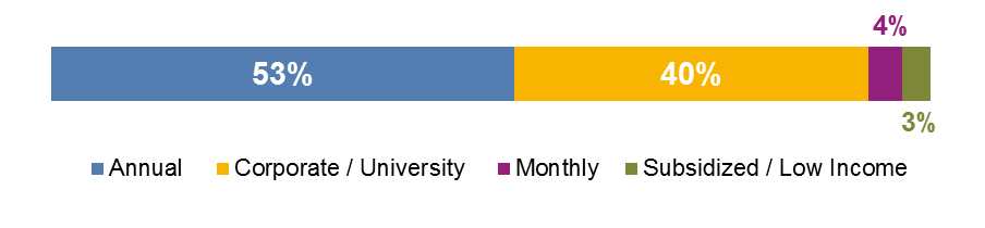
Data source: 2015 Hubway member survey. Sample size = 1,315.
Annual memberships and corporate or university-supported memberships are most common among the sample group, together comprising 93 percent of all reported memberships. Corporate or university-supported memberships are those where an organization collaborates with Hubway and covers some or all of members’ costs. 7
FIGURE 2-2
2015 Survey Respondents by Initial Membership Year
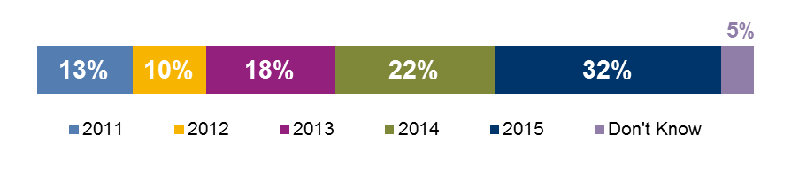
Data source: 2015 Hubway member survey (sample size = 1,315).
Many respondents became Hubway members relatively recently; approximately half report joining in 2014 or 2015.
As shown in Figures 2-3 and 2-4, approximately two-thirds of respondents identified themselves as male, and 85 percent of respondents identified as white.
FIGURE 2-3
2015 Survey Respondents by Gender

Data source: 2015 Hubway member survey (sample size = 1,252).
Note: Those who identified as Other comprised less than one percent of respondents and are not shown above.
FIGURE 2-4
2015 Survey Respondents by Race/Ethnicity
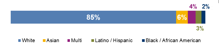
Data source: 2015 Hubway member survey (sample size = 1,190).
Notes: 1) The Multi category reflects those who selected more than one response option. 2) Other responses (not shown) includes American Indian and Alaskan Native (one person), Native Hawaiian and Pacific Islander (one person), and Other (three people). 3) The Other category includes those identifying as being of Middle Eastern ethnicity.
Figures 2-5, 2-6, and 2-7 describe respondents’ age, household income, and education level. Staff aggregated responses to these questions in ways that made it possible to compare this information to US Census data on age, income, and education level for the Hubway service area population.
FIGURE 2-5
2015 Survey Respondents and
Population of Hubway Municipalities by Age
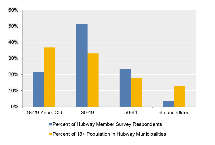
Data sources: 2015 Hubway Member Survey (sample size = 1,234), and 2010-14 American Community Survey (ACS) data for Boston, Brookline, Cambridge, and Somerville.
Note: A person must be at least 16 years of age to become a Hubway member.
Of the respondents who answered this question, most were between 30 and 49 years old. The shares of respondents in the 18-to-29-year-old and 50-to-64-year-old categories are similar. As shown above, the largest share of survey respondents falls into the 30-to-49-year-old category, while the largest share of the 18-year-or-older population of the municipalities that have Hubway stations—Boston, Brookline, Cambridge, and Somerville—falls into the 18-to-29-year-old category.
FIGURE 2-6
2015 Survey Respondents and Population
of Hubway Municipalities by Education Level
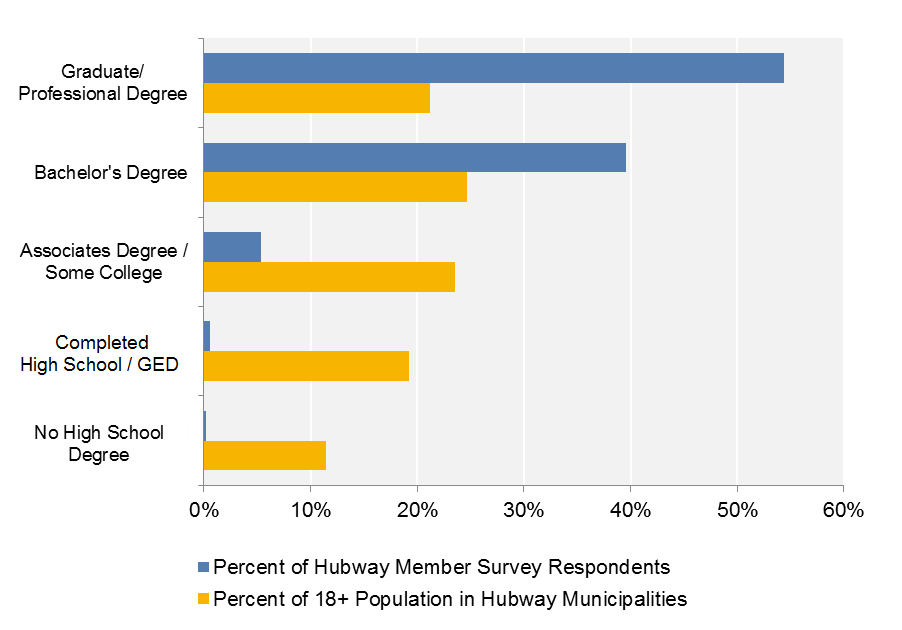
Data sources: 2015 Hubway Member Survey (sample size = 1,263), and 2010-14 ACS data.
GED = general education development (high school equivalency).
The survey respondent group also has higher educational levels compared to the 18-year-or-older population in the Hubway service area municipalities. As shown above, 94 percent of survey respondents earned a bachelor’s degree or higher, compared to 46 percent of the service area population.
FIGURE 2-7
2015 Survey Respondents and
Population of Hubway Municipalities by Household Income
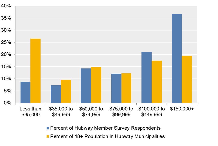
Data sources: 2015 Hubway Member Survey (sample size = 1,086) and the 2010-14 ACS Survey Public Use Microsample (PUMS).8
The survey respondent group skews toward higher household incomes than the 18-year-or-older population in the Hubway service area municipalities. The two groups are similar in terms of their shares of people with incomes between $50,000 and $74,999 and between $75,000 and $99,999.
The characteristics of the 2015 Hubway member survey respondents generally correspond to findings about the characteristics of bikeshare users. Fishman’s 2016 review of bikesharing literature reports that bikeshare users are more likely to be white (in the US and London), and male, and to have higher-than-average incomes and levels of education.9
FIGURE 2-8
2015 Survey Respondents by Reported
Access to Select Transportation Resources
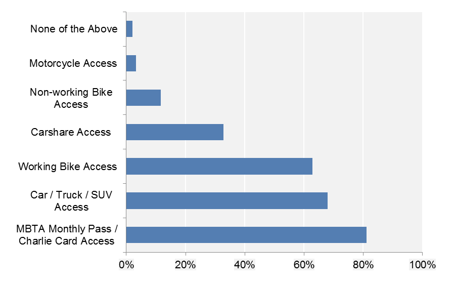
Data source: 2015 Hubway member survey (sample size = 1,327).
Notes: 1) 133 respondents who did not identify any transportation resources, and who did not answer subsequent questions, were excluded. 2) One person did not select “None of the Above” but did not identify any transportation resources.
SUV = sport utility vehicle.
When asked about the transportation resources available to them, approximately 81 percent of respondents reported that they had access to a MBTA “Monthly Pass/Charlie Card, as shown in Figure 2-8.”10 Sixty-eight percent said they had access to a personal vehicle, while 63 percent reported access to a working bike.11 This information, combined with information about Hubway member incomes and education level, suggests that Hubway members generally are aware of, and have access to, a variety of transportation options; which enhances their ability to select the optimal mode for a given trip.
Figures 2-9 and 2-10 provide information about members’ biking frequency during periods of good weather and the distance they are willing to walk to access a Hubway station.
FIGURE 2-9
2015 Survey Respondents by Biking Frequency
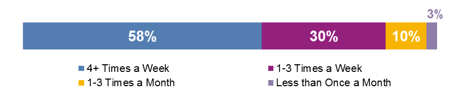
Data source: 2015 Hubway member survey (sample size = 1,397).
Note: Values sum to greater than 100 percent because of rounding.
FIGURE 2-10
2015 Survey Respondents by Distance
They Are Willing to Walk to a Hubway Station
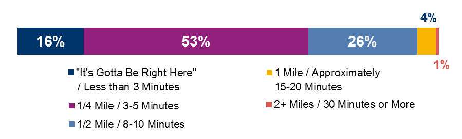
Data source: 2015 Hubway member survey (sample size = 1,309).
The majority of survey respondents (88 percent) reported using Hubway or their personal bike during periods of good weather at least once a week, as shown in Figure 2-9. Figure 2-10 shows that 53 percent of respondents reported that they would be willing to walk as much as one-quarter mile to reach a Hubway station, although 16 percent said that the station would need to be “right here,” or within a three-minute walk.
The member survey includes questions about respondents’ most recent Hubway trip. Figures 2-11 through 2-17 display the results of a subset of these questions.
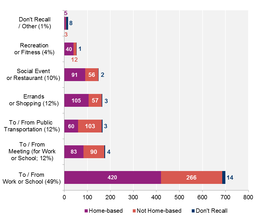
Data source: 2015 Hubway member survey (sample size = 1,426).
Note: Percent values in data labels reflect each trip purposes's share of total responses.
The top Hubway trip purpose identified by survey respondents was commuting to or from work or school (49 percent of all responses), followed by traveling to or from work-related meetings or public transportation or for errands. In his review of bikesharing systems in the US and internationally, Fishman found that commuting was a top trip purpose among bikesharing members.12 Fifty-five percent of respondents’ most recent trips were home-based. Figure 2-11 shows that less than half of trips to or from work-related meetings (12 percent of all trips) or public transit (12 percent of all trips) began from respondents’ homes.
Figure 2-12 examines Hubway trip purposes with respect to respondents’ household income.
FIGURE 2-12
2015 Survey Respondents by Purpose
of Most Recent Hubway Trip and Household Income
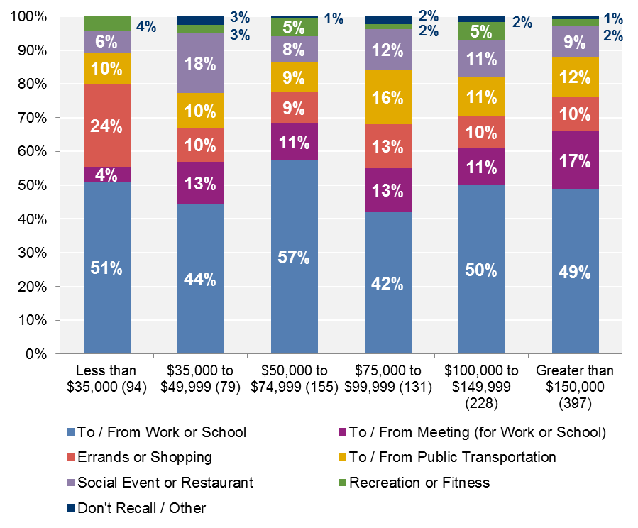
Data source: 2015 Hubway member survey (sample size = 1,084 respondents).
Notes: 1) The sample size for each income category is included in its data label. 2) The percent values in each column may not sum to 100 percent because of rounding.
More than 50 percent of the people in each income group reported making their most recent trip for work or school purposes (including meetings). Those who earned less than $35,000 made a larger share of Hubway trips for errands or shopping than other groups, while those with incomes in the $75,000–$99,999 range made a larger share of trips to connect with public transportation.
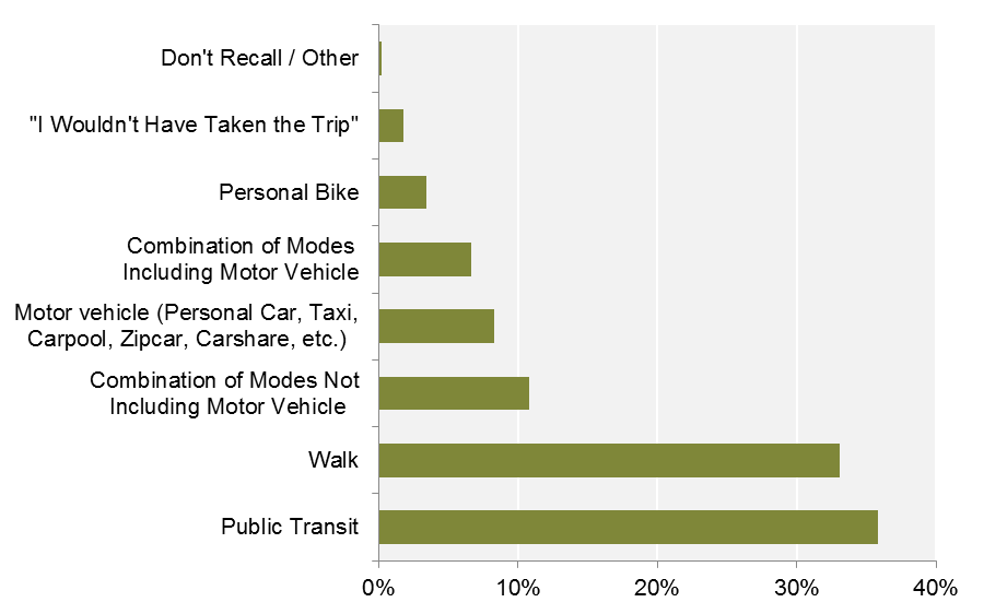
Figure 2-13 shows survey respondents’ most-preferred alternative travel modes had Hubway not been available for their most recent trip.
Data source: 2015 Hubway member survey (sample size = 1,430).
Thirty-six percent of respondents identified public transit as their most-preferred alternative for their recent trip, while 33 percent selected walking. Again, these results might have been affected by the survey being distributed in winter. However, these results do reflect findings from other bikeshare surveys across the country.13 In particular, the Shared Use Mobility Center (SUMC) found that respondents to their 2015 multi-city survey tended to cluster into active-transportation or motor vehicle-oriented groups when selecting alternatives to their preferred shared-use mode.14 Those who are inclined to use bikesharing might be most inclined to use transit or walking as a next-best alternative.
Figure 2-14 provides additional detail on the subset of respondents who selected “motor vehicle,” or “combination of modes including motor vehicle,” as their preferred alternate mode to Hubway for their most recent trip.
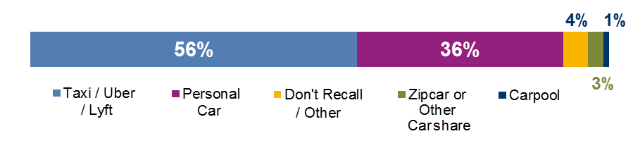
Data source: 2015 Hubway member survey (sample size = 214).
Note: The sample for this chart only includes respondents who selected “motor vehicle” or “combination of modes including motor vehicle” as their preferred alternative to Hubway.
Respondents in this subset more frequently selected taxis or ridesourcing (56 percent) compared to personal vehicles (36 percent). This seems reasonable given that many respondents’ (41 percent) most recent trips started somewhere other than home.
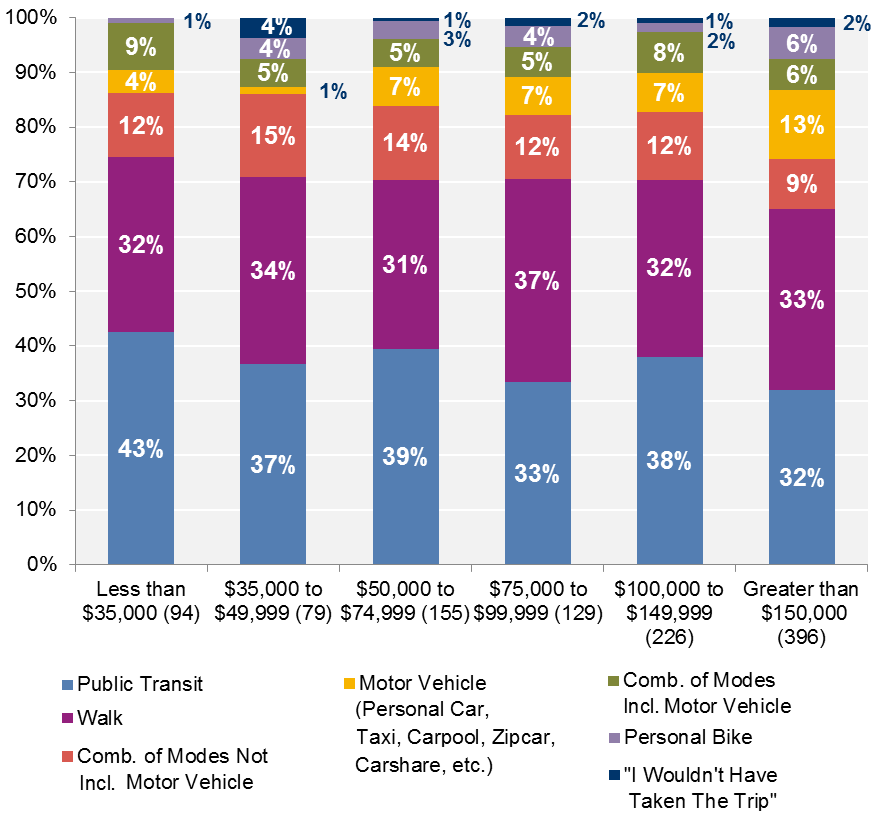
Figure 2-15 examines respondents’ preferred alternate mode for their most recent Hubway trip with respect to their household income.
Data source: 2015 Hubway member survey (sample size = 1).
Notes: 1) The sample size for each income category is included in its data label. 2) The percent values in each column may not sum to 100 percent because of rounding.
Across all income groups, walk and public transit make up the largest shares in terms of the modes respondents would have used if Hubway were not available. Those with household incomes greater than $150,000 had the highest share of those who selected motor vehicle as their alternate travel mode (13 percent).
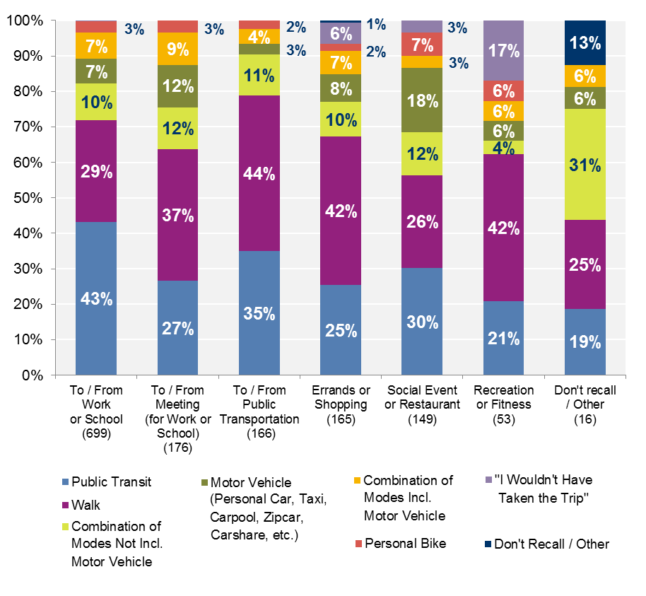
Figure 2-16 shows the percent of respondents who selected each alternate mode for a given trip purpose.
FIGURE 2-16
2015 Survey Respondents by Most Recent Trip by Purpose
and Preferred Alternate Mode
Data source: 2015 Hubway member survey (sample size = 1,424).
Notes: 1) The sample size for each trip purpose category is included in its data label. 2) The percent values in each column may not sum to 100 percent because of rounding.
Public transit and walking are generally the travel alternatives respondents chose, although the rank of these alternatives (in terms of preference) varies depending on the trip purpose. Motor vehicles are a more popular alternative for social trips. Recreation or fitness trips had the highest share of respondents who said they would not have taken the trip if Hubway had not been available.
Respondents were asked about their primary reason for using Hubway for their most recent trip; their responses are shown in in Figure 2-17.
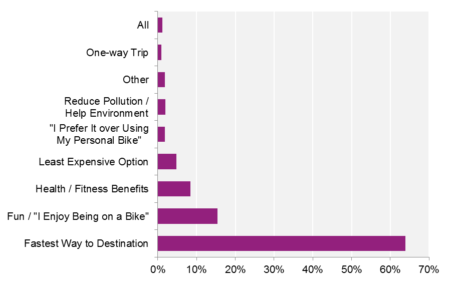
Data source: 2015 Hubway member survey (sample size = 1,412).
Note: The “One-Way Trip” category includes “One-Way T” responses.
Approximately two-thirds of respondents selected “fastest way to [their] destination” as their primary reason for using Hubway for their most recent trip, which is consistent with findings in bikesharing literature.15 However, other choices may have been more prominent had the survey been issued during a warmer season.
Figure 2-18 compares the primary reason that members used Hubway for their most recent trip with the alternate mode they would have chosen for that trip.
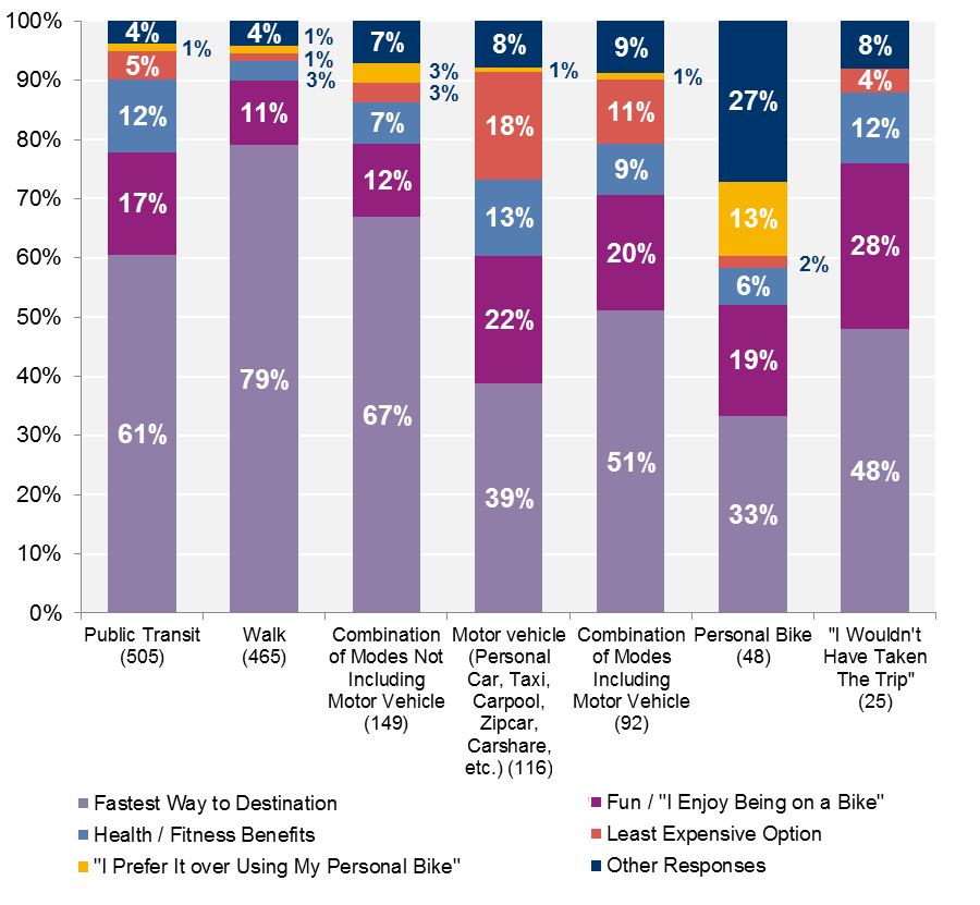
Data source: 2015 Hubway member survey (sample size = 1,407).
Notes: 1) The sample size for each alternate mode category is included in its data label. 2) "Other" reasons for using Hubway include "reduce pollution/help the environment;" "Other;" "All;" "One-way Trip.” 3) The percent values in each column may not sum to 100 percent because of rounding.
The majority of respondents who otherwise would have taken public transit, taken a combination of modes, or walked said that their primary reason for using Hubway was that it was the “fastest way to [their] destination.” Approximately 18 percent of members who otherwise would have taken a motor vehicle said that they chose Hubway because it was the “least expensive option.”
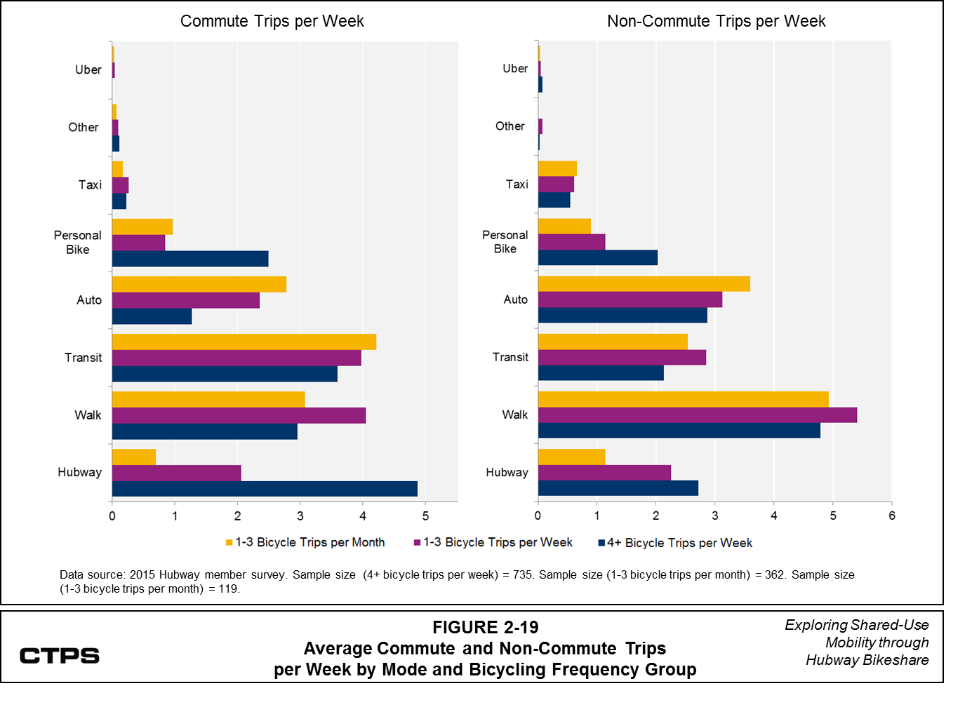
The Hubway member survey also offered insights into how Hubway fits into respondents’ overall travel habits. The survey asked respondents to report the number of one-way commuting trips and non-commuting trips they make during a typical week using various forms of transportation.16 CTPS used responses to these questions to calculate a weighted average number of commuting and non-commuting trips per week for each mode.17 Figure 2-19 shows these average numbers of trips for three groups of respondents: those who made four or more bicycle (Hubway or personal bike) trips per week, those who made between one-and-three bicycle trips per week, and those who made between one-and-three bicycle trips per month.
Figure 2-19 shows that those who reported biking four or more times a week made a much larger average number of Hubway commuting trips per week, compared to those who reported biking less frequently. Respondents in the “one-to-three trips per week” group made about one additional walking trip compared to the other two groups. Meanwhile, the “one-to-three trips per week” and “one-to-three trips per month” groups made at least one additional commute trip per week by auto compared to those who used Hubway or their personal bicycle more frequently. Those in the “one-to-three bicycle trips per month” group made slightly more transit commute trips per week, on average, than the other two groups, though there is not a large difference in the average number of transit-based commute trips across the three groups. The evidence that transit commute trips are relatively consistent across respondent groups while Hubway trips vary may suggest that some members in the “four or more bicycle trips per week” group use Hubway to connect to transit.
For non-commute trips. walking and transit trip making across groups was fairly similar, although the “one-to-three bicycle trips per week” group made slightly more walking and transit trips, on average, than the “four or more bicycle trips per week” or the “one-to-three bicycle trips per month” groups. Overall, Hubway and transit appear to be prominent options for Hubway member commute trips, while auto is a more prominent option for non-commuting purposes. Walking is a prominent option for both types of trips.
FIGURE 2-19
Average Commute and Non-Commute Trips
per Week by Mode and Bicycling Frequency Group
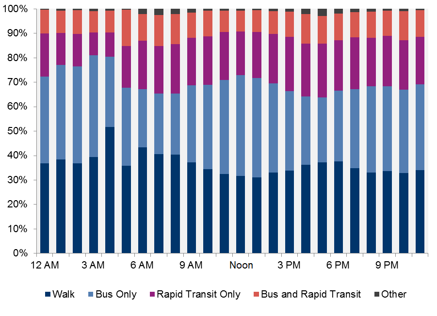
As mentioned in section 2.3, approximately 12 percent of Hubway respondents reported that they made their most recent trip to connect to transit. Later in the survey, respondents were asked to report how many of their Hubway trips started or ended near various public transit locations during a typical week. Figure 2-20 shows these results for subway/trolley, bus, and commuter rail.

Data source: 2015 Hubway member survey (sample size (subway / trolley) = 1,166).
Notes: 1) Sample size (bus) = 970. Sample size (commuter rail) = 1,035. 2) Respondents who did not provide an answer for a specific mode were left out of that mode's sample.3) Percent values in each bar may not sum to 100 percent because of rounding.
As Figure 2-20 shows, more respondents reported making at least one trip per week that started or ended near a subway/trolley connection (59 percent), compared to trips that started or ended near bus or commuter rail (24 percent each). However, the wording of this question imposes some limitations on the information CTPS could glean about how frequently Hubway members may connect to transit stations, and what modes they use. The Hubway system is located in a relatively transit-dense area, so the likelihood of a Hubway station being near at least one transit option is high. While this question asks about the number of trips that started or ended near transit, it does not ask whether respondents used transit prior to or after making their Hubway trips, which would provide more information on how Hubway is used in multimodal trip making.
The survey also asked respondents “If you have access to a motor vehicle, how many trips in a typical week in 2015 did you use Hubway instead of your motor vehicle?” This question could shed light on a great potential benefit of Hubway: encouraging users to shift away from single-occupant motor vehicle travel. Responses to this question are shown in Figure 2-21.
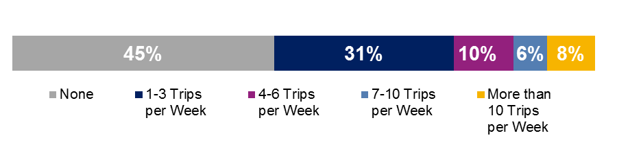
Data source: 2015 Hubway member survey (sample size = 1,152).
Approximately 55 percent of respondents reduced their motor vehicle travel by at least one trip per week. Research using bikesharing data from other cities, including Minneapolis/St. Paul (the Twin Cities), Montreal, and Washington DC similarly found reductions in driving among bikeshare members. 18
To explore this topic in more detail CTPS created an ordinary-least-squares (OLS) linear regression model to explore the factors that may influence respondents to replace motor vehicle trips with Hubway trips.19 This model estimated an individual’s tendency to replace vehicle trips with Hubway trips using this replacement ratio:
Replacement Ratio =
Number of Vehicle Trips Replaced by Hubway in a Typical Week/Number of Hubway Trips in a Typical Week
For this model, CTPS selected 600 respondents from the overall sample who reported
CTPS calculated the total number of Hubway trips that a respondent made each week by summing the Hubway commute and non-commute trips that the respondent reported, as discussed earlier in this section (see Figure 2-19). CTPS then examined the category the respondent selected for the number of motor vehicle trips she typically replaced with Hubway each week (see Figure 2-21). Because respondents did not provide raw values for the motor vehicle trips that they replaced each week, CTPS used the midpoint value as the representative value for the “1-3 trips”, “4-6 trips”, and “7-10 trips” categories, as shown in Table 2-1. For the “More than 10 trips” category, CTPS assumed a left-skewed distribution and therefore selected 11.5 trips as the representative value.
TABLE 2-1
Numeric Values Assigned to Motor Vehicle Trip-Reduction Categories
Motor Vehicle Trip-Reduction Category |
Assigned Numerical Value |
0 trips |
0 trips |
1-3 trips |
2 trips |
4-6 trips |
5 trips |
7-10 trips |
8.5 trips |
More than 10 trips |
11.5 trips |
CTPS examined different groups of variables from the survey that might influence an individual’s inclination to replace Hubway trips with motor vehicle trips, including but not limited to
CTPS removed survey responses that contained at least one missing value for these explanatory variables and ultimately used 462 Hubway member survey responses in the final model estimation. Table 2-2 describes the seven explanatory variables (including the model intercept20 ) that were ultimately included in the final model. All of these variables are statistically significant, meaning that it is highly probable that there is a relationship between each variable and the replacement ratio is not random.21
The model includes two explanatory variables that are difficult to explain directly: the home-based trip indicator and the Asian-respondent indicator. CTPS kept these statistically significant variables in the model because they might serve as proxies for a “true” factor that contributes to variations in the vehicle-trip replacement ratio. Meanwhile, the “years since first becoming a Hubway member” variable provides valuable information from a policy standpoint. If people can maintain their Hubway memberships over time—perhaps through financial support—they may be able to maintain the behaviors that would help them transition away from single-occupant motor vehicle use for some of their trips.
TABLE 2-2
OLS Regression Results Measuring Hubway Members’
Propensity to Replace Auto Vehicle Trips with Hubway Trips
Variable Description |
Estimated Parameter |
t-Statistic |
Coefficient Interpretation |
Description and Possible Explanation |
Intercept |
0.31 |
4.5 |
N/A |
N/A |
The share of automobile and taxi trips of all (commute and non-commute) trips in a typical week |
0.37 |
3.4 |
A 10 percent increase in motor vehicle trip share results in a 3.7 percent average increase in a respondent’s motor vehicle trip replacement ratio. |
Hubway members that rely primarily on motor vehicles are more likely to replace motor vehicle trips with Hubway trips (as opposed to those who may rely more on transit). |
Home-based trip indicator (1 if the respondent's most recent Hubway trip was home-based, 0 if otherwise) |
0.13 |
3.4 |
If a respondent's most recent Hubway trip was home-based, her replacement ratio increases by 13 percent, on average. |
If a respondent’s most recent Hubway trip was home-based, we assume that she may be more likely to start her Hubway trips from home generally than would a member who reported that his most recent trip was not based at home. Using this assumption, members who typically make home-based Hubway trips may be more likely to replace motor-vehicle trips than if they were not typically making home-based trips. This makes sense if a member’s motor vehicle is parked near her home. |
Commute trips by transit in a typical week |
-0.01 |
-3.0 |
Each additional transit commute trip a respondent makes per week decreases his replacement ratio by one percent on average. |
As members increase the number of commute trips they make by transit each week, they become less likely to replace motor vehicle trips with Hubway trips. This is probably because their Hubway trips would replace transit trips more often (as opposed to motor vehicle trips). |
Asian respondent indicator (1 if the respondent is Asian, 0 if otherwise) |
0.24 |
2.7 |
If a respondent is Asian, his replacement ratio increases by 24 percent on average. |
This variable might be a proxy for where Hubway trips are being made. For example, Asian members may take Hubway trips in neighborhoods where taking trips by Hubway might be easier than taking trips by motor vehicle. |
Years of Hubway membership |
0.03 |
2.3 |
For each additional year that has passed since a respondent first became a Hubway member, her replacement ratio increases by three percent on average. |
The more years that have passed since a person first became a Hubway member, the more likely she is to replace motor vehicle trips with Hubway trips. |
Willingness to walk more than five minutes to a Hubway station (1 if yes, 0 if otherwise) |
0.07 |
1.8 |
If a respondent is willing to walk longer than five minutes to access a Hubway station, his replacement ratio increases by seven percent on average. |
Members that are willing to walk longer to reach a Hubway station might be more likely to make behavior changes that support a mode shift from motor vehicle to Hubway use. |
Note: The “Descriptions and Possible Explanations” column suggests possible reasons behind the relationships between each explanatory variable and the response variable. However, this model can only highlight correlations between variables and not definitively explain why the relationship exists.
N/A = Not available or applicable. OLS = ordinary-least-squares.
Table 2-3 shows the number of observations included in the final model, along with statistics that describe how well the model fits the data.
TABLE 2-3
Motor-Vehicle Trip Replacement OLS Regression Model Statistics
Model Parameter |
Value |
Number of observations |
462 |
F-statistic |
10.75 |
R-squared |
0.124 |
Adjusted R-squared |
0.113 |
Note: The p-value associated with the F-statistic is 0.000 or 3.396e-11
OLS = ordinary-least-squares.
The F-statistic for this model indicates that this model predicts changes in the response variable (motor-vehicle-trip replacement ratio) better than a model that included only the intercept, or the mean motor-vehicle replacement ratio value. In terms of the overall model fit, an r-square value of 0.124 means that the model explains 12 percent of the variability in the data. The model may have this relatively low R-squared value for the following reasons:
Though this model has a low R-squared value, which limits its ability to make precise predictions, it still provides valuable insights into the relationship between the variables, and the factors that may influence the extent to which a person might replace motor-vehicle trips with Hubway trips. The high t-statistics associated with the explanatory variables (see Table 2-2) indicate that these variables reveal significant trends in otherwise noisy and highly variable data.
Of the research objectives mentioned in Section 1, the results of Hubway’s 2015 member survey provide insights into
In the 2015 Hubway member survey, the majority of respondents reported that their top reason for using Hubway for their most recent trip was that it was the fastest way to their destination. Figure 2-13 shows that this response far surpassed other reasons, including cost, health, or environmental benefits. Moreover, Figure 2-18 shows that this reason continued to be prominent regardless of the alternative mode the member might have taken for their trip. While not surprising, this finding speaks to the role that Hubway can play as part of an integrated transportation system. Figures 2-14 and 2-17 suggest that members may be making very small numbers of bikeshare trips that they would not otherwise have made, and that these trips were primarily for recreational, fitness, errands, or shopping purposes. It is important to note that because this research used member survey data, these results are biased towards individuals who have chosen to use Hubway. To conduct an unbiased study that examines people’s decisions to switch to bikesharing, one would need data from a broader population—including people who did not use Hubway—and comprised of individuals with the ability to choose from multiple modes for particular trips. This data then would describe how respondents would choose from various transportation modes to make particular trips.
The survey also provides information about who is taking advantage of the Hubway system to meet their travel needs. The results indicate that Hubway survey respondents tend to be better educated and have higher household incomes than the overall population of municipalities with Hubway service (Figures 2-3 and 2-7), suggesting that knowledge and resources may enable people to make the choice to use bikesharing. The City of Boston and the Boston Public Health Commission have collaborated to make subsidized memberships available to low-income individuals, and Hubway offers monthly memberships, which can increase access for those who might not be able to afford an annual membership.22 To the degree that these initiatives, along with public education campaigns, can be sustained and expanded, more people of various incomes and education levels may be able take advantage of the service. Hubway has also made new stations available in East Boston, Dorchester, Roxbury, and other areas during 2016. Therefore, the 2016 member survey possibly may reflect more diversity in respondent characteristics than it might have prior to this geographic expansion.
Survey data on respondents’ most recent Hubway trips reveals mixed findings with respect to bike sharing’s ability to help individuals live a less car-dependent lifestyle. Many members made their most recent Hubway trip to commute, attend work or school meetings, access public transportation, or do errands, which suggests that people use Hubway to meet essential transportation needs (see Figure 2-11); thus, offering the potential for people to become less dependent on automobiles for regular or essential travel. Meanwhile, the majority of survey respondents reported that they otherwise would have walked or taken public transit for their most recent trip; and in cases where they would have used a vehicle, they more likely would have used a taxi or ridesourcing service (such as Uber or Lyft) than a personal vehicle.
Bikesharing’s potential to reduce motor vehicle dependent lifestyles may be more apparent when one examines broader trip-making patterns. Figure 2-11 shows that more than half of respondents made their last Hubway trip for work or school, while Figure 2-19 shows that those who bicycle most frequently make a larger average number of commuting trips (an essential transportation purpose) using Hubway during a typical week. The survey results also show that 55 percent of respondents reported replacing at least one motor vehicle trip with a Hubway trip each week. The results of the regression model show that respondents who had been Hubway members for longer periods, continuously or intermittently, had higher propensities to replace motor vehicle trips with Hubway trips. This is a positive indicator that Hubway might help people to live a more car-free lifestyle. Future surveys could supplement these findings by adding questions about whether Hubway members have sold cars or postponed new car purchases because they had access to Hubway, or how they have changed their use of different modes since joining Hubway. Future research also could explore how members use Hubway differently based on their reported home zip codes.
While Hubway’s member survey data provide information about user characteristics, preferences, and self-reported behaviors, Hubway trip logs reveal when and where users actually make bikeshare trips. This makes it possible to look at trip-making behavior across all users and explore whether they are using the Hubway system in ways that potentially complement, or compete with, transit.
CTPS obtained trip logs for the years 2011 through 2015 from Motivate in February 2016, although Motivate also now provides trip logs on the Hubway website.23 These logs include trip duration (length of time), the start and stop dates and times of the trip, the start and end stations, and the bicycle identification number. The logs that CTPS obtained also list whether the person who made the trip was a Hubway member or casual user (that is, a short-term pass purchaser). If the person was a member, the data includes the member’s home zip code and gender. While this data is a rich resource for exploring shared-use mobility, it lacks several details that prevent it from telling the full story about a person’s trip:
In the absence of full details, CTPS has defined a Hubway trip as including only the time and activity between when a bicycle is checked out of a Hubway station dock and when it is returned to a station dock. In addition to Hubway trip logs, CTPS used data provided by Motivate about Hubway stations, including stations’ identification numbers, names, coordinates, and number of available bike docks.
Figures 3-1 and 3-2 below show the number of trips and stations that appeared in each year of Hubway data.24
FIGURE 3-1
Hubway Trips per Year
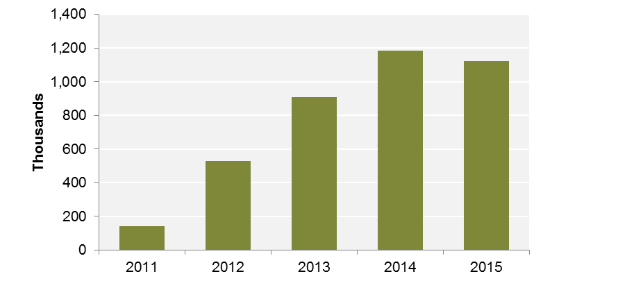
Data source: 2011-2015 Hubway trip logs.
FIGURE 3-2
Available Hubway Stations per Year
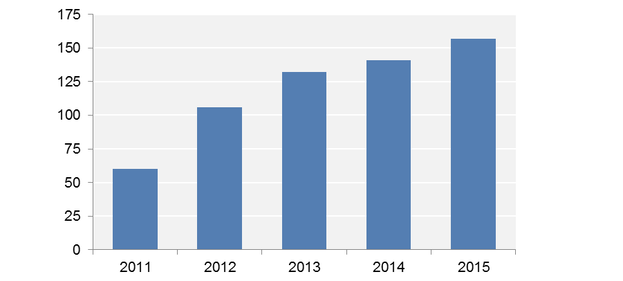
Data source: 2011-2015 Hubway trip logs.
Hubway launched service in Boston in 2011 and expanded into Cambridge, Somerville, and Brookline during summer 2012. During this time, total annual trips increased 276 percent, and total available stations increased by 75 percent.25 Total annual trips decreased by about five percent between 2014 and 2015, despite the increase in the number of stations. This likely can be explained in part by the heavy snowfall and extended periods of inclement weather during early 2015.
Subsequent components of this analysis focus on trips made during 2015. Figure 3-3 shows the distribution of Hubway trips over the course of 2015.
FIGURE 3-3
Hubway Daily Trip Volumes in 2015
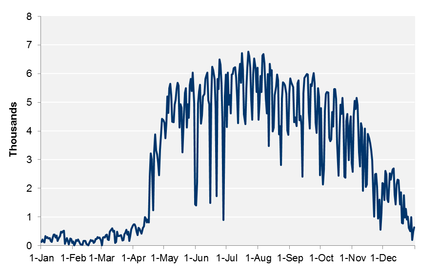
Data source: 2015 Hubway trip logs.
Depending on the time of year, Hubway may have only a limited number of stations in operation, which contributes to the variations in Hubway usage over the course of the year. According to Motivate, 32 stations were open in Cambridge during winter and early spring 2015, during which the number of trips per day remained consistently below 1,000 until the full season opening on April 17, 2015.26 In the summer and fall months, the number of trips on the system generally remained between 4,000 and 6,000 per day and then began to decline in mid-November. Starting on November 25, system stations began to close; according to Motivate 111 stations were open through December 7, and 108 stations were open through the end of the year.27 After December 18, the number of trips per day trips generally remained below 1,000, similar to wintertime levels exhibited in the early parts of the year.
The Hubway 2015 trip data reflects trip made by both Hubway members and casual users of the Hubway system. According to Motivate, Hubway had 13,248 members and sold 102,445 24-or-72 hour casual passes during 2015; and system volumes reflect trips made by about 60,000 unique users.28 In 2015, casual users accounted for approximately 22 percent of the trips made on the system, while members accounted for the other 78 percent.
Figure 3-4 shows how the trips made by members and casual users are distributed throughout the year.
FIGURE 3-4
Hubway Daily Trip Volumes by User Type in 2015
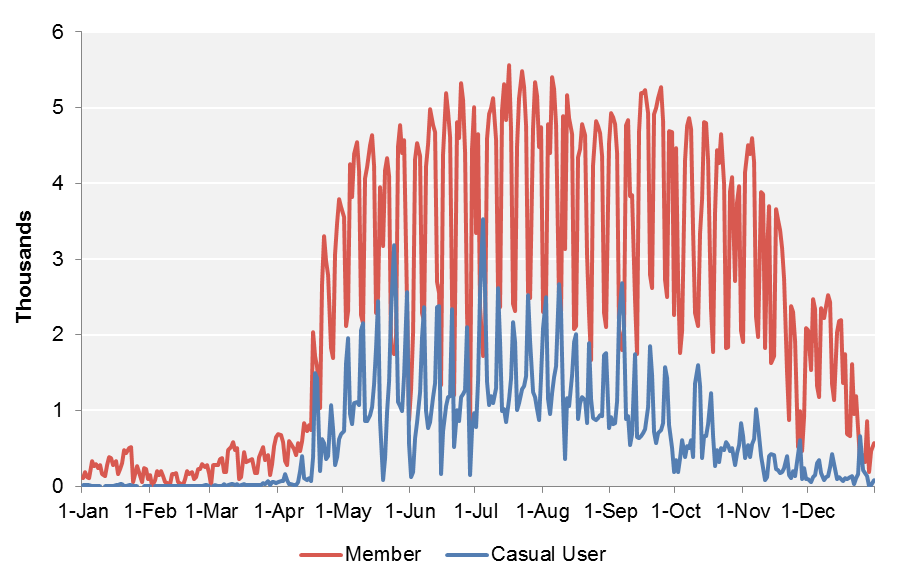
Data source: 2015 Hubway trip logs.
In general, the number of Hubway trips made by casual users per day is lower than the number of trips made by members, except during holidays and holiday weekends, when the number of casual user trips tends to exceed those made by members. This likely reflects that members are not making their typical commuting trips, while casual users are biking more for recreational purposes.
For the subsequent sections of this report, CTPS analyzed only Hubway trips within a “high-activity season,” the period between April 17, 2015 and December 18, 2015. CTPS analyzed this subset of trips to focus on the part of the year when the Hubway system was most widely available and most heavily used and to avoid data outliers that the wintertime trips may introduce, such as longer-than-typical durations because of inclement weather. To create this subset, CTPS removed approximately 45,000 of 1,122,000 trips or four percent of all 2015 trips, from the dataset, and retained approximately 1,077,000 trips for the next stage of analysis. CTPS excluded other subsets of trips to meet the needs of subsequent analyses, as we discuss later in this section and in Section 4. Appendix A includes a diagram that identifies each stage in the analysis when trips were excluded from the 2015 dataset.
Table 3-1 shows the typical daily volume of trips made by members and casual users during the previously defined “high-activity” season (4/17/2015–12/18/2015).
TABLE 3-1
Average Hubway Trips per Day by User Type and Day of Week
(High-Activity Season)
User Type |
Number of |
Number of |
Casual User |
844 |
1,296 |
Member |
3,593 |
2,996 |
Overall Users |
4,438 |
4,292 |
Data source: 2015 Hubway trip logs (4/17/2015–12/18/2015).
Members tend to make more trips per day than casual users on both weekdays and weekend days. Unlike members, casual users tend to make more trips on weekend days than on weekdays.
Figure 3-5 shows the distribution of member- and casual-user trips made during the 2015 high-activity season according to the day of the week and time they were made.
FIGURE 3-5
Hubway Trip Volumes by User Type,
Day of Week, and Time of Day (High-Activity Season)
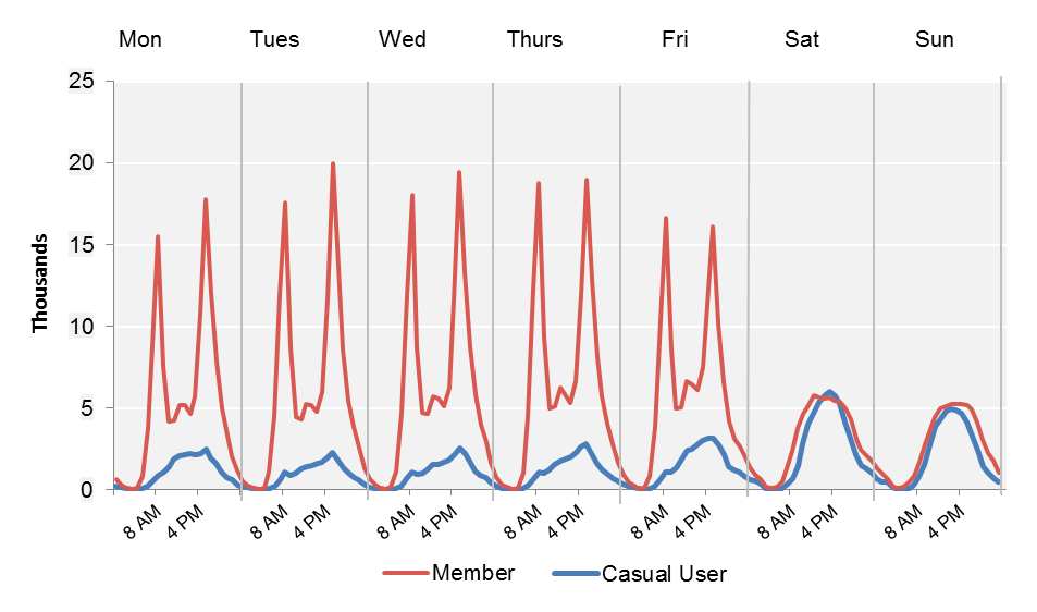
Data source: 2015 Hubway trip logs (4/17/2015–12/18/2015).
During weekdays, member trips exhibit clear peaks in usage: around 8:00 AM and 5:00 PM (commuting periods), while the number of casual-user trips gradually increases during the day to a peak at around 5:00 PM. On weekend days, members and casual users are similar in terms of the number and timing of trips they make, which are distributed gradually throughout the day and peak in the afternoon. These weekday and weekend trip distributions generally reflect usage patterns identified in previous analyses of Hubway trip making29 , and in similar research of bikeshare systems around the country.30
Analyses at the station and origin-destination-pair (O-D pair) level place Hubway trip data in a geospatial context. The 2015 Hubway trip log referenced 156 stations. CTPS combined two stations near the Old State House into one record and two stations near TD Garden into one record because these stations were very close together, and established a set of 154 stations for the purposes of analysis.31 For this report, CTPS assigned aliases to replace the station names assigned by Hubway, which can be long. Hubway station names and their aliases are listed in Appendix B.
Figure 3-6 displays these stations, which have been classified by their total station visits between April 17, 2015 and December 18, 2015. Station visits include trips originating or arriving at a given Hubway station, according to the trip logs. In general, stations with a large volume of visits are close to MBTA transit facilities—particularly along the Orange and Green Line subway lines in the northern part of Boston, and along the northern portion of the Red Line, extending from South Station north into Cambridge and Somerville. High-volume stations also are often near or within college and university campuses, such as Harvard, MIT, and Boston University.
Table 3-2 shows the top-10 Hubway stations by the number of station visits made during the high-activity season. These stations account for 20 percent of station visits. The top-four stations—TD Garden, South Station, MIT at Massachusetts Ave. and Amherst Street, and Harvard Square at Massachusetts Ave. and Dunster Street—account for 10 percent of all station visits, while 37 stations (24 percent of all stations) account for 50 percent of all station visits.
TABLE 3-2
Top-Ten Stations by 2015 Station-Visit Volume (High-Activity Season)
Station Name |
Municipality |
Station Visits in 2015a |
TD Garden |
Boston |
65,070 |
South Station |
Boston |
61,372 |
MIT: Mass Ave |
Cambridge |
53,141 |
Harvard Square: Mass Ave @ Dunster St. |
Cambridge |
42,394 |
Boston Public Library |
Boston |
38,389 |
Central Square |
Cambridge |
37,614 |
Lafayette Square |
Cambridge |
35,395 |
MIT: Stata Center |
Cambridge |
34,545 |
Charles Circle |
Boston |
34,108 |
Back Bay / South End Station |
Boston |
32,110 |
Total Visits |
null |
434,287 |
Average of all 154 Stationsb |
null |
13,987 |
Data sources: 2015 Hubway trip logs (4/17/2015–12/18/2015).
a The number of bicycle docks varies by station. b This average excluded visits made to the Hubway Warehouse at 18 Dorrance Street, Boston (149 visits).
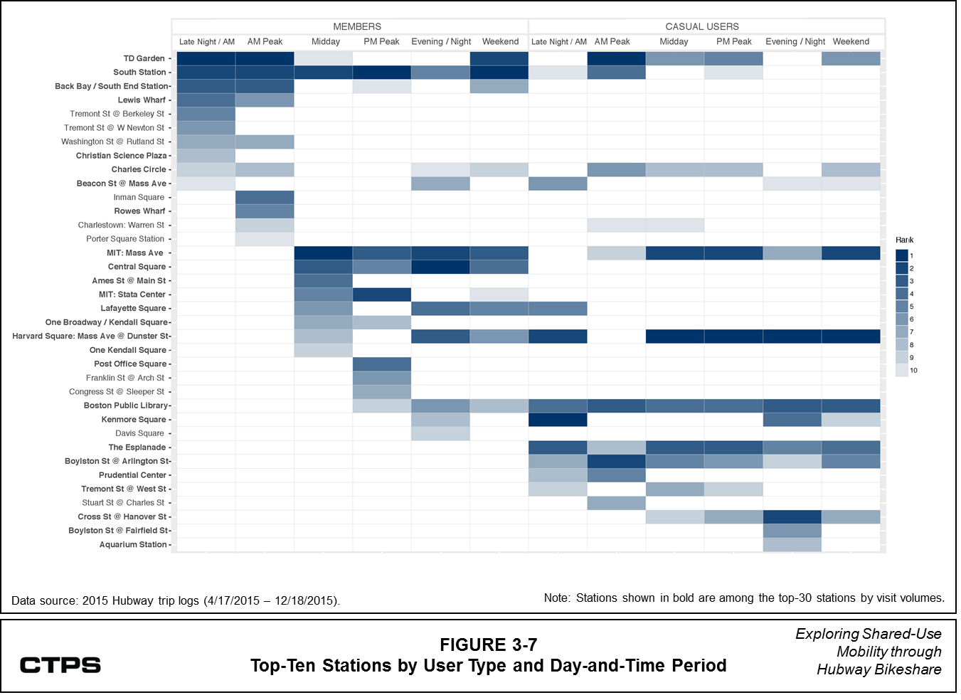
Figure 3-6 ranks stations by visit volumes and according to user type (member or casual user), day of the week (weekday or weekend day), and time of day. The top-10 stations in each category are shown on the chart, which also shows the stations that are prominent across multiple categories.
FIGURE 3-6
Hubway Station Locations and Visit Volumes
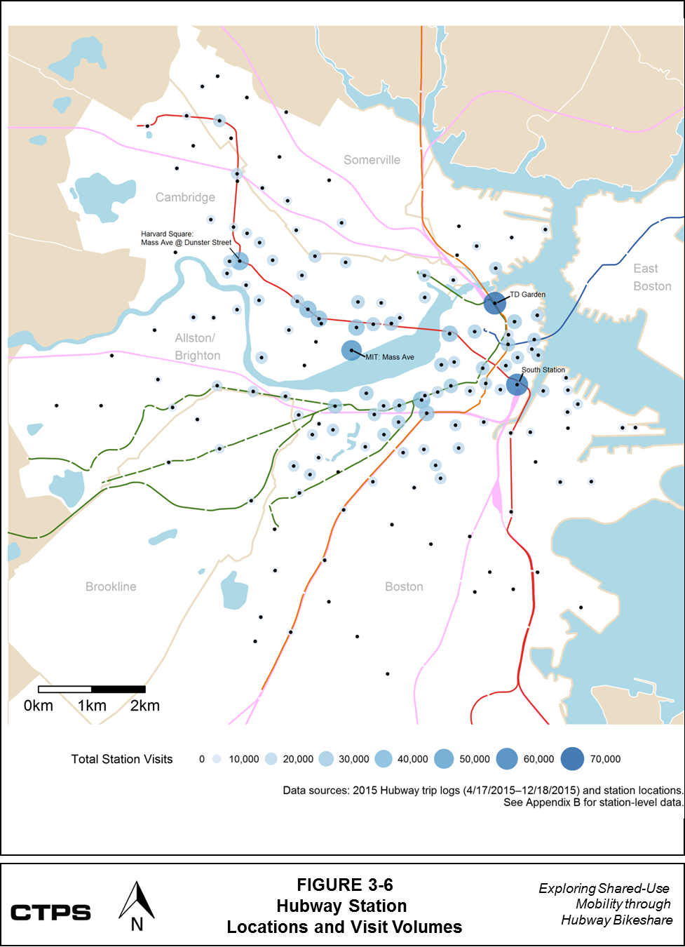
Table 3-3 describes the hours covered by each weekday time period; the weekend category includes all hours on Saturdays and Sundays.
TABLE 3-3
Weekday Time Periods
Time Period |
Relevant Hours |
Late Night / Early Morning |
12:00 AM–6:59 AM |
AM Peak |
7:00 AM–10:00 AM |
Midday |
10:01 AM-3:59 PM |
PM Peak |
4:00 PM–7:00 PM |
Evening / Night |
7:01 PM–11:59 AM |
Source: Central Transportation Planning Staff.
Note: These time periods are based on distribution of Hubway member trips over the course of a weekday.
Twenty-six of the 36 stations in Figure 3-7, below, fall within the top-30 stations, as ranked by overall station visit volumes between April 17 and December 18, 2015; these stations are shown in bold. However, these stations vary somewhat in terms of when they are used and by whom. Several stations rank high across all, or nearly all categories, such as TD Garden, Harvard Square, and MIT: Massachusetts Avenue at Amherst Street. Some stations—such as Boylston Street at A rlington Street, the Boston Public Library (Boylston Street), and the Esplanade—rank high in terms of casual user visits across all day and time categories, but do not rank as high in terms of member visits. Other stations, such as those at Back Bay and Central Square, experience more visits by members, particularly during commuting hours.
FIGURE 3-7
Top Ten Stations by User Type and Day-and-Time Period
CTPS organized the trip data into origin-destination flows to explore where people have used Hubway to make connections. According to the 2015 Hubway trip logs, of the 1,077,000 trips during the high-activity period, 97 percent have different origin and destination stations. Seventy-nine percent of these trips were made by Hubway members, while the remaining 21 percent were made by casual users. These trips have been classified into 17,615 O-D pairs, which account for the direction of the trip.32 Table 3-4 classifies these O-D pairs by their trip volumes during the high-activity season.
TABLE 3-4
O-D Pairs Categorized by Trip Volume
Trip Volume per O-D Pair |
Number of O-D Pairs |
Percent of All O-D Pairs |
Cumulative Percent of All O-D Pairs |
Number of Trips |
Percent of All Trips |
Cumulative Percent of All Trips |
1,000 or more |
36 |
0.2% |
0.2% |
55,537 |
5.3% |
5.3% |
500 to 999 |
201 |
1.1% |
1.3% |
134,708 |
12.9% |
18.2% |
200 to 499 |
1,033 |
5.9% |
7.2% |
306,067 |
29.3% |
47.6% |
100 to 199 |
1,684 |
9.6% |
16.8% |
232,809 |
22.3% |
69.9% |
Less than 100 |
14,661 |
83.2% |
100.0% |
314,166 |
30.1% |
100.0% |
Total |
17,615 |
100.0% |
100.0% |
1,043,287 |
100.0% |
100.0% |
Data source: 2015 Hubway trip logs (4/17/2015–12/18/2015).
O-D = Origin-destination.
Table 3-5 shows that a relatively small share of O-D pairs covers a large share of Hubway trips. For example, 1.5 percent of O-D pairs had 500 or more trips, and these comprised 18.2 percent of trips on the system. Meanwhile, 83.2 percent of O-D pairs had less than 100 trips, but these pairs accounted for only slightly more than 30 percent of trips during the high-activity season.
Figure 3-8 displays the O-D pairs with 500 or more trips or more during the high-activity season.
FIGURE 3-8
Trip Volumes by Hubway O-D Pairs
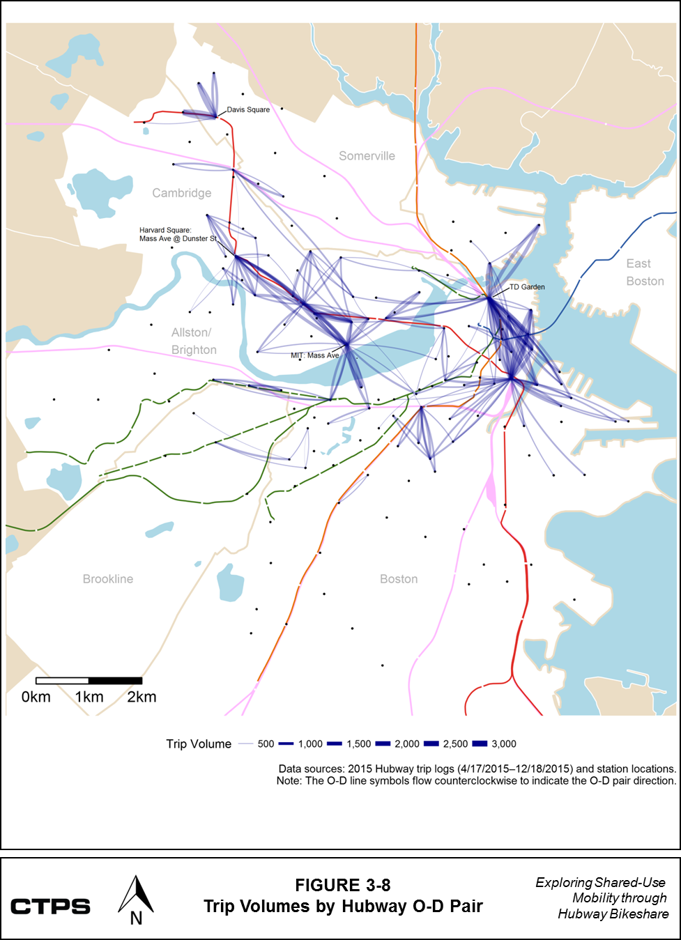
High-volume flows exist between Hubway stations at Teele Square and the northern end of Linear Park and Davis Square, between and within Harvard and MIT, and on the link over the Charles River at the Harvard Bridge. Other high-volume flows exist between North Station (TD Garden) and South Station, between North Station and Congress/Sleeper Streets, between South Station and the Boston Waterfront, and between TD Garden and points in Charlestown. Woodruff identified similar high-volume flows in his analysis of Hubway trips between July 2011 and October 2012.33 These findings also correspond to a Hubway trip flow analysis conducted for the GoBoston 2030 Vision Framework, which highlights high-volume flows between North and South Stations and over the Mass Ave. (Harvard) bridge.34
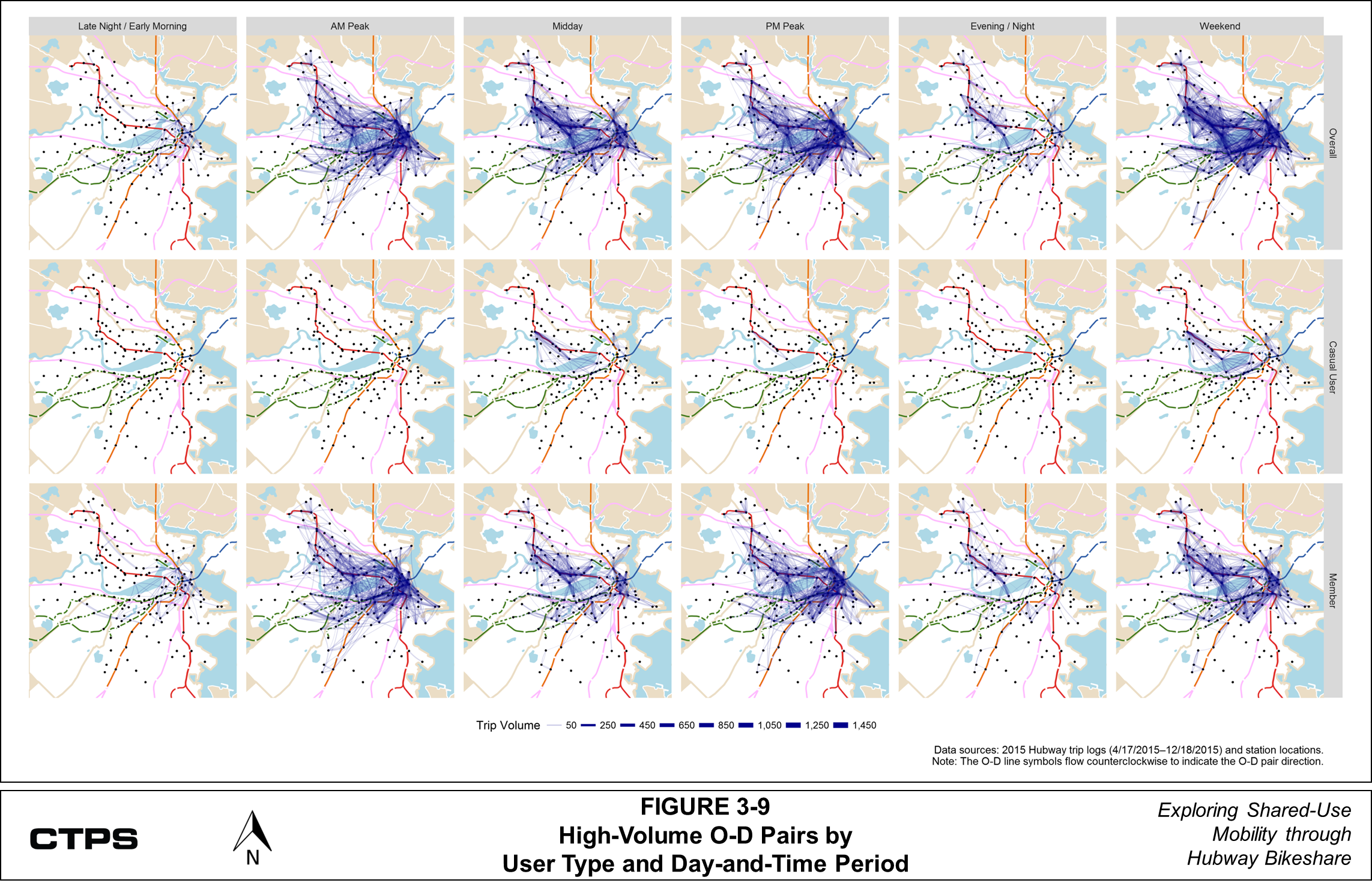
Figure 3-9 shows the geographic distribution of O-D pairs by time period, and by the type of user. The “Weekend” maps show system use for the full day on weekend days.
The variations in trip activity shown in Figure 3-9 correspond to CTPS’s earlier findings on the extent to which members influence overall trip patterns. They also highlight the presence of morning and evening peaks in system use. Casual user activity appears to be the most concentrated in Cambridge on weekdays, though casual user activity in downtown Boston increases on the weekends. Member trips comprise most of the trip activity in northern parts of Cambridge, in Somerville, and in Brookline. Travel near universities—including but not limited to Harvard, MIT, Northeastern, Tufts, and Boston University—comprises a considerable portion of trip activity during the midday and evening/night periods.
FIGURE 3-9
High Volume O-D Pairs by User Type and Day-and-Time Period
The remaining three percent of trips during the high-activity season have a common origin and destination point. Of these, 57 percent were made by casual users and 43 percent were made by members. Table 3-5 shows the top stations in terms of overall trip volumes during the high-activity season.
TABLE 3-5
Stations with High Volumes of “One-Station” Trips
|
Number of Trips (Common O-D) |
The Esplanade |
1,296 |
MIT: Mass Ave |
912 |
Harvard Square: Mass Ave @ Dunster St |
848 |
Old State House |
768 |
Boston Public Library |
684 |
Charles Circle |
665 |
TD Garden |
636 |
Charlestown: Warren St |
634 |
Total Common Origin and Destination Trips |
6,443 |
Data source: 2015 Hubway trip logs (4/17/2015–12/18/2015).
O-D = Origin and destination.
Many of these stations are in areas with recreational and tourist activity, suggesting that many trips made from these locations may be for recreation, rather than strictly for transportation from one point to another. Many of these trips also could be made by people who are not familiar with the area. These eight stations account for nearly 20 percent of all trips with a common origin and destination.
Section 3 provided an overview of the Hubway system, and where, when, and how many riders used it in 2015. This section explores instances when trips on the Hubway system may complement activity on the transit network or when Hubway trips may be competing with adequate transit service. Existing research has examined the ways that Hubway bikeshare service, when integrated with the MBTA system, can reduce travel time and transfers for trips throughout a combined network.35 Chiraphadhanakul modeled optimal travel on all links on the MBTA system, both with Hubway service (as it existed in 2011 and 2012) and without it, and found that the availability of Hubway improved travel time savings and reduced transfers between transit nodes, or connection points, across the combined system.36 His research highlights the overall value of strategically placed one-way links to extend the transit system or close gaps in the network.
This analysis uses trip data to look more closely at where and when large volumes of Hubway trips are being made, and explores the MBTA fixed-route transit alternatives that are available for those high-volume O-D pairs. In some cases, Hubway may complement transit by:
However, in other cases, people may be using Hubway as a substitute for trips that might be as direct and as fast—or faster—on transit, and on links where travel on transit vehicles may be comfortable (relatively uncrowded). In these cases, it might be worth gathering more data to learn why people might use Hubway for these O-D pairs.
To learn more about how transit service may compare to Hubway service for various O-D pairs, CTPS used a trip planning tool to generate alternative transit or walk itineraries for 2015 Hubway bikesharing trips. The goal of this exercise was to model how riders might otherwise have traveled on transit or by foot to complete the trips they made using Hubway, so as to compare travel times and other trip characteristics across modes. Staff used a methodology initially implemented by James Wong to compare bicycling travel time to transit travel time for trips between Capital Bikeshare stations in the Washington DC region.37 Following his approach, CTPS used Open Trip Planner (OTP), an open-source journey-planning tool, to generate transit or walk itineraries for individual Hubway trips from the 2015 trip dataset. 38
Output information for these itineraries included the following:
CTPS used the Hubway trip travel time from the data logs and the alternate transit trip travel time from OTP’s output to calculate a travel-time ratio using the following formula:
Travel Time Ratio = Transit Travel Time (excluding walk access and egress time) / Hubway Travel Time
As mentioned in Section 3.1, the Hubway trip data used in this analysis only included the portion of each Hubway trip from when a rider picked up a bicycle at the origin Hubway station to when she dropped it off at the destination Hubway station. The rider’s true origin (for example, her home), her true destination (for example, her workplace), and the distance she traveled between these locations and Hubway stations are all unknown. The Hubway station coordinates were the only data that CTPS could use to identify the locations associated with a Hubway trip and to model an alternative transit trip. However, using the Hubway stations as trip start-and-end points systematically underestimates the total time of the Hubway trip. Using these stations as start-and-end points for an alternative transit trip also may overestimate or underestimate travel time by transit, depending on the locations of the rider’s true origin and destination. To mitigate this bias, and better compare Hubway trips and their estimated transit alternatives, CTPS excluded walk access and walk egress times from the estimates of transit travel time that were used to calculate trip travel-time ratios. For more information about this adjustment, see Appendix C.
At this stage, CTPS removed several other groups of trips from the 2015 sample before conducting further analysis. (See the diagram in Appendix A for impacts on the overall trip sample.) These trips include the following:
CTPS used the scheme described in Table 4-1 to classify the travel time ratios that were calculated using the formula cited in Section 4.2.
TABLE 4-1
Travel-Time-Ratio Categories
Category |
Travel-Time-Ratio Range |
Transit Faster than Hubway |
0 < x < 0.9 |
Transit Comparable to Hubway |
|
Transit Slower than Hubway |
1.1 < x ≤ 2 |
Transit Much Slower than Hubway |
x > 2 |
Source: Central Transportation Planning Staff.
Figure 4-1 summarizes how the transit alternatives for approximately 814,200 Hubway member trips were distributed across the travel-time-ratio categories listed in Table 4-1.
FIGURE 4-1
Alternatives to Hubway Trips by Travel-Time-Ratio Category
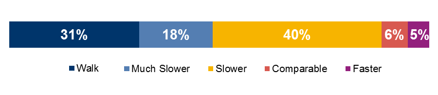
Data source: 2015 Hubway trip logs and Open Trip Planner output, 4/17/2015–12/18/2015 (trip sample = 814,225).
Note: The Walk category includes some trips without itineraries.
In only 11 percent of cases would Hubway trips have been faster or comparable via transit. A larger share of trips (18 percent) would have taken more than twice as long by transit.
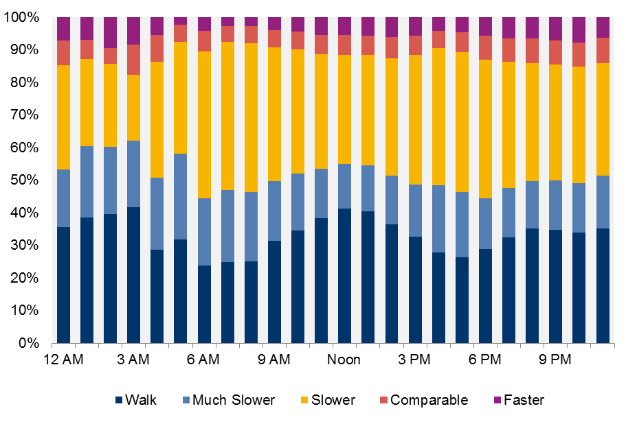
Figure 4-2 summarizes the modes included in the alternative transit itineraries for these Hubway trips, which were recommended by OTP to minimize travel time. Figure 4-3 provides similar information but excludes trips with walk-only itineraries.
FIGURE 4-2
Alternatives to Hubway Trips by Mode
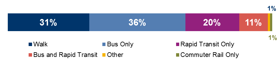
Data source: 2015 Hubway trip logs and Open Trip Planner output, 4/17/2015–12/18/2015 (trip sample = 814,225).
Notes: 1) The “Rapid Transit Only” and “Bus Only” categories include trips with transit itineraries that would have involved transfers between rapid transit lines or bus routes, respectively. 2) The Walk category includes some trips without itineraries.
FIGURE 4-3
Transit Alternatives to Hubway Trips by Mode (Walk Trips Excluded)
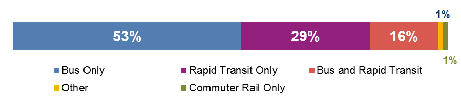
Data source: 2015 Hubway trip logs and Open Trip Planner output, 4/17/2015–12/18/2015 (trip sample (excluding walk trips) = 562,831).
Note: The “Rapid Transit Only” and “Bus Only” categories include trips with transit itineraries that would have involved transfers between rapid transit lines or bus routes, respectively.
Figure 4-2 shows that OTP recommended a bus trip alternative for 36 percent of member Hubway trips. For 11 percent of trips, OTP recommended a transit alternative that included both bus and rapid transit; this was the largest group of trips that would have involved multiple transit modes. Figures 4-1 and 4-2 both show that walk-only alternatives were suggested for 31 percent of Hubway trips.43 Figure 4-3 shows that slightly more than half of trips for which OTP recommended a transit alternative only involved bus service.
The next series of graphs show how shares of Hubway member trips vary throughout the day with respect to travel-time-ratio categories and OTP-recommended alternative modes. Figure 4-4 provides some context by showing the distribution of Hubway member trips over the course of a weekday.
FIGURE 4-4
Hubway Member Trips by Weekday Hour
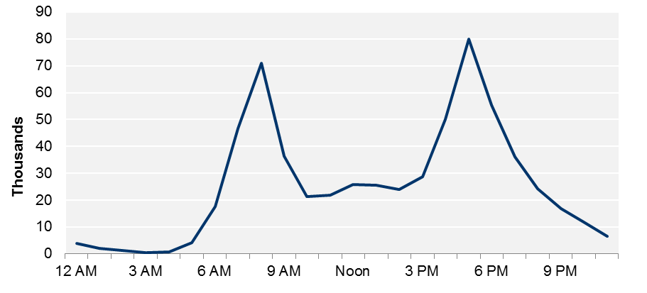
Data source: 2015 Hubway trip logs and Open Trip Planner output, 4/17/2015–12/18/2015 (trip sample (weekday trips) = 612,917).
Figure 4-5 shows how member trips that took place during each weekday hour fall into the various travel-time-ratio categories.
FIGURE 4-5
Transit Alternatives to Hubway Trips
by Travel-Time Ratio Category and Weekday Hour
Data source: 2015 Hubway trip logs and Open Trip Planner output, 4/17/2015–12/18/2015 (trip sample (weekday trips) = 612,917).
Figure 4-5 shows that even though the level of trip activity varies over the course of the day, the share of trips that would be faster or comparable in travel time by transit stays relatively consistent, though this share is largest in the late night or early morning hours. Meanwhile, the share of Hubway trips for which OTP recommended a walk alternative decreases during the morning and afternoon peak periods. This may be because transit service is operating at higher frequencies, and may be a more readily available alternative for certain trips.
Figure 4-6 shows the share of trips by recommended alternate mode, by weekday hour.
FIGURE 4-6
Hubway Trips by Alternative
Recommended Modes by Weekday Hour
Data source: 2015 Hubway trip logs and Open Trip Planner output, 4/17/2015–12/18/2015, (trip sample (weekday trips) = 612,917).
Note: The “Rapid Transit Only” and “Bus Only” categories include trips with transit itineraries that would have involved transfers between rapid transit lines or bus routes, respectively.
The share of trips for which OTP recommended a “bus-only” alternative fluctuates more dramatically over the course of the day than shares of trips with “rapid transit-only” or “bus and rapid transit” alternatives. This may be because bus service frequencies change more dramatically than do rapid transit service frequencies.
Figure 4-7 shows how trips for which OTP recommended a bus-only, rapid-transit-only, or bus-and-rapid-transit alternative fell into the various travel-time-ratio categories.
FIGURE 4-7
Hubway Trips by Alternative Recommended
Modes and Travel-Time-Ratio Category
Data source: 2015 Hubway trip logs and Open Trip Planner output, 4/17/2015–12/18/2015.
Notes: 1) Data reflect both weekdays and weekends. All trips = 814,225 trips. 2) Walk trips (31 percent of trips) or trips involving other modes or combinations of modes (two percent of trips) are not shown. 3) The “Rapid Transit Only” and “Bus Only” categories include trips with transit itineraries that would have involved transfers between rapid transit lines or bus routes, respectively.
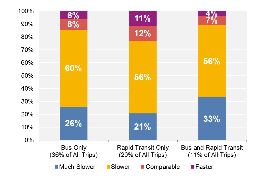
Of trips that had a “rapid-transit-only” alternative, 11 percent would have been faster and 12 percent would have been comparable in travel time if made by transit. These percentages are higher than in the “bus only” or “bus-and-rapid transit” categories.
Alternative transit itineraries from OTP included the number of transfers between transit vehicles. Of the trips with transit itineraries, which make up 69 percent of all trips discussed in this section, 69 percent did not include any transfers, and another 30 percent involved one transfer. Figure 4-8 shows the number of trips in each travel-time-ratio category that have zero, one, or more than one transfers.
FIGURE 4-8
Hubway Trips by Number of Transfers
and Travel-Time-Ratio Category
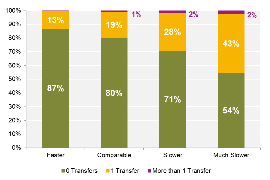
Data source: 2015 Hubway trip logs and Open Trip Planner output, 4/17/2015–12/18/2015 (trip sample = 562,831 trips with transit itineraries).
Note: Values are rounded to the nearest whole percent; not all columns sum to 100 percent.
The itineraries for Hubway trips that would have been faster or comparable in travel time by transit almost always involved zero transfers or one transfer.
Figure 4-9 shows Hubway trips with transit itineraries by their mode and number of transfers. Figure 4-10 incorporates information about how the alternate transit itineraries for these trips fell into the various travel-time-ratio categories.
FIGURE 4-9
Trips with Transit Itineraries by Mode and Number of Transfers
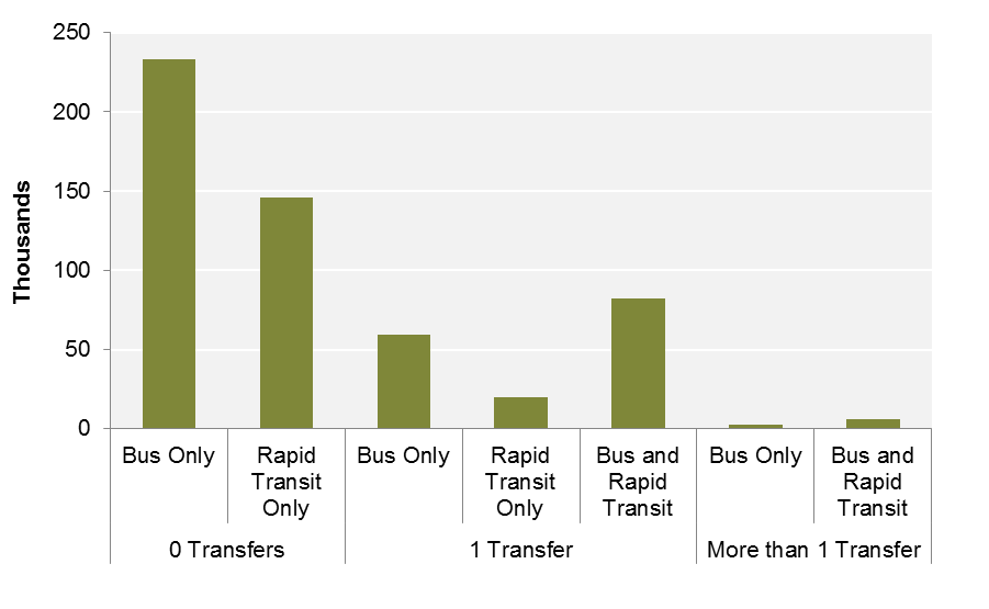
Data source: 2015 Hubway trip logs and Open Trip Planner output, 4/17/2015–12/18/2015 (trip sample = 549,811 trips (of 562,831 trips with transit itineraries).
Note: Trips in other modal categories (two percent of trips with transit itineraries) are not shown.
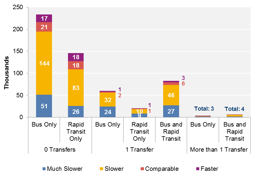
Data source: 2015 Hubway trip logs and Open Trip Planner output, 4/17/2015–12/18/2015 (trip sample = 549,811 trips (of 562,831 trips with transit itineraries).
Notes: 1) Trips in other modal categories (two percent of trips with transit itineraries) are not shown. 2) Total trips in each category have been rounded to the nearest thousand.
There is a slightly larger share of Hubway trips with bus-and-rapid-transit alternative itineraries involving one transfer that are faster or comparable by transit (11 percent) than Hubway trips with “bus only” or “rapid transit only” itineraries involving one transfer (6 percent and 7 percent). For these trips, transit may be more competitive in terms of travel time because the alternative itineraries effectively combine the frequency and speed of rapid transit with the geographic coverage of the bus system.
Sections 4.4 through 4.8 discuss Hubway trips that have been clustered into O-D pairs. O-D pairs can be categorized and analyzed using the metrics that CTPS used to analyze individual Hubway trips in section 4.3. The significant difference is that an O-D pair is essentially a bundle of Hubway trips taking place between a unique set of points. Hubway trips within each O-D bundle were taken at various times of day or on different days of the week, and OTP may have recommended different transit alternatives depending on when the trip took place. As a result, the alternate itineraries for these trips may fall into a range of travel-time-ratio categories, or involve a variety of modes. However, by examining trips according to their origin and destination, it is possible to see patterns in a geospatial context.
As described in Section 4.2, CTPS used OTP to generate alternative transit itineraries for approximately 1,043,000 Hubway trips.44 Approximately 814,000 of these trips were made by Hubway members. These member trips can be classified into 16,696 O-D pairs. CTPS analyzed O-D pairs that included 200 or more trips to ensure sufficient samples for analysis, and 873 O-D pairs met this criterion.
CTPS focused specifically on O-D pairs with large shares of Hubway trips that 1) would have been faster or comparable in travel time by transit; 2) would have been much slower by transit; or 3) would have had walk-only itineraries. Tables 4-2, 4-3, and 4-4 categorize the 873 O-D pairs with respect to the shares of their alternative itineraries that fall into these categories.
Table 4-2 shows that for 90 percent of the analyzed O-D pairs, less than 25 percent of trips would have been faster or comparable in travel time by transit. These results correspond to those in Figure 4-1, which shows that of all Hubway trips—and not just O-D pairs—only 11 percent would have been faster or comparable in travel time by transit.
TABLE 4-2
O-D Pairs by Percentage of Trips that
Would Have Been Faster or Comparable by Transit
Share of Faster |
Number of O-D Pairs |
Percent of O-D Pairs |
100% |
0 |
0% |
75% to 99% |
13 |
1% |
50% to 74% |
28 |
3% |
25% to 49% |
55 |
6% |
1% to 24% |
442 |
51% |
0% |
335 |
38% |
Total O-D Pairs |
873 |
100% |
Data source: 2015 Hubway trip logs and Open Trip Planner output, 4/17/2015–12/18/2015.
Note: Table shows data for 873 pairs, each of which includes 200 or more trips.
Table 4-3 shows that for 77 percent of O-D pairs, less than 25 percent of trips would have been much slower—more than twice as long—by transit. Only 12 percent of O-D pairs had more than 50 percent of trips that would have been much slower by transit than they would have been by Hubway.
TABLE 4-3
O-D Pairs by Percentage of Trips that
Would Have Been Much Slower by Transit
Share of Much Slower Trips |
Number of O-D Pairs |
Percent of O-D Pairs |
100% |
1 |
0% |
75% to 99% |
40 |
5% |
50% to 74% |
57 |
7% |
25% to 49% |
101 |
12% |
1% to 24% |
313 |
36% |
0% |
361 |
41% |
Total O-D Pairs |
873 |
100% |
Data source: 2015 Hubway trip logs and Open Trip Planner output, 4/17/2015–12/18/2015.
Note: Table shows data for 873 pairs, each of which includes 200 or more trips.
Table 4-4 shows that most O-D pairs either 1) only included trips that would have had walk-only itineraries; or 2) did not include any trips that would have had walk-only itineraries. In 30 percent of O-D pairs, all Hubway trips would have had walk-only itineraries. Only one-third of O-D pairs include a mix of trips that would have had walk-only itineraries and those that would have had transit itineraries.
TABLE 4-4
O-D Pairs by Percentage of Trips that
Would Have Had Walk-Only Itineraries
Share of Walk Only Trips |
Number of O-D Pairs |
Percent of |
100% |
263 |
30% |
75% to 99% |
88 |
10% |
50% to 74% |
48 |
5% |
25% to 49% |
54 |
6% |
1% to 24% |
93 |
11% |
0% |
327 |
37% |
Total O-D Pairs |
873 |
100% |
Data source: 2015 Hubway trip logs and Open Trip Planner output, 4/17/2015–12/18/2015.
Note Table shows data for 873 pairs, each of which includes 200 or more trips.
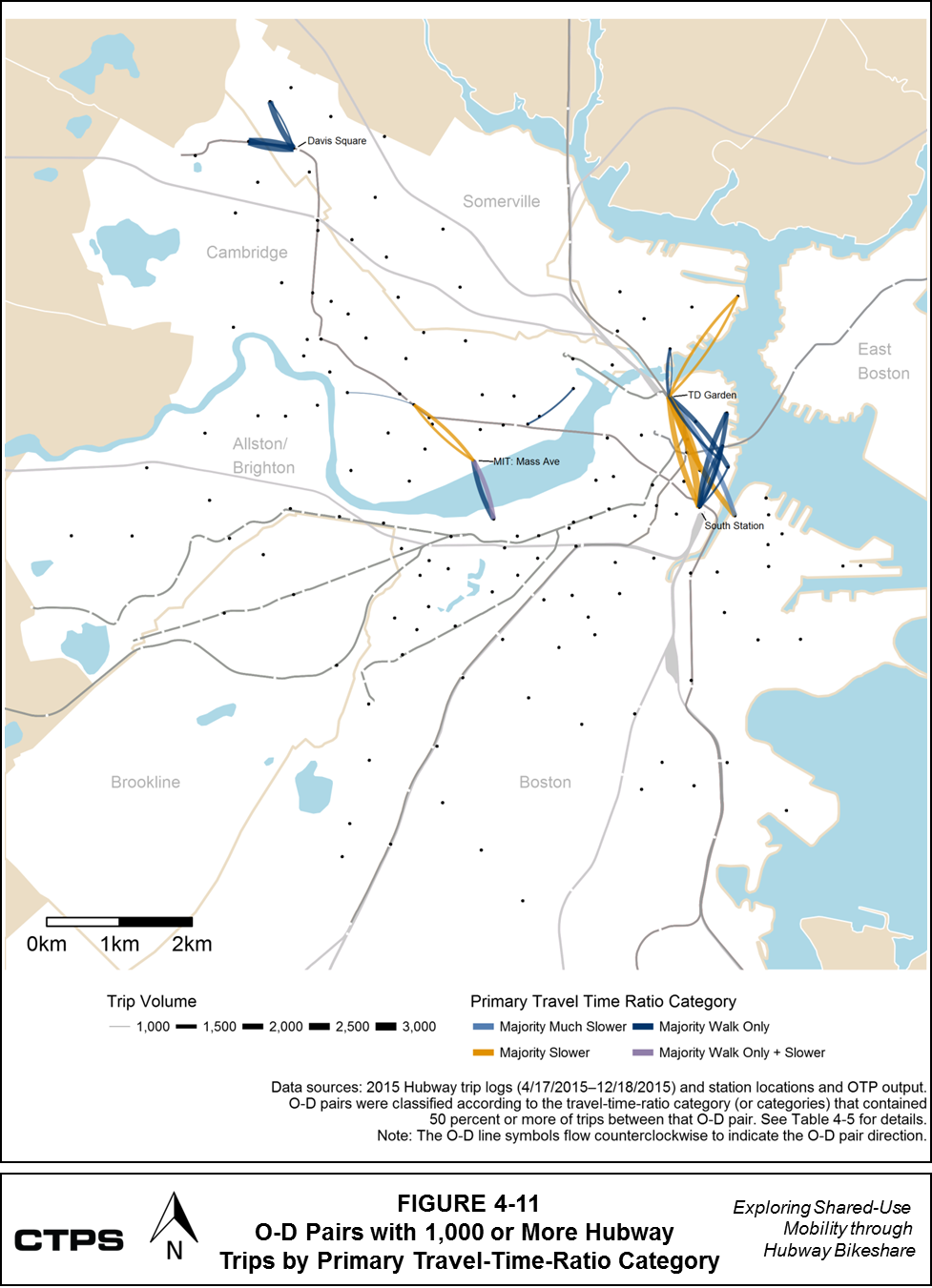
Table 4-5 displays details for O-D pairs that include more than 1,000 member trips. These pairs comprise approximately five percent of all trips in the analysis sample (approximately 814,000 member trips in total). Many of these O-D pairs have very large shares of trips that would have had walk-only itineraries or much slower transit itineraries, although a few O-D pairs include trips from a variety of categories. Figure 4-11 shows these pairs on a map of the Hubway service area.
TABLE 4-5
High Volume O-D Pairs with Trips Classified by Travel-Time-Ratio Category
|
|
|
Percent of Total Trips |
|||||
O-D Pair: |
O-D Pair: Station Names |
Total Number of Trips |
Faster by Transit |
Comparable by Transit |
Slower by Transit |
Much Slower by Transit |
Walk- |
Grand Total |
M32025 to S32006 |
Linear Park: Mass Ave @ Cameron Ave to Davis Square |
2,800 |
0% |
0% |
0% |
0% |
100% |
100% |
S32006 to M32025 |
Davis Square to Linear Park: Mass Ave @ Cameron Ave |
2,542 |
0% |
0% |
0% |
0% |
100% |
100% |
A32010 to D32022 |
South Station to TD Garden |
2,445 |
2% |
2% |
64% |
32% |
0% |
100% |
S32011 to S32006 |
Teele Square to Davis Square |
1,962 |
1% |
1% |
1% |
0% |
96% |
100% |
D32022 to A32010 |
TD Garden to South Station |
1,876 |
4% |
10% |
73% |
14% |
0% |
100% |
D32022 to C32010 |
TD Garden to Congress St @ Sleeper St |
1,826 |
1% |
1% |
68% |
30% |
0% |
100% |
D32006 to A32010 |
Lewis Wharf to South Station |
1,792 |
4% |
5% |
21% |
5% |
65% |
100% |
M32006 to B32016 |
MIT: Mass Ave to Beacon St @ Mass Ave |
1,758 |
3% |
4% |
33% |
6% |
53% |
100% |
C32010 to D32022 |
Congress St @ Sleeper St to TD Garden |
1,689 |
0% |
1% |
23% |
76% |
0% |
100% |
D32008 to D32022 |
Rowes Wharf to TD Garden |
1,656 |
0% |
0% |
4% |
3% |
93% |
100% |
B32016 to M32006 |
Beacon St @ Mass Ave to MIT: Mass Ave |
1,597 |
4% |
10% |
38% |
2% |
46% |
100% |
A32010 to D32006 |
South Station to Lewis Wharf |
1,580 |
0% |
2% |
28% |
4% |
65% |
100% |
D32012 to D32022 |
Post Office Square to TD Garden |
1,545 |
1% |
2% |
53% |
26% |
18% |
100% |
B32004 to A32010 |
Aquarium Station to South Station |
1,340 |
0% |
0% |
4% |
0% |
96% |
100% |
M32006 to M32011 |
MIT: Mass Ave to Central Square |
1,315 |
2% |
4% |
57% |
15% |
23% |
100% |
A32010 to B32004 |
South Station to Aquarium Station |
1,266 |
0% |
0% |
5% |
0% |
95% |
100% |
D32021 to D32022 |
Charlestown: Warren St to TD Garden |
1,246 |
0% |
0% |
0% |
0% |
100% |
100% |
D32023 to D32022 |
Spaulding Hospital: Charlestown Navy Yard to TD Garden |
1,221 |
2% |
3% |
67% |
23% |
5% |
100% |
D32022 to A32013 |
TD Garden to John F Fitzgerald - Surface Rd |
1,210 |
0% |
0% |
0% |
0% |
100% |
100% |
M32011 to M32006 |
Central Square to MIT: Mass Ave |
1,175 |
8% |
17% |
64% |
1% |
10% |
100% |
D32022 to D32023 |
TD Garden to Spaulding Hospital: Charlestown Navy Yard |
1,175 |
7% |
8% |
54% |
25% |
6% |
100% |
A32010 to D32008 |
South Station to Rowes Wharf |
1,109 |
0% |
0% |
0% |
0% |
100% |
100% |
M32003 to M32019 |
One Broadway / Kendall Square to CambridgeSide Galleria |
1,079 |
0% |
0% |
0% |
0% |
100% |
100% |
S32006 to S32011 |
Davis Square to Teele Square |
1,052 |
0% |
1% |
5% |
0% |
94% |
100% |
D32022 to D32021 |
TD Garden to Charlestown: Warren St |
1,017 |
0% |
0% |
0% |
0% |
100% |
100% |
M32011 to M32014 |
Central Square to Harvard Housing: Putnam Ave |
1,003 |
0% |
0% |
2% |
1% |
97% |
100% |
Data source: 2015 Hubway Trip Logs and OTP output, 4/17/2015–12/18/2015.
O-D = Origin-Destination. OTP = Open Trip Planner.
Note: Hubway trips within each O-D bundle were taken at various times of day or on different days of the week, and OTP may have recommended different transit alternatives depending on when the trip took place. As a result, the alternate itineraries for these trips may fall into a range of travel-time-ratio categories, or involve a variety of modes.
FIGURE 4-11
O-D Pairs with 1,000 or More Hubway Trips by Primary Travel-Time-Ratio Category
To understand how Hubway O-D pairs may complement or compete with transit service, CTPS began by examining how the alternate transit itineraries for the trips in each O-D pair were distributed across the travel-time-ratio categories.
Section 4.6 describes CTPS’s analysis of these O-D pairs.
CTPS first examined Hubway trips and O-D pairs using the day-and-time periods shown in Table 4-6.
TABLE 4-6
Day-and-Time Periods
Time Period |
Relevant Hours |
Weekday - Late Night / Early Morning |
12:00 AM–6:59 AM |
Weekday AM Peak |
7:00 AM–10:00 AM |
Weekday - Midday |
10:01 AM–3:59 PM |
Weekday - PM Peak |
4:00 PM–7:00 PM |
Weekday - Evening / Night |
7:01 PM–11:59 AM |
Weekend |
All day |
Source: Central Transportation Planning Staff.
For each day-and-time period, CTPS selected a subset of pairs that met the following two criteria:
Trips between these O-D pairs may compete with transit during off-peak periods. They may also compete with transit during peak periods unless there is evidence of uncomfortable conditions or a need to make transfers on the transit modes that might otherwise serve the trip.
As discussed in Sections 4.2 and 4.3, the OTP output data provides information on the modes and transfers included in each transit itinerary. Using this information, CTPS reviewed the O-D pairs that met the trip volume and travel-time-ratio criteria during the different day-and-time periods and identified the combinations of transit modes and transfers that would have provided alternatives to Hubway trips for each O-D pair. CTPS documented the transit mode and transfer combinations that accounted for the majority of Hubway trips that would have been faster or comparable in travel time by transit. For more information about the results for these O-D pairs, see tables E-1 to E-4 in Appendix E.
CTPS considered Hubway activity on prominent O-D pairs during off-peak periods to be competing with transit. In general, the transit alternatives for these trips did not involve any transfers (for more information, see tables E-3 and E-4 in Appendix E). For O-D pairs that were prominent during the AM and PM peak periods, CTPS followed several additional steps:
Figure 4-12 shows the results of this four-step analysis for Hubway trips that took place in the AM and PM peak periods. The O-D pairs shown in Figure 4-12 are classified by the transit mode that served the majority of trips that would be faster or comparable in travel time by transit. Tables E-1 and E-2 in Appendix E contain more detailed information for the OD pairs in these time periods.
FIGURE 4-12
O-D Pairs that may Complement or Compete with Transit (AM and PM Peak Period)
.png)
Many of the transit alternatives for the O-D pairs in the weekday AM peak period involve rapid transit, while a wider variety of transit modes could serve the pairs in the weekday PM peak period. When these two periods are compared, it is possible to see how the flow of travel changes over the course of the day. Three pairs that flow away from TD Garden during the AM peak period flow toward TD Garden during the PM peak period.
Most O-D pairs in both periods could be complements to transit, because some evidence suggests that transit travel on these segments could be uncomfortable during peak periods. Transit alternatives for these O-D pairs did not involve transfers. In both periods, many alternative transit trips would have relied upon the Green Line subway and the portion of the Orange Line between Back Bay and North Station. Commuter rail would have supported transit trips between several O-D pairs that may compete with transit; there is no evidence of uncomfortable conditions for these commuter rail segments. However, commuter rail is not necessarily designed to help people make these short-distance connections in urban cores. In particular, commuter rail service is less frequent than other modes, such as rapid transit; as a result, riders need to be aware of schedules, and their trips would need to coincide with these schedules. People might also avoid commuter rail for this O-D pair because they might assume that it is more expensive and less convenient to travel by commuter rail, even if the trip would be quick and presumably comfortable.
Figure 4-13 shows O-D pairs that met the trip volume and travel-time-ratio criteria during the weekday off-peak periods and the weekend period. Tables E-3 and E-4 in Appendix E contain more detailed information for the OD pairs in these time periods, including the shares of faster or comparable trips that could be served by different transit modes. The O-D pairs shown in Figure 4-13 are classified by the transit mode that served the majority of these trips. CTPS did not investigate whether conditions would be uncomfortable on relevant transit modes during these off-peak periods; these O-D pairs could be considered potential competitors to transit until more detailed transit itinerary and passenger demand information is analyzed. The maps in Figure 4-13 provide information about the transit mode combinations that would otherwise serve these O-D pairs. Figure 4-13 shows that Hubway O-D pairs near Harvard, MIT, Tufts, and Boston University are prominent during the weekday midday and evening periods and during the weekend. During the early-morning and midday periods, several O-D pairs that have many trips with transit alternatives that would be faster or comparable in travel time to Hubway would be served by rapid transit. In the evening and on the weekend, more of these O-D pairs would be served by buses.
FIGURE 4-13
O-D Pairs that may Compete with Transit (Weekday Off-Peak and Weekend Periods)
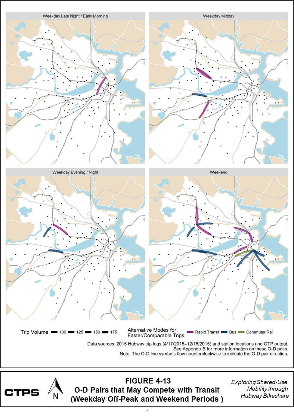
As shown in Table 4-1, Hubway trips that would have been much slower by transit are those for which OTP recommended an alternative transit itinerary with a travel time that was more than twice as long as the Hubway travel time. Given this difference in travel time, O-D pairs that include a large share of these trips may complement transit because it might be difficult for the MBTA to provide a quick or direct transit option for this link. This is particularly the case if Hubway riders also have MBTA monthly passes, which would mean that the MBTA would receive the same revenues even if these people were using Hubway to make these trips. However, if the MBTA can apply a relatively low-cost fix to improve transit service that would otherwise serve these links, Hubway could eventually compete with transit. In either case, it is important to understand where O-D pairs with large volumes of “much slower” trips are located, so that the MBTA can choose whether to improve transit service in these locations.
To identify relevant O-D pairs for analysis, CTPS examined each day-and-time period listed in Table 4-3 and selected a subset of O-D pairs that met the following two criteria:
Figures 4-14 and 4-15 show these O-D pairs by time of day. These individual O-D pairs have been classified by the transit mode that would have served 50 percent or more of trips that would have been much slower by transit. Tables F-1 to F-5 in Appendix F describe these O-D pairs. These tables show that for each O-D pair, one transit mode-and-transfer combination tends to account for most trips that would have been slower or much slower by transit. For example, the alternative option for 85 percent of “much slower” trips between Inman Square and the MIT Stata Center during the AM peak period would be a bus trip with no transfers. However, although one option tends to dominate, the transit options for “much slower” trips on many O-D pairs are spread across multiple mode-and-transfer categories.
Figure 4-14 shows that during the weekday AM peak period, many O-D pairs meet the trip volume and travel-time-ratio criteria, though no pair stands out in terms of trip volume. In the PM peak period, there are fewer O-D pairs that meet these criteria, but the qualifying O-D pairs vary more by volume. The highest volume O-D pairs generally connect TD Garden (North Station) to points in Cambridge or South Boston. During the PM peak period, several O-D pairs represent trips flowing in the opposite direction of O-D pairs during the AM peak period, although different combinations of transit modes might have served these trips during the PM peak period.
Figures 4-14 and 4-15 both show that OTP recommended bus options for many O-D pairs that would have been much slower by transit. Tables F-1 to F-5 in Appendix F show that transit itineraries for these OD pairs involve more transfers and multi-modal combinations than do the itineraries for O-D pairs with 50 percent or more trips that would be faster or comparable by transit.
FIGURE 4-14
O-D Pairs with 75 Percent or More Trips Much Slower by Transit (Weekday AM and PM Peak Periods)
FIGURE 4-15
O-D Pairs with 75 Percent or More Trips Much Slower by Transit (Weekday Off- Peak and Weekend Periods)
For some connections, Hubway may complement the existing transit system by providing a way for people to make trips on links where transit service is limited, complicated, nonexistent, or otherwise not a sensible alternative (especially if the distance between the origin and destination is relatively short). CTPS used OTP outputs that recommended a walk-only alternative (as opposed to a transit alternative) for many trips between a particular O-D pair as a way to identify these cases. As part of this analysis, CTPS examined O-D pairs during each day-and-time period listed in Table 4-3 and identified a subset of O-D pairs that met the following two criteria:
CTPS also classified Hubway stations according to the transit modes available near each station, using a geographic information systems (GIS) analysis of the bus stops and modes available at transit stations within 200 meters (approximately one-eighth mile) of each Hubway station. Figure 4-16 classifies Hubway stations by the transit modes that are nearby. Appendix B also lists the transit modes that are near each Hubway station.
Figure 4-17 shows the high-volume O-D pairs with 95 percent or more walk-only trips during the weekday AM and PM peak periods and Figure 4-18 shows these pairs for the weekday off-peak and weekend periods. Tables G-1 to G-6 in Appendix G list the prominent O-D pairs during each time period.
As Figures 4-17 and 4-18 show, many of these O-D pairs exist along the Rose Kennedy Greenway in Boston, near MIT and Harvard, and near stations further north on the Red Line, including Porter and Davis Squares.
FIGURE 4-16
Hubway Stations by Transit Modes Available within 200 Meters
FIGURE 4-17
O-D Pairs with 95 Percent or More Walk-Only Trips (Weekday AM and PM Peak Periods)
FIGURE 4-18
O-D Pairs with 95 Percent or More Walk-Only Trips(Weekday Off-Peak and Weekend Periods)
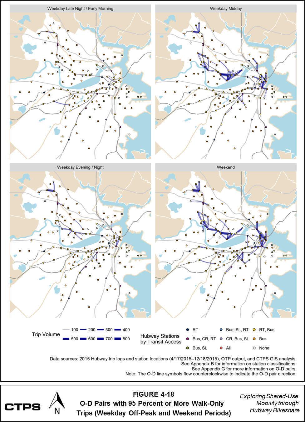
CTPS analyzed which O-D pairs with large shares of walk-only trips might complement transit by helping riders connect to stations, specifically those serving rapid transit. As shown in Figure 2-21, more than half of Hubway member survey respondents reported making at least one trip that ended near a rapid transit station during a typical week. To identify this subset of O-D pairs, CTPS examined the transit modes that were near the origin and destination stations of each O-D pair. Figures 4-19 and 4-20 take the O-D pairs shown in Figures 4-17 and 4-18 and classify them by whether they include zero, one, or two trip ends at a rapid transit station.
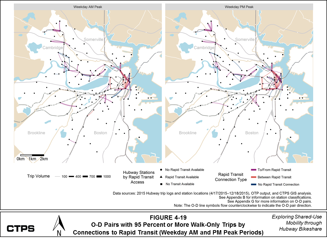
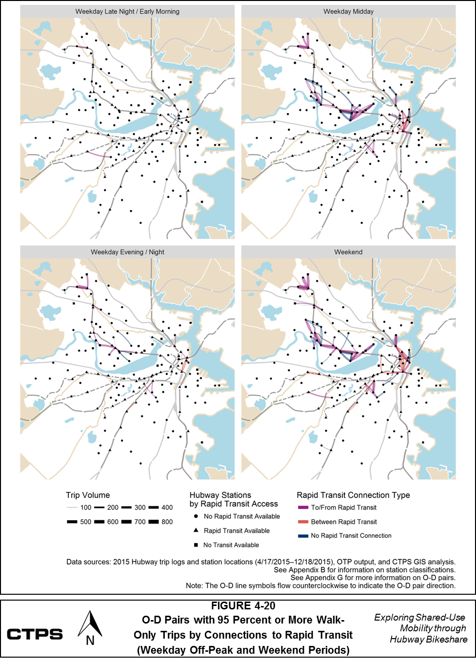
Figure 4-21 shows the number of O-D pairs in each day-or-time period that have zero, one, or both ends near a rapid transit station. High-volume O-D pairs that 1) are almost exclusively made up of walk alternative trips, and 2) have one trip end at a rapid transit station may support first-or-last-mile connections to rapid transit. Trips between O-D pairs with no ends near rapid transit may close gaps in the transportation network by providing service where transit service does not exist and/or where it may not make sense to provide fixed-route transit service. More analysis of trips between origins and destinations that each are near rapid transit would be needed to determine whether these trips might complement or compete with transit. If the origin and destination Hubway stations each are near different rapid transit lines, Hubway trips between these points could help travelers avoid transit trips with transfers.
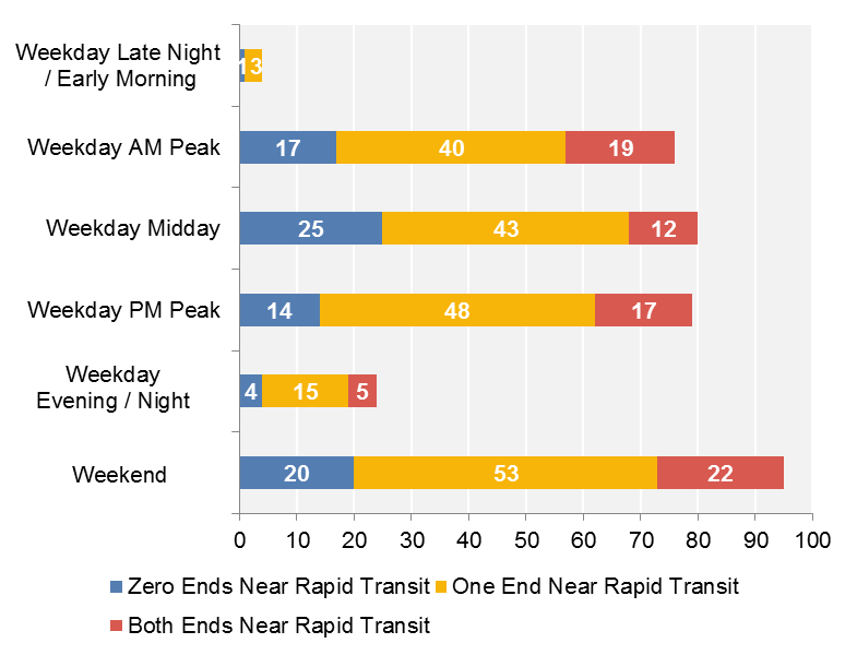
Data sources: 2015 Hubway trip logs (4/17/2015–12/18/2015), OTP output, CTPS GIS analysis.
Note: O-D pairs may appear in multiple day/time periods.
It is important to note that OTP’s algorithm determined whether to recommend a walk or transit alternative for a particular O-D pair using MBTA GTFS files that had been incorporated into the OTP implementation. This implementation does not include data for other transit services that may be operating in the Hubway service area—including Transportation Management Area, university, or other shuttles. If available data from these other services had been incorporated into OTP, it is possible that some of these O-D pairs would have had lower shares of walk alternative trips. That said, the fact that people are using Hubway to make these connections raises questions about whether people are aware of these other transit services or perceive them as being a preferable alternative to Hubway.
Section 3 describes when and where Hubway riders are making their trips, in terms of visits to stations or between O-D pairs. This information creates a context for the analysis in Section 4, which examines potential synergies and areas of competition between the Hubway system and the MBTA fixed-route transit system. CTPS used the ratio of Hubway travel time to the travel time from OTP’s alternative itinerary for each trip as a basis for comparing the two modes in different circumstances.
Some of these synergies and potential areas of competition between Hubway and transit appear at the trip level (see Section 4.3).
Sections 4.4 through 4.8 described how CTPS clustered trips into O-D pairs to explore trip flows based on time and geographic location. CTPS examined O-D pairs with larger-than-typical shares of trips with walk-only alternatives or transit alternatives that would have been faster, comparable to, slower, or much slower than the Hubway trips. The findings discussed in these sections generally highlight potentially complementary relationships between Hubway and MBTA fixed-route transit because Hubway might provide an alternative for
However, Hubway O-D pairs with large shares of trips in the slower range (travel time ratio between 1 and 2) or much slower range (travel time ratio greater than 2), merit further exploration. Hubway trips that would have much slower transit alternatives may be able to complement transit if it would not make sense for the MBTA to improve transit service or provide other options on these links. More nuanced analyses would be needed to identify the potential for synergies or competition for O-D pairs where OTP generally identified slower or much slower transit alternatives.
This study provides one analytical perspective on how bike sharing and the fixed-route transit system interrelate by using evidence of when and where people have used the Hubway system to meet their travel needs. However, Hubway trip data by itself cannot provide complete information about how and why people chose to use Hubway instead of transit or other modes in specific circumstances. This study is limited in that it is inherently biased toward Hubway by only analyzing Hubway trips, which likely happen in places where Hubway is convenient and transit is not. The data do not make it possible to analyze cases when people might have chosen to use transit instead of Hubway. Moreover, CTPS’s ability to identify possible alternatives to Hubway trips was limited by having data only on the portions of trips between the Hubway stations, as discussed in Section 4.2. Without knowing the true origins and destinations of riders’ full trips, or the purposes of their trips, it is not possible to identify an optimal itinerary definitively.
Future research could include a more detailed examination of the O-D pairs in Sections 4.6 to 4.8, in order to determine whether Hubway use on these links should be encouraged, or if transit service in these areas should be improved to make it more competitive. Other options include exploring the travel patterns of casual bikesharing users, including their potential to interact with other parts of the transportation system, particularly fixed-route transit. The methodology used in this report also could be adapted to compare the travel times of other point-to-point shared-use mobility services to transit.
Appendix A:
Data Used in Analysis Stages
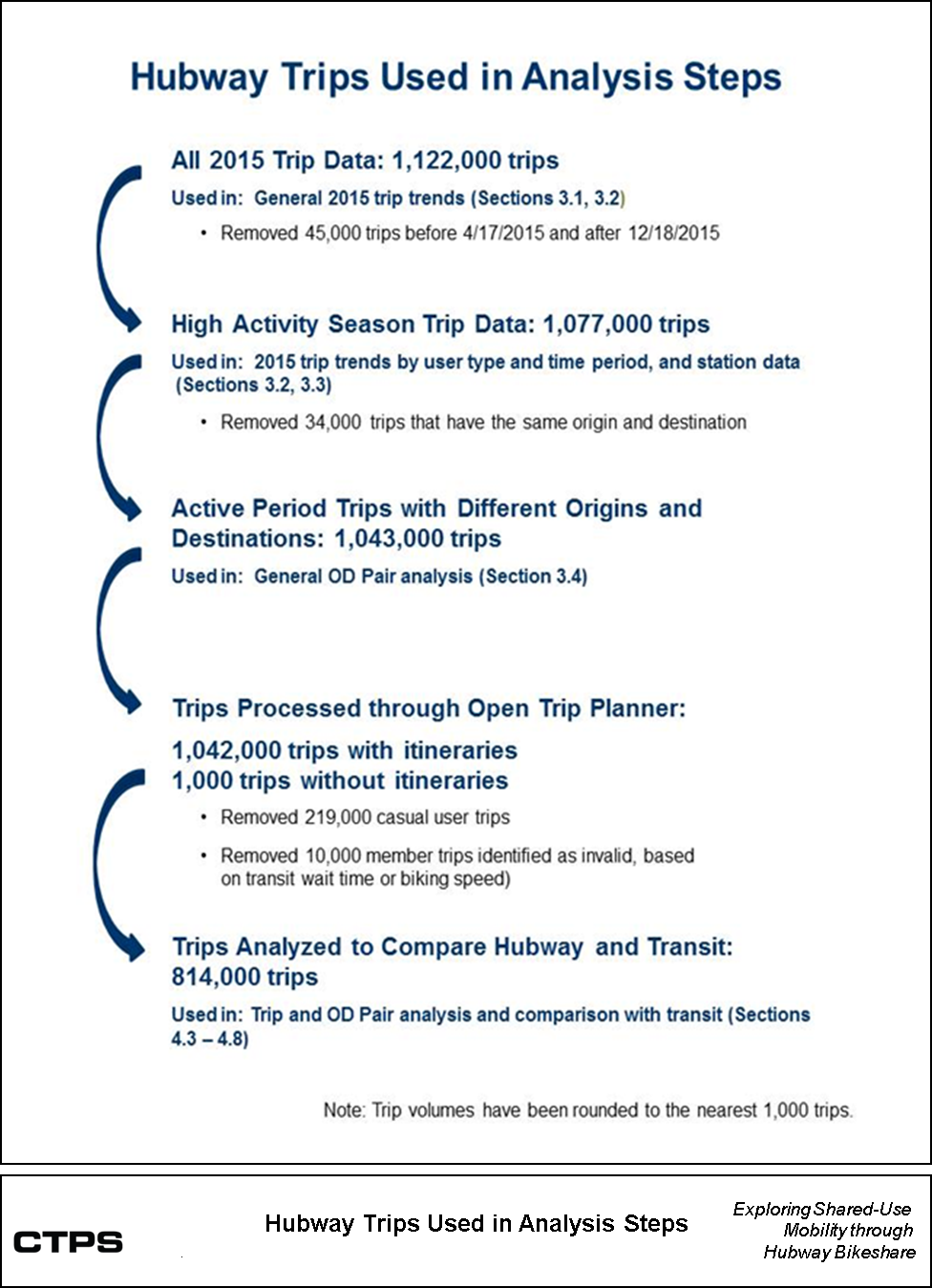
Appendix B:
Station Names, Aliases, and Visit Data
| TABLE B-1 |
||||||
|---|---|---|---|---|---|---|
|
|
|
|
|
|
||
|
|
|
|
4/17/2015 to 12/18/2015 |
|
||
| Original |
Hubway |
Trip Origins from Station |
Trip Destinations at Station |
Total Station Visits |
Transit Options within 200 Meters |
|
Boston Stations: |
|
|
||||
D32022 |
TD Garden - Causeway @ Portal Park #1 a |
TD Garden |
30,117 |
34,953 |
65,070 |
Bus, Commuter Rail, and Rapid Transit |
A32010 |
South Station - 700 Atlantic Ave. |
South Station |
30,434 |
30,938 |
61,372 |
All |
D32005 |
Boston Public Library - 700 Boylston St. |
Boston Public Library |
18,944 |
19,445 |
38,389 |
Bus and Rapid Transit |
D32016 |
Charles Circle - Charles St. @ Cambridge St. |
Charles Circle |
17,285 |
16,823 |
34,108 |
Rapid Transit Only |
C32003 |
Back Bay / South End Station |
Back Bay / South End |
16,473 |
15,637 |
32,110 |
Bus, Commuter Rail, and Rapid Transit |
B32010 |
Kenmore Sq / Comm Ave |
Kenmore Square |
14,330 |
14,461 |
28,791 |
Bus and Rapid Transit |
D32010 |
Cross St. @ Hanover St. |
Cross St @ Hanover St |
14,497 |
13,551 |
28,048 |
Bus and Rapid Transit |
B32008 |
Old State House b |
Old State House |
14,217 |
13,364 |
27,581 |
Bus and Rapid Transit |
B32016 |
Beacon St / Mass Ave |
Beacon St @ Mass Ave |
13,861 |
13,345 |
27,206 |
Bus Only |
D32007 |
Boylston St. @ Arlington St. |
Boylston St @ Arlington St |
13,119 |
14,044 |
27,163 |
Bus and Rapid Transit |
D32017 |
The Esplanade - Beacon St. @ Arlington St. |
The Esplanade |
13,204 |
12,914 |
26,118 |
None |
C32008 |
Boylston @ Fairfield |
Boylston St @ Fairfield St |
12,646 |
12,664 |
25,310 |
Bus Only |
D32000 |
Cambridge St. @ Joy St. |
Cambridge St @ Joy St |
12,826 |
12,436 |
25,262 |
Bus Only |
C32007 |
Prudential Center / Belvidere |
Prudential Center |
12,404 |
12,697 |
25,101 |
Bus and Rapid Transit |
D32008 |
Rowes Wharf - Atlantic Ave |
Rowes Wharf |
12,452 |
12,376 |
24,828 |
Bus Only |
D32014 |
Tremont St / West St |
Tremont St @ West St |
12,226 |
12,218 |
24,444 |
Bus, Rapid Transit, and Silver Line |
B32004 |
Aquarium Station - 200 Atlantic Ave. |
Aquarium Station |
12,206 |
11,733 |
23,939 |
Bus and Rapid Transit |
B32005 |
Christian Science Plaza |
Christian Science Plaza |
11,729 |
11,500 |
23,229 |
Bus and Rapid Transit |
B32018 |
Boylston / Mass Ave |
Boylston St @ Mass Ave |
11,328 |
11,235 |
22,563 |
Bus and Rapid Transit |
D32012 |
Post Office Square |
Post Office Square |
10,841 |
11,171 |
22,012 |
Bus Only |
D32006 |
Lewis Wharf - Atlantic Ave. |
Lewis Wharf |
11,101 |
10,663 |
21,764 |
Bus Only |
D32021 |
Charlestown - Warren St @ Chelsea St |
Charlestown: Warren St |
11,227 |
10,531 |
21,758 |
Bus Only |
B32000 |
Newbury St / Hereford St |
Newbury St @ Hereford St |
10,396 |
10,220 |
20,616 |
Bus and Rapid Transit |
D32019 |
Boylston St / Washington St |
Boylston St @ Washington St |
10,165 |
10,342 |
20,507 |
Bus, Rapid Transit, and Silver Line |
D32004 |
Franklin St. / Arch St. |
Franklin St @ Arch St |
10,301 |
10,176 |
20,477 |
Bus and Rapid Transit |
C32010 |
Congress / Sleeper |
Congress St @ Sleeper St |
9,617 |
10,732 |
20,349 |
Bus Only |
B32011 |
Yawkey Way @ Boylston St. |
Yawkey Way @ Boylston St |
9,786 |
9,760 |
19,546 |
Bus Only |
C32006 |
Washington St. @ Rutland St. |
Washington St @ Rutland St |
9,373 |
9,592 |
18,965 |
Bus and Silver Line |
B32003 |
HMS / HSPH - Ave. Louis Pasteur @ Longwood Ave. |
Harvard: HMS/HSPH |
9,425 |
9,279 |
18,704 |
Bus Only |
D32013 |
Boylston St / Berkeley St |
Boylston St @ Berkeley St |
8,866 |
9,388 |
18,254 |
Bus Only |
C32000 |
Tremont St. @ Berkeley St. |
Tremont St @ Berkeley St |
9,395 |
8,857 |
18,252 |
Bus Only |
D32024 |
Charles St @ Beacon St |
Charles St @ Beacon St |
9,353 |
8,863 |
18,216 |
Bus Only |
D32002 |
Washington St. @ Waltham St. |
Washington St @ Waltham St |
9,103 |
9,077 |
18,180 |
Bus and Silver Line |
C32002 |
Boston Medical Center - East Concord @ Harrison Ave |
Boston Medical Center |
8,913 |
9,037 |
17,950 |
Bus Only |
A32002 |
Agganis Arena - 925 Comm Ave. |
Agganis Arena |
8,423 |
8,688 |
17,111 |
Bus and Rapid Transit |
D32015 |
Chinatown Gate Plaza - Surface Rd. @ Beach St. |
Chinatown Gate Plaza |
8,240 |
8,717 |
16,957 |
Bus Only |
A32004 |
Longwood Ave / Binney St |
Longwood Ave @ Binney St |
7,783 |
8,798 |
16,581 |
Bus Only |
C32004 |
Columbus Ave. @ Mass. Ave. |
Columbus Ave @ Mass Ave |
8,551 |
7,688 |
16,239 |
Bus and Rapid Transit |
B32015 |
Landmark Centre |
Landmark Center |
7,662 |
7,870 |
15,532 |
Bus Only |
D32011 |
Stuart St. @ Charles St. |
Stuart St @ Charles St |
7,606 |
7,708 |
15,314 |
Bus Only |
A32012 |
Packard's Corner - Comm. Ave. @ Brighton Ave. |
Packard's Corner |
7,730 |
7,512 |
15,242 |
Bus and Rapid Transit |
A32009 |
Tremont St / W Newton St |
Tremont St @ W Newton St |
7,950 |
7,177 |
15,127 |
Bus Only |
A32003 |
B.U. Central - 725 Comm. Ave. |
BU Central |
7,172 |
7,544 |
14,716 |
Bus and Rapid Transit |
B32014 |
Seaport Hotel |
Seaport Hotel |
7,345 |
7,047 |
14,392 |
Bus and Silver Line |
A32013 |
John F Fitzgerald - Surface Road @ India Street |
John F Fitzgerald - Surface Rd |
7,021 |
7,263 |
14,284 |
Bus and Rapid Transit |
D32009 |
Faneuil Hall - Union St. @ North St. |
Faneuil Hall |
7,257 |
7,016 |
14,273 |
Bus and Rapid Transit |
| A32008 | Buswell St. @ Park Dr. | Buswell St @ Park Dr | 6,777 | 7,028 | 13,805 | Bus and Rapid Transit |
A32006 |
Harvard University Housing - 111 Western Ave. @ Soldiers Field Park |
Harvard Housing: Western Ave |
6,502 |
6,308 |
12,810 |
None |
B32002 |
Ruggles Station / Columbus Ave. |
Ruggles Station |
6,313 |
6,397 |
12,710 |
Bus, Commuter Rail, and Rapid Transit |
B32007 |
Seaport Square - Seaport Blvd. @ Boston Wharf |
Seaport Square |
6,528 |
6,112 |
12,640 |
Bus Only |
B32012 |
Northeastern U / North Parking Lot |
Northeastern |
6,121 |
6,239 |
12,360 |
Bus and Rapid Transit |
D32027 |
New Balance Store - Boylston @ Dartmouth |
New Balance: Boylston St |
5,764 |
5,849 |
11,613 |
Bus and Rapid Transit |
D32020 |
Charlestown - Main St @ Austin St |
Charlestown: Main St |
5,954 |
5,500 |
11,454 |
Bus Only |
C32025 |
Ink Block |
Ink Block |
5,677 |
5,736 |
11,413 |
Bus and Silver Line |
B32013 |
Brigham Cir / Huntington Ave |
Brigham Circle |
5,291 |
5,118 |
10,409 |
Bus and Rapid Transit |
C32024 |
State Street @ Channel Center |
State Street |
5,133 |
5,178 |
10,311 |
None |
B32006 |
Colleges of the Fenway |
Colleges of the Fenway |
5,017 |
5,004 |
10,021 |
Bus Only |
A32019 |
Harvard University Transportation Services - 175 North Harvard St |
Harvard: Transportation Services |
5,066 |
4,843 |
9,909 |
Bus Only |
D32023 |
Spaulding Rehabilitation Hospital - Charlestown Navy Yard |
Spaulding Hospital: Charlestown Navy Yard |
4,894 |
5,009 |
9,903 |
None |
A32000 |
Fan Pier |
Fan Pier |
4,668 |
5,231 |
9,899 |
None |
A32017 |
Allston Green District - Commonwealth Ave & Griggs St |
Allston Green District |
5,123 |
4,529 |
9,652 |
Rapid Transit Only |
D32018 |
Boston Convention & Exhibition Center |
BCEC |
4,756 |
4,632 |
9,388 |
Bus and Silver Line |
C32016 |
West Broadway @ Dorchester St |
W Broadway @ Dorchester St |
4,846 |
4,363 |
9,209 |
Bus Only |
C32017 |
South Boston Library - 646 East Broadway |
South Boston Library |
4,352 |
4,562 |
8,914 |
Bus Only |
C32001 |
Roxbury Crossing Station |
Roxbury Crossing Station |
4,244 |
4,015 |
8,259 |
Bus and Rapid Transit |
C32021 |
ID Building West |
ID Building W |
3,844 |
3,957 |
7,801 |
Bus and Silver Line |
A32001 |
Union Square - Brighton Ave. @ Cambridge St. |
Union Square: Brighton Ave |
3,662 |
3,723 |
7,385 |
Bus Only |
C32009 |
Dorchester Ave. @ Gillette Park |
Dorchester Ave @ Gillette Park |
3,542 |
3,554 |
7,096 |
Bus and Rapid Transit |
E32003 |
Hyde Square @ Barbara St |
Hyde Square |
3,458 |
3,131 |
6,589 |
Bus Only |
C32020 |
ID Building East |
ID Building E |
3,221 |
3,341 |
6,562 |
Bus and Silver Line |
E32005 |
Green St T |
Green Street Station |
3,133 |
3,270 |
6,403 |
Rapid Transit Only |
A32011 |
Innovation Lab - 125 Western Ave. @ Batten Way |
Innovation Lab: Western Ave |
3,065 |
3,174 |
6,239 |
Bus Only |
E32006 |
Jackson Square T @ Centre St |
Jackson Square Station |
3,142 |
2,932 |
6,074 |
Bus and Rapid Transit |
B32020 |
BIDMC - Brookline @ Burlington St |
BIDMC - Brookline |
2,888 |
3,105 |
5,993 |
Bus Only |
C32005 |
Washington St. @ Lenox St. |
Washington St Lenox Street |
2,748 |
2,826 |
5,574 |
Bus and Silver Line |
C32012 |
Andrew Station - Dorchester Ave @ Humboldt Pl |
Andrew Station |
2,689 |
2,533 |
5,222 |
Bus and Rapid Transit |
D32026 |
Hayes Square @ Vine St. |
Hayes Square |
2,445 |
2,612 |
5,057 |
Bus Only |
E32002 |
JP Center - Centre Street @ Myrtle Street |
JP Center |
2,094 |
2,288 |
4,382 |
Bus Only |
A32005 |
Harvard Real Estate - Brighton Mills - 370 Western Ave |
Harvard Real Estate - Brighton Mills - 370 Western Ave |
2,012 |
2,136 |
4,148 |
Bus Only |
E32001 |
JP Monument - South St @ Centre St |
JP Monument |
2,053 |
2,059 |
4,112 |
Bus Only |
B32017 |
Dudley Square |
Dudley Square |
1,601 |
1,602 |
3,203 |
Bus and Silver Line |
C32013 |
JFK / UMASS Station |
JFK / UMASS Station |
1,431 |
1,610 |
3,041 |
Bus, Commuter Rail, and Rapid Transit |
D32001 |
New Balance - 20 Guest St. |
New Balance: Guest St |
1,235 |
1,297 |
2,532 |
Bus Only |
C32022 |
Newmarket Square |
Newmarket Square |
1,183 |
1,308 |
2,491 |
Commuter Rail, Bus, and Silver Line |
E32004 |
Egleston Square @ Columbus Ave |
Egleston Square |
1,128 |
881 |
2,009 |
Bus Only |
C32018 |
E. Cottage St @ Columbia Rd |
E Cottage St @ Columbia Road |
703 |
776 |
1,479 |
Bus Only |
B32021 |
Wentworth Institute of Technology |
Wentworth IT |
711 |
705 |
1,416 |
Bus and Rapid Transit |
C32019 |
Upham's Corner - Ramsey St @ Dudley St |
Upham's Corner |
761 |
609 |
1,370 |
Bus Only |
C32029 |
West Broadway @ D Street |
W Broadway @ D St |
670 |
690 |
1,360 |
Bus Only |
C32014 |
UMass Boston Integrated Sciences Complex |
UMass Boston ISC |
648 |
650 |
1,298 |
None |
C32015 |
Mt Pleasant Ave / Dudley Town Common |
Dudley Town Common |
625 |
566 |
1,191 |
Bus Only |
A32022 |
Main Street @ Eden Street Park |
Main St @ Eden St Park |
614 |
552 |
1,166 |
Bus Only |
C32028 |
Lawn on D |
Lawn on D |
535 |
493 |
1,028 |
None |
A32023 |
Bunker Hill Community College |
Bunker Hill CC |
252 |
226 |
478 |
Rapid Transit Only |
D32028 |
Brighton Center |
Brighton Center |
202 |
197 |
399 |
Bus Only |
E32007 |
Heath St @ South Huntington |
Heath St @ S Huntington Ave |
191 |
142 |
333 |
Bus and Rapid Transit |
D32029 |
Washington St @ Brock St |
Washington St @ Brock St |
116 |
127 |
243 |
Bus Only |
C32031 |
Ryan Playground - Dorchester Avenue Station |
Ryan Playground |
88 |
100 |
188 |
Bus Only |
X32999 |
Dorrance Warehouse |
Dorrance Warehouse |
45 |
104 |
149 |
No Data |
C32027 |
Franklin Park - Seaver Street @ Humbolt Ave |
Franklin Park |
65 |
39 |
104 |
Bus Only |
C32030 |
Franklin Park Zoo |
Franklin Park Zoo |
42 |
35 |
77 |
Bus Only |
Brookline Stations: |
|
|
||||
K32001 |
Coolidge Corner - Beacon St @ Centre St |
Coolidge Corner |
6,213 |
6,197 |
12,410 |
Bus and Rapid Transit |
K32003 |
Brookline Village - Station Street @ MBTA |
Brookline Village |
4,017 |
4,217 |
8,234 |
Bus and Rapid Transit |
K32004 |
JFK Crossing @ Harvard St. / Thorndike St. |
JFK Crossing |
3,348 |
2,860 |
6,208 |
Bus Only |
K32002 |
Washington Square @ Washington St. / Beacon St. |
Washington Square |
3,193 |
2,584 |
5,777 |
Bus and Rapid Transit |
Cambridge Stations: |
|
|
||||
M32006 |
MIT @ Mass Ave / Amherst St |
MIT: Mass Ave |
26,511 |
26,630 |
53,141 |
Bus Only |
M32018 |
Harvard Square @ Mass Ave/ Dunster |
Harvard Square: Mass Ave @ Dunster St |
20,856 |
21,538 |
42,394 |
Bus and Rapid Transit |
M32011 |
Central Square @ Mass Ave / Essex St |
Central Square |
19,011 |
18,603 |
37,614 |
Bus and Rapid Transit |
M32009 |
Lafayette Square @ Mass Ave / Main St / Columbia St |
Lafayette Square |
17,832 |
17,563 |
35,395 |
Bus Only |
M32005 |
MIT Stata Center @ Vassar St / Main St |
MIT: Stata Center |
14,919 |
19,626 |
34,545 |
None |
M32003 |
One Broadway / Kendall Sq @ Main St / 3rd St |
One Broadway / Kendall Square |
13,419 |
12,928 |
26,347 |
Bus and Rapid Transit |
M32037 |
Ames St @ Main St |
Ames St @ Main St |
12,267 |
12,666 |
24,933 |
Bus and Rapid Transit |
M32012 |
Central Sq Post Office / Cambridge City Hall @ Mass Ave / Pleasant St |
Cambridge City Hall |
12,414 |
11,964 |
24,378 |
Bus and Rapid Transit |
M32002 |
One Kendall Square @ Hampshire St / Portland St |
One Kendall Square |
12,312 |
11,818 |
24,130 |
Bus Only |
M32010 |
Inman Square @ Vellucci Plaza / Hampshire St |
Inman Square |
11,250 |
10,308 |
21,558 |
Bus Only |
M32001 |
Lechmere Station @ Cambridge St / First St |
Lechmere Station |
9,969 |
10,087 |
20,056 |
Bus and Rapid Transit |
M32022 |
Lower Cambridgeport @ Magazine St/Riverside Rd |
Lower Cambridgeport |
9,962 |
9,905 |
19,867 |
Bus Only |
M32017 |
Harvard Square @ Brattle St / Eliot St |
Harvard Square: Brattle St |
9,698 |
9,907 |
19,605 |
Bus and Rapid Transit |
M32029 |
Porter Square Station |
Porter Square Station |
9,636 |
9,239 |
18,875 |
Bus, Commuter Rail, and Rapid Transit |
M32019 |
CambridgeSide Galleria - CambridgeSide PL @ Land Blvd |
CambridgeSide Galleria |
9,085 |
9,548 |
18,633 |
None |
M32007 |
Cambridge St - @ Columbia St / Webster Ave |
Cambridge St @ Columbia St |
8,958 |
8,371 |
17,329 |
Bus Only |
M32021 |
Harvard University Gund Hall @ Quincy St / Kirkland S |
Harvard: Gund Hall |
8,457 |
8,539 |
16,996 |
Bus Only |
M32014 |
Harvard University Housing - 115 Putnam Ave @ Peabody Terrace |
Harvard Housing: Putnam Ave |
8,695 |
7,870 |
16,565 |
None |
M32013 |
Cambridge Main Library @ Broadway / Trowbridge St |
Cambridge Main Library |
8,301 |
8,241 |
16,542 |
Bus Only |
M32016 |
Harvard Kennedy School @ Bennett St / Eliot St |
Harvard Kennedy School |
7,210 |
7,697 |
14,907 |
Bus Only |
M32026 |
359 Broadway - Broadway @ Fayette Street |
359 Broadway |
7,751 |
6,764 |
14,515 |
Bus Only |
M32023 |
Harvard University / SEAS Cruft-Pierce Halls @ 29 Oxford St |
Harvard: SEAS Cruft-Pierce Halls |
6,939 |
6,957 |
13,896 |
None |
M32027 |
Binney St / Sixth St |
Binney St @ Sixth St |
6,472 |
6,428 |
12,900 |
None |
M32032 |
Kendall Street |
Kendall Street |
6,041 |
6,066 |
12,107 |
None |
M32038 |
Harvard University River Houses @ DeWolfe St / Cowperthwaite St |
Harvard: River Houses |
5,853 |
5,819 |
11,672 |
None |
M32030 |
Dana Park |
Dana Park |
5,893 |
5,402 |
11,295 |
Bus Only |
M32020 |
Harvard Law School @ Mass Ave / Jarvis St |
Harvard Law School |
5,683 |
5,575 |
11,258 |
Bus Only |
M32024 |
Harvard University Radcliffe Quadrangle @ Shepard St / Garden St |
Harvard: Radcliffe Quadrangle |
5,571 |
5,488 |
11,059 |
Bus Only |
M32034 |
EF - North Point Park |
EF - North Point Park |
5,359 |
5,271 |
10,630 |
None |
M32025 |
Linear Park - Mass. Ave. @ Cameron Ave. |
Linear Park: Mass Ave @ Cameron Ave |
5,185 |
5,003 |
10,188 |
Bus Only |
M32033 |
Alewife Station @ Russell Field |
Alewife Station |
3,194 |
3,322 |
6,516 |
Bus Only |
M32031 |
Danehy Park |
Danehy Park |
2,564 |
2,517 |
5,081 |
None |
M32036 |
Rindge Avenue - O'Neill Library |
Rindge Ave |
1,289 |
1,349 |
2,638 |
Bus Only |
M32041 |
MIT Pacific St @ Purrington St |
MIT: Pacific St |
1,029 |
943 |
1,972 |
None |
M32042 |
MIT Vassar St |
MIT: Vassar St |
766 |
709 |
1,475 |
Bus Only |
M32040 |
University Park |
University Park |
748 |
667 |
1,415 |
Bus Only |
M32039 |
Lesley University |
Lesley Univ |
236 |
264 |
500 |
Bus, Commuter Rail, and Rapid Transit |
M32043 |
Mt Auburn |
Mt Auburn |
207 |
196 |
403 |
Bus Only |
Somerville Stations: |
|
|
||||
S32006 |
Davis Square |
Davis Square |
10,027 |
11,662 |
21,689 |
Bus and Rapid Transit |
S32002 |
Union Square - Somerville |
Union Square: Somerville |
6,122 |
6,460 |
12,582 |
Bus Only |
S32004 |
Conway Park - Somerville Avenue |
Conway Park |
5,321 |
5,242 |
10,563 |
Bus Only |
S32003 |
Beacon St @ Washington / Kirkland |
Beacon St @ Washington St |
4,617 |
4,375 |
8,992 |
Bus Only |
S32005 |
Wilson Square |
Wilson Square |
3,756 |
3,521 |
7,277 |
Bus Only |
S32011 |
Teele Square @ 239 Holland St |
Teele Square |
3,258 |
2,108 |
5,366 |
Bus Only |
S32010 |
Somerville Hospital @ Highland Ave / Crocker St |
Somerville Hospital |
2,387 |
1,670 |
4,057 |
Bus Only |
S32001 |
Somerville City Hall |
Somerville City Hall |
2,051 |
1,781 |
3,832 |
Bus Only |
S32009 |
Packard Ave / Powderhouse Blvd |
Packard Ave @ Powderhouse Blvd |
1,861 |
1,780 |
3,641 |
None |
S32012 |
Summer St @ Cutter St |
Summer St @ Cutter St |
1,563 |
1,773 |
3,336 |
Bus Only |
S32008 |
Powder House Circle - Nathan Tufts Park |
Powder House Circle |
1,699 |
1,589 |
3,288 |
Bus Only |
S32013 |
Magoun Square @ Trum Field |
Magoun Square |
1,266 |
1,349 |
2,615 |
Bus Only |
Data Source: 2015 Hubway trip logs (4/17/2015-12/18/2015) and CTPS GIS analysis.
a Data for TD Garden - Causeway at Portal Park #1 reflects data for both the TD Garden - Causeway at Portal Park #1 and the TD Garden and the TD Garden - Causeway at Portal Park #2 stations. These stations were combined given their close proximity. b Data for Old State House reflects data for both the Old State House and the Mayor Martin J Walsh - 28 State St. stations. These stations were combined given their close proximity.
CTPS = Central Transportation Planning Staff. O-D = Origin-Destination.
Appendix C:
Adjusting Transit Travel Time Estimates to Mitigate Bias
As discussed in Section 4.1, CTPS sought a strategy to mitigate the biases that arise when modeling and calculating the travel time of alternative transit trips so that they can be compared to Hubway trips. The Hubway trip data used in this analysis only included the portion of each Hubway trip from when a rider picked up a bicycle at the origin Hubway station to when she dropped it off at the destination Hubway station. The rider’s true origin (for example, her home), her true destination (for example, her workplace), and the distance she traveled between these locations and Hubway stations are all unknown. The Hubway station coordinates were the only data that CTPS could use to identify the locations associated with a Hubway trip and to model an alternative transit trip. However, using the Hubway stations as trip start-and-end points systematically underestimates the total time of the Hubway trip. Also, using these stations as start-and-end points for an alternative transit trip may overestimate or underestimate travel time by transit, depending on the locations of the rider’s true origin and destination.
Figure C-1 illustrates a scenario where setting Hubway trip origins and destinations at Hubway stations overestimates the travel time of the alternative transit trip.
FIGURE C-1
Scenario 1: Underestimating Hubway
Travel Time and Overestimating Transit Travel Time
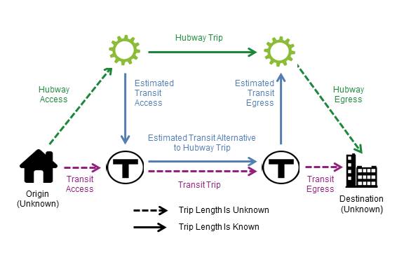
In scenario shown in Figure C-1, the true origin and true destination locations are closer to transit stations than to Hubway stations. In the diagram, the solid green arrow corresponds to the recorded Hubway trip between the two stations, while the dashed green arrows represent the trips of unknown distance that the rider would need to make from her origin to the first Hubway station and from the second Hubway station to her true destination. The blue arrows represent an estimated alternative transit trip that starts and ends at the Hubway stations, and includes walk trips between the Hubway stations and transit stations. The dashed purple arrows represent a transit alternative for making the complete trip that does not involve stopping at Hubway stations. In this hypothetical situation, by using Hubway stations as proxies for the true origin and destination, CTPS underestimated the total Hubway trip time—because the trips to and from Hubway stations are not included—and overestimated the amount of time needed to access and egress transit, thereby overestimating total transit travel time.
Figure C-2 illustrates a scenario where setting Hubway trip origins and destinations at Hubway stations underestimates the travel time of the alternative transit trip.
FIGURE C-2
Scenario 2: Underestimating Hubway
Travel Time and Underestimating Transit Travel Time
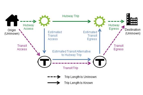
In this hypothetical case, the rider’s true origin and true destination are closer to Hubway stations than to transit stations. Using Hubway stations to represent the origin and destination underestimates the amount of time needed to access and egress transit stations, and thereby underestimates total transit travel time. Also, as in the first scenario, the Hubway trip does not account for the walk access and walk egress trips between the true origin and destination and Hubway stations, which would lead to underestimating total Hubway travel time.
For this analysis described in Section 4, CTPS assumed that the actual start and end points of Hubway trips have a random geographic distribution with respect to Hubway stations and transit stations. If the trips represented by the Hubway data are considered in aggregate, the sums of the variations in walking time to and from Hubway stations (dashed green arrows) would be cancelled out by the sums of the variations in walking time to and from transit stations (dashed purple arrows). Using this assumption, CTPS removed walk access and walk egress time from OTP’s transit travel time estimates, in order to compare a Hubway trip’s travel time with the travel time of OTP’s transit alternative more fairly. Figure C-3 illustrates the effect of CTPS’s approach.
FIGURE C-3
Results of CTPS Approach
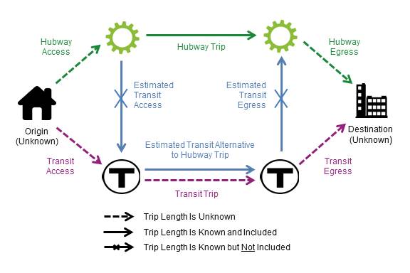
This approach has a noticeable quantitative impact on estimates of transit travel time, as walk access and egress time make up about 38 percent of all transit travel time for OTP’s recommended transit alternatives to Hubway trips, on average. However, in the absence of more detailed trip information, CTPS believes this is the best option to correct for the systematic bias introduced by using Hubway stations as proxies for actual trip origins and destinations.
Appendix D:
Methods used to Estimate Uncomfortable Conditions
CTPS used the following resources to identify evidence of uncomfortable conditions on alternative transit routes identified in Section 4.6, “Results for Origin Destination Pairs with Large Shares of Trips that are Faster or Comparable by Transit”:
Data tabulators count bus passengers at the maximum load point for bus trips traveling either inbound or outbound during peak periods. These data-collection activities are referred to as point checks. If the passenger load at the point check falls between 100 and 140 percent of seated bus capacity, the trip is considered overburdened. If the load at the point check is greater than 140 percent of seated capacity, the trip is considered overcrowded. CTPS reviewed fall 2015 point-check data for bus routes that could provide substitute service for a Hubway O-D pair. If the point-check location fell within the bus route segment that would serve as a transit alternative for a particular Hubway O-D pair, CTPS counted the number and share of overcrowded or overburdened bus trips during the relevant peak period. If the point-check data showed that more than 50 percent of trips for a given route were overcrowded or overburdened during the peak period (AM or PM), then CTPS considered this information to be evidence of uncomfortable conditions on that route.
To understand passenger comfort levels on MBTA bus routes better, the MBTA has calculated the ratio of comfortable passenger time to total passenger time for each route during the course of the day using data for average weekdays in fall 2015 from its busload dataset.46 This data—which is in active development and is considered experimental—combines average trip loads from on-bus automated passenger counter (APC) data and information on boarding and alighting locations from the MBTA’s ODX model. During high-volume periods, whenever passenger loads exceeded 140 percent of seated capacity, then all passengers were considered as being uncomfortable.47
In its current Service Delivery Policy, the MBTA set a minimum threshold of 92 percent of passenger minutes in comfortable conditions for its bus routes.48 CTPS queried bus crowding data from fall 2015 for the MBTA’s relevant bus routes and directions (inbound or outbound) during the peak periods (when information was available), and documented the percentage for the overall routes, as this ratio is the most meaningful at the route level. When a relevant bus route failed to meet the minimum threshold (92 percent) during the relevant peak period, CTPS noted this as possible evidence of uncomfortable conditions on that bus route. CTPS also gathered information for relevant route segments that that would support transit alternatives for Hubway O-D pairs during the AM and PM peak periods. When a bus route failed to meet the minimum threshold during these periods on at least one part of these segments, then CTPS noted this as possible evidence of uncomfortable conditions on that segment.
CTPS reviewed MBTA disaggregate automated fare collection data from May 10–12, 2016.49 This data had been processed through CTPS’s CCARD2OD model, which infers origins and destinations on the rapid transit system. This data showed the average passenger load on trains departing from rapid transit stations, by line, for each hour of the day.
To determine whether loads at specific rapid transit stations might indicate uncomfortable conditions, CTPS estimated the passenger capacity per hour for specific rapid transit lines. The passenger capacity per train was estimated using standards for total passenger vehicle loads on rapid transit during peak periods, which are listed in the MBTA’s Service Delivery Policy. These vehicle loads were multiplied by an estimated number of cars per train, as shown in Table D-1.
TABLE D-1
Estimated Passenger Capacity for
Rapid Transit Trains during Peak Periods
Line |
Total Passenger per Vehicle |
Estimated Cars per Train |
Estimated Total Passenger Load Capacity per Train |
Red |
165 |
6 |
990 |
Orange |
141 |
6 |
846 |
Blue |
86 |
6 |
516 |
Green |
100 |
2 |
200 |
Data source for passengers per vehicle: MBTA, MBTA Service Delivery Policy, p. 45.
CTPS then multiplied these values by an estimated number of trains per hour on different lines (accounting for direction) of the rapid transit system, as shown in Table D-2.
| TABLE D-2 |
||||
|---|---|---|---|---|
|
|
|
|
|
|
| Line |
Segment |
Trains Per Hour (All Relevant Lines) |
Estimated Total Passenger Load Capacity per Train |
Estimated Passenger Load Capacity Per Hour |
Red |
Alewife to JFK U-Mass (Ashmont, Braintree) |
13 |
990 |
13,200 |
Red |
JFK U-Mass to Braintree |
7 |
990 |
6,600 |
Red |
JFK U-Mass to Ashmont |
7 |
990 |
6,600 |
Red |
Braintree to JFK/U-Mass |
7 |
990 |
6,600 |
Red |
Ashmont to JFK/U-Mass |
7 |
990 |
6,600 |
Red |
JFK/UMass to Alewife (Ashmont, Braintree) |
13 |
990 |
13,200 |
Orange |
Oak Grove to Forest Hills |
10 |
846 |
8,460 |
Orange |
Forest Hills to Oak Grove |
10 |
846 |
8,460 |
Green |
Lechmere to North Station (E ) |
10 |
200 |
2,000 |
Green |
North Station to Park St (C, E) |
20 |
200 |
4,000 |
Green |
Park Station to Copley (B, C, D, E) |
40 |
200 |
8,000 |
Green |
Copley to Kenmore (B, C, D) |
30 |
200 |
6,000 |
Green |
Copley to Symphony (E) |
10 |
200 |
2,000 |
Green |
Surface B Line to Boston College |
10 |
200 |
2,000 |
Green |
Surface C Line to Cleveland Circle |
10 |
200 |
2,000 |
Green |
Surface D Line to Riverside |
10 |
200 |
2,000 |
Green |
Surface E Line to Heath Street |
10 |
200 |
2,000 |
Green |
North Station to Lechmere (E) |
10 |
200 |
2,000 |
Green |
Park to North Station ( C, E) |
20 |
200 |
4,000 |
Green |
Copley to Park (B, C, D, E) |
40 |
200 |
8,000 |
Green |
Kenmore to Copley (B, C, D) |
30 |
200 |
6,000 |
Green |
Symphony to Copley (E) |
10 |
200 |
2,000 |
Green |
Surface B Line to Kenmore |
10 |
200 |
2,000 |
Green |
Surface C Line to Kenmore |
10 |
200 |
2,000 |
Green |
Surface D Line to Kenmore |
10 |
200 |
2,000 |
Green |
Surface E Line to Copley |
10 |
200 |
2,000 |
Data source for rapid transit service frequencies by line: MBTA Rapid Transit schedule: December 31, 2017 to March 24, 2017, http://www.mbta.com/uploadedFiles/Documents/Schedules_and_Maps/Subway/frequency-schedule.pdf, accessed January 26, 2017, p. 2.
Note: These frequencies were used to calculate the trains per hour, which have been rounded to the nearest whole number of trains in this table.
CTPS noted that there could be uncomfortable conditions on trains departing from a particular station at a particular hour if the ratio between the average load at that station and the total passenger capacity of the relevant rapid transit line was greater than 0.6 for that hour. This threshold was selected because at this level, the passenger loads would be at least 125 percent of seated capacity on all transit lines. It also allows for some variations in passenger loads on individual trains that may pass through a station during a one-hour period. CTPS noted that there could be uncomfortable conditions on a rapid transit segment that would provide an alternative for a Hubway O-D pair if that segment included at least one station meeting the 0.6 ratio threshold during at least one hour of the AM or PM peak period.
In 2012, CTPS conducted passenger counts for the MBTA commuter rail system, which were used to determine line volumes. The commuter rail segment between South Station and Back Bay Station—served by the Framingham/Worcester, Franklin, Needham, and Providence/Stoughton Lines—is the only option that emerged as an alternative for the Hubway O-D pairs analyzed in Section 4.6. Based on 2012 passenger count data, on these rail lines, the maximum loads occur at some point prior to Back Bay inbound and after Back Bay outbound. By comparison, the commuter rail traffic between Back Bay and South Station is low. For the purposes of this analysis, CTPS assumed that crowding did not take place on this segment, although crowding could theoretically occur because of non-uniform distribution of passengers between cars on a train.
Appendix E:
Details on O-D Pairs with Large Shares of Trips Faster
or Comparable by Transit
TABLE E-1
O-D Pairs With Large Shares of Trips Faster or Comparable by Transit (AM Peak Period)
|
|
|
|
|
|
|
|
|
Evidence of |
|||
O-D Pair: Station Numbers |
O-D Pair: |
Total Weekday AM Peak Period Trips |
Percent Trips Faster or Comparable by Transit |
Main Alternative Transit Mode for Trips Faster or Comparable by Transit |
Transit Mode Share of All O-D Pair Trips |
Transit Mode Share of Trips Faster or Comparable by Transit |
Hubway: Potential Complement or Potential Competitor? |
Transit Lines and |
Bus Point Checks |
Bus Route Comfort Fraction Data |
Bus Segment Comfort Fraction Data |
Loads at Rapid Transit Stations |
D32022 to C32007 |
TD Garden to Prudential Center |
109 |
98% |
Rapid Transit (0 Transfers) |
100% |
100% |
Complement |
1. Green Line (North Station to Prudential) |
|
|
|
X |
|
|
|
|
|
2. Orange Line (No Stan to Massachusetts Avenue) |
|
|
|
X |
|||
D32022 to C32003 |
TD Garden to Back Bay / South End |
128 |
86% |
Rapid Transit (0 Transfers) |
100% |
100% |
Complement |
1. Orange Line (No Sta to Back Bay) |
X |
|||
2. Green Line (No Sta to Copley) |
X |
|||||||||||
D32022 to D32007 |
TD Garden to Boylston St @ Arlington St |
139 |
83% |
Rapid Transit 0 Transfers) |
100% |
100% |
Complement |
1. Orange Line (No Sta to Back Bay) |
|
|
|
X |
|
|
|
|
|
2. Green Line (No Sta to Arlington) |
|
|
|
X |
|||
D32005 to A32010 |
Boston Public Library to South Station |
146 |
63% |
Commuter Rail (0 Transfers) |
100% |
100% |
Competitor |
1. Multiple Lines (Back Bay to So Sta) |
||||
D32022 to C32008 |
TD Garden to Boylston St @ Fairfield St |
178 |
61% |
Rapid Transit (0 Transfers) |
100% |
100% |
Complement |
2. Green Line (No Sta to Copley) |
|
|
|
X |
M32022 to A32004 |
Lower Cambridgeport to Longwood Ave @ Binney St |
111 |
58% |
Bus (0 Transfers) |
100% |
100% |
Complement |
1. Route 47 (Magazine St @ Riverside Rd to Brookline Ave @ Longwood Ave) |
X |
X |
||
A32010 to D32018 |
So Sta to BCEC |
305 |
54% |
Bus (0 Transfers) |
100% |
100% |
Competitor |
1.Route 7 bus (So Sta to Summer St Op WTC Avenue)b |
|
|
|
|
|
|
|
|
|
2.Route 4 (So Sta to Summer St Op WTC Ave)c |
|
|
|
|
|||
Data sources: 2015 Hubway trip logs (4/17/2015–12/18/2015), Open Trip Planner and Google Maps output, MBTA fall 2015 bus point-check data, MBTA fall 2015 bus crowding data, MBTA AFC data (May 10-12, 2016),
a An "X" in the Evidence of Uncomfortable Conditions columns indicates that CTPS identified evidence in this category, according to the methods described in Appendix D. b Point-check data was not available for Route 7 buses traveling outbound during the AM Peak period. c Point-check data and bus route comfort fraction data were not available for Route 4 buses traveling outbound during the AM Peak period.
AFC = automated fare collection. BCEC = Boston Convention and Exhibition Center. CTPS = Central Transportation Planning Staff. O-D = Origin-Destination. OTP = Open Trip Planner.
TABLE E-2
O-D Pairs With Large Shares of Trips Faster or Comparable by Transit (PM Period)
|
|
|
|
|
|
|
|
|
|
Evidence of |
|||
|---|---|---|---|---|---|---|---|---|---|---|---|---|
| O-D Pair: Station Numbers |
O-D Pair: |
Total Weekday PM Peak Period Trips |
Percent of Trips Faster or Comparable by Transit |
Main Alternative Transit Mode for Trips Faster or Comparable by Transit |
Transit Mode Share of All O-D Pair Trips |
Transit Mode Share of Trips Faster or Comparable by Transit |
Hubway: Potential Complement or Potential Competitor? |
Transit Lines and Segments |
Bus |
Bus Route Comfort Fraction Data |
Bus Segment Comfort Fraction Data |
Loads at Rapid Transit Stations |
C32007 to D32022 |
Prudential Center to TD Garden |
194 |
98% |
Rapid Transit (0 transfers) |
100% |
100% |
Complement |
1. Green Line (Prudential to North Station) |
X |
|||
2. Orange Line (Massachusetts Avenue to No Sta) |
X |
|||||||||||
A32010 to C32003 |
South Station to Back Bay/South End |
128 |
96% |
Commuter Rail Only (0 transfers) |
98% |
100% |
Competitor |
1. Commuter Rail (Multiple Lines, So Sta to Back Bay) |
|
|
|
|
A32010 to C32012 |
So Sta to Andrew Sta |
104 |
91% |
Rapid Transit (0 transfers) |
100% |
100% |
Complement |
1. Red Line (So Sta to Andrew) |
X |
|||
C32003 to A32010 |
Back Bay /So End to So Sta |
204 |
91% |
Commuter Rail (0 transfers) |
95% |
100% |
Competitor |
1. Commuter Rail (Multiple Lines, Back Bay to So Sta) |
|
|
|
|
D32014 to D32005 |
Tremont St @ West St to Boston Public Library |
110 |
81% |
Rapid Transit (0 transfers) |
98% |
100% |
Complement |
1. Green Line (Park St to Copley) |
X |
|||
2. Orange Line (Chinatown to Back Bay Sta) |
X |
|||||||||||
D32009 to D32021 |
Faneuil Hall to Charlestown: Warren St |
102 |
78% |
Bus (0 transfers) |
100% |
100% |
Complement |
1. Route 93 (Congress St @ North St to Chelsea St @ Warren St) |
|
X |
X |
|
|
|
|
|
|
|
2. Route 92 (Congress St @ North St to Warren St @ Winthrop St)b |
|
|
|
|
||
C32003 to D32022 |
Back Bay/ So End to TD Garden |
141 |
75% |
Rapid Transit (0 transfers) |
100% |
100% |
Complement |
1. Orange Line (Back Bay to No Sta) |
X |
|||
A32010 to D32005 |
So Sta to Boston Public Library |
167 |
61% |
Commuter Rail Only (0 transfers) |
98% |
100% |
Competitor |
1. Commuter Rail (Multiple Lines, So Sta to Back Bay) |
|
|
|
|
D32007 to D32022 |
Boylston St @ Arlington St to TD Garden |
333 |
58% |
Rapid Transit (0 transfers) |
100% |
100% |
Complement |
1. Green Line (Arlington to No Sta) |
X |
|||
A32003 to A32012 |
BU Central to Packard's Corner |
168 |
55% |
Bus (0 transfers) |
90% |
100% |
Complement |
1. Route 57 (Commonwealth Ave @ University Rd to 1079 Comm Ave) |
X |
X |
X |
|
|
|
|
|
|
|
2. Route 57A (Comm Ave @ University Rd to 1079 Comm Ave) |
X |
X |
X |
|
||
A32010 to D32018 |
So Sta to BCEC |
156 |
55% |
Bus (0 transfers) |
100% |
100% |
Complement |
1. Route 7 bus (So Sta to Summer St op WTC Ave) |
X |
X |
||
2. Route 4 bus (So Sta to Summer St op World Trade Center Ave)c |
||||||||||||
M32011 to M32018 |
Central Square to Harvard Sq: Mass Ave @ Dunster St |
119 |
54% |
Rapid Transit (0 transfers) |
86% |
94% |
Complement |
1. Red Line (Central to Harvard) |
|
|
|
X |
B32007 to A32010 |
Seaport Sq to So Sta |
105 |
53% |
Bus (0 transfers) |
100% |
100% |
Complement |
1.SL1 (Courthouse to So Sta)d |
X |
|||
2. SL2 (Courthouse to So Sta) |
X |
X |
||||||||||
|
|
|
|
|
|
3. SL Waterfront (Courthouse to So Sta)e |
|
|
|
|
||
B32010 to A32002 |
Kenmore Sq to Agganis Arena |
124 |
53% |
Bus (0 transfers) |
92% |
98% |
Complement |
1. 57 (Kenmore to Comm Ave @ Buick St) |
X |
X |
X |
|
|
|
|
|
|
|
2. 57/57A (Kenmore to Comm Ave @ Buick St) |
X |
X |
X |
|
||
D32012 to D32021 |
Post Office Sq to Charlestown: Warren St |
138 |
51% |
Bus (0 transfers) |
100% |
100% |
Complement |
1. Route 93 (Pearl St @ Congress St to Chelsea St @ Warren St) |
X |
X |
||
2. Route 92 (Pearl St @ Congress St to Warren St @ Winthrop St)b |
||||||||||||
M32001 to D32022 |
Lechmere Sta to TD Garden |
255 |
51% |
Rapid Transit (0 transfers) |
59% |
100% |
Competitor |
1. Green Line (Lechmere to No Sta) |
|
|
|
|
Data sources: 2015 Hubway trip logs (4/17/2015–12/18/2015), Open Trip Planner and Google Maps output, MBTA fall 2015 bus point-check data, MBTA fall 2015 bus crowding data, MBTA AFC data (May 10-12, 2016),
a An "X" in the Evidence of Uncomfortable Conditions columns indicates that CTPS identified evidence in this category, according to the methods described in Appendix D. b Comfort fraction data was not available for Route 92 buses traveling outbound during the AM Peak period. c Point-check data and bus route comfort fraction data were not available for Route 4 buses traveling outbound during the PM Peak period. d Comfort fraction data was not available for SL 1 buses traveling inbound during the PM peak period. eComfort fraction data was not available for SL Waterfront buses traveling inbound during the PM peak period.
AFC = automated fare collection. BCEC = Boston Convention and Exhibition Center. BU = Boston University. CTPS = Central Transportation Planning Staff. O-D = Origin-Destination. OTP = Open Trip Planner.
TABLE E-3
O-D Pairs With Large Shares of Trips Faster or Comparable by Transit (Weekday Off-Peak Periods)
|
|
|
|
|
|
Alternative Transit Modes and Transfers |
||||
|
|
|
|
|
|
Bus |
Rapid |
Commuter Rail |
||
O-D Pair: Station Numbers |
O-D Pair: |
Weekday |
Total Trips |
Number of |
Percent of Trips Faster or Comparable by Transit |
Zero |
One |
Zero |
One |
Zero |
D32022 to D32007 |
TD Garden to Boylston St @ Arlington St |
Late Night / Early Morning |
113 |
106 |
94% |
0% |
0% |
100% |
0% |
0% |
A32003 to A32012 |
BU Central to Packard's Corner |
Midday |
113 |
72 |
64% |
97% |
0% |
3% |
0% |
0% |
M32018 to M32011 |
Harvard Square: Mass Ave @ Dunster St to Central Sq |
Midday |
110 |
86 |
78% |
1% |
0% |
99% |
0% |
0% |
M32011 to M32018 |
Central Square to Harvard Sq: Mass Ave @ Dunster St |
Midday |
109 |
61 |
56% |
10% |
0% |
90% |
0% |
0% |
K32003 to A32008 |
Brookline Village to Buswell St @ Park Dr |
Midday |
100 |
89 |
89% |
0% |
0% |
100% |
0% |
0% |
A32003 to A32012 |
BU Central to Packard's Corner |
Evening / Night |
125 |
72 |
58% |
97% |
0% |
3% |
0% |
0% |
M32011 to M32018 |
Central Square to Harvard Sq: Mass Ave @ Dunster St |
Evening / Night |
121 |
63 |
52% |
32% |
0% |
68% |
0% |
0% |
M32016 to A32019 |
Harvard Kennedy School to Harvard: Transportation Services |
Evening / Night |
101 |
77 |
76% |
100% |
0% |
0% |
0% |
0% |
Data sources: 2015 Hubway trip logs (4/17/2015–12/18/2015) and OTP output.
BU = Boston University. O-D = Origin-Destination. OTP = Open Trip Planner.
TABLE E-4
O-D Pairs With Large Shares of Trips Faster or Comparable by Transit (Weekend)
|
|
Alternative Transit Modes and Transfers |
|||||||
Bus |
Rapid Transit |
Commuter Rail |
|||||||
O-D Pair: Station Numbers |
O-D Pair: |
Total Trips |
Number of |
Percent of Trips Faster or Comparable by Transit |
Zero |
One |
Zero |
One |
Zero |
D32014 to D32005 |
Tremont St @ West St to Boston Public Library |
105 |
93 |
89% |
0% |
0% |
100% |
0% |
0% |
M32018 to M32011 |
Harvard Square: Mass Ave @ Dunster St to Central Square |
151 |
118 |
78% |
3% |
0% |
97% |
0% |
0% |
A32010 to C32003 |
South Station to Back Bay / South End |
110 |
72 |
65% |
0% |
0% |
7% |
0% |
93% |
A32010 to C32017 |
South Station to South Boston Library |
117 |
75 |
64% |
96% |
4% |
0% |
0% |
0% |
M32011 to M32018 |
Central Square to Harvard Square: Mass Ave @ Dunster St |
176 |
108 |
61% |
16% |
0% |
84% |
0% |
0% |
A32003 to A32012 |
BU Central to Packard's Corner |
151 |
87 |
58% |
95% |
0% |
5% |
0% |
0% |
M32018 to M32029 |
Harvard Square: Mass Ave @ Dunster St to Porter Square Station |
122 |
70 |
57% |
43% |
0% |
57% |
0% |
0% |
D32022 to M32001 |
TD Garden to Lechmere Station |
102 |
58 |
57% |
0% |
0% |
100% |
0% |
0% |
M32016 to A32019 |
Harvard Kennedy School to Harvard: Transportation Services |
107 |
56 |
52% |
100% |
0% |
0% |
0% |
0% |
B32010 to A32002 |
Kenmore Square to Agganis Arena |
119 |
61 |
51% |
98% |
0% |
2% |
0% |
0% |
A32010 to C32006 |
South Station to Washington St @ Rutland St |
119 |
60 |
50% |
100% |
0% |
0% |
0% |
0% |
B32008 to D32022 |
Old State House to TD Garden |
152 |
76 |
50% |
0% |
0% |
100% |
0% |
0% |
A32010 to D32018 |
South Station to BCEC |
151 |
75 |
50% |
100% |
0% |
0% |
0% |
0% |
M32010 to M32018 |
Inman Square to Harvard Square: Mass Ave @ Dunster St |
105 |
52 |
50% |
100% |
0% |
0% |
0% |
0% |
Data sources: 2015 Hubway trip logs (4/17/2015–12/18/2015) and OTP output.
BCEC = Boston Convention and Exhibition Center. BU = Boston University. O-D = Origin-Destination. OTP = Open Trip Planner.
Appendix F:
Details on O-D Pairs with Large Shares of Trips
Much Slower by Transit 50
| TABLE F-1 |
|||||||||||||
|---|---|---|---|---|---|---|---|---|---|---|---|---|---|
|
|
|
Alternative Transit Modes and Transfers for Trips Much Slower by Transit |
|||||||||||
|
|
|
Bus |
Rapid Transit |
Bus and |
Commuter |
Other |
|||||||
| O-D Pair: Station Numbers |
O-D Pair: |
Total Trips |
Number of Trips Much Slower by Transit |
Percent of Trips Much Slower by Transit |
Zero |
One |
Zero |
One |
One |
Two |
Zero |
One |
Two |
D32006 to C32010 |
Lewis Wharf to Congress St @ Sleeper St |
135 |
135 |
100% |
84% |
1% |
0% |
2% |
13% |
0% |
0% |
0% |
0% |
C32024 to D32012 |
State Street to Post Office Square |
106 |
105 |
99% |
0% |
0% |
100% |
0% |
0% |
0% |
0% |
0% |
0% |
B32004 to C32024 |
Aquarium Station to State Street |
161 |
158 |
98% |
0% |
4% |
0% |
1% |
95% |
0% |
0% |
0% |
0% |
K32001 to B32003 |
Coolidge Corner to Harvard: HMS/HSPH |
216 |
209 |
97% |
99% |
0% |
0% |
0% |
1% |
0% |
0% |
0% |
0% |
A32010 to D32017 a |
South Station to The Esplanade |
101 |
95 |
94% |
6% |
0% |
0% |
24% |
0% |
0% |
0% |
69% |
0% |
K32004 to A32004 |
JFK Crossing to Longwood Ave @ Binney St |
102 |
95 |
93% |
63% |
37% |
0% |
0% |
0% |
0% |
0% |
0% |
0% |
A32017 to B32003 |
Allston Green District to Harvard: HMS/HSPH |
179 |
166 |
93% |
78% |
0% |
0% |
0% |
22% |
0% |
0% |
0% |
0% |
C32000 to A32000 b |
Tremont St @ Berkeley St to Fan Pier |
113 |
104 |
92% |
0% |
78% |
0% |
0% |
0% |
0% |
0% |
21% |
1% |
K32004 to B32003 |
JFK Crossing to Harvard: HMS/HSPH |
197 |
181 |
92% |
100% |
0% |
0% |
0% |
0% |
0% |
0% |
0% |
0% |
D32000 to M32003 |
Cambridge St @ Joy St to One Broadway / Kendall Square |
115 |
100 |
87% |
0% |
0% |
100% |
0% |
0% |
0% |
0% |
0% |
0% |
C32000 to D32004 |
Tremont St @ Berkeley St to Franklin St @ Arch St |
177 |
153 |
86% |
100% |
0% |
0% |
0% |
0% |
0% |
0% |
0% |
0% |
A32017 to A32004 |
Allston Green District to Longwood Ave @ Binney St |
140 |
121 |
86% |
47% |
5% |
0% |
0% |
47% |
1% |
0% |
0% |
0% |
D32016 to D32005 |
Charles Circle to Boston Public Library |
121 |
104 |
86% |
16% |
0% |
0% |
60% |
21% |
0% |
0% |
3% |
0% |
D32008 to M32019 |
Rowes Wharf to CambridgeSide Galleria |
126 |
108 |
86% |
0% |
0% |
0% |
4% |
96% |
0% |
0% |
0% |
0% |
M32001 to M32002 |
Lechmere Station to One Kendall Square |
160 |
137 |
86% |
45% |
55% |
0% |
0% |
0% |
0% |
0% |
0% |
0% |
D32008 to D32007 |
Rowes Wharf to Boylston St @ Arlington St |
264 |
222 |
84% |
22% |
0% |
72% |
0% |
7% |
0% |
0% |
0% |
0% |
M32001 to B32008 |
Lechmere Station to Old State House |
135 |
113 |
84% |
0% |
1% |
0% |
0% |
98% |
1% |
0% |
0% |
0% |
M32022 to M32005 |
Lower Cambridgeport to MIT: Stata Center |
144 |
119 |
83% |
74% |
26% |
0% |
0% |
0% |
0% |
0% |
0% |
0% |
M32010 to M32005 |
Inman Square to MIT: Stata Center |
284 |
234 |
82% |
85% |
14% |
0% |
0% |
1% |
0% |
0% |
0% |
0% |
B32002 to M32005 |
Ruggles Station to MIT: Stata Center |
152 |
125 |
82% |
51% |
49% |
0% |
0% |
0% |
0% |
0% |
0% |
0% |
D32008 to D32013 |
Rowes Wharf to Boylston St @ Berkeley St |
141 |
114 |
81% |
8% |
0% |
13% |
0% |
16% |
0% |
63% |
0% |
0% |
B32004 to C32021 |
Aquarium Station to ID Building W |
114 |
91 |
80% |
96% |
1% |
0% |
0% |
3% |
0% |
0% |
0% |
0% |
B32008 to A32000 |
Old State House to Fan Pier |
135 |
105 |
78% |
95% |
1% |
0% |
0% |
4% |
0% |
0% |
0% |
0% |
Data sources: 2015 Hubway trip logs (4/17/2015–12/18/2015) and OTP output.
a For pair A32010 to D32017, 62 percent of trips involved a combination of bus and commuter rail 1 transfer, while 5 percent of trips involved a combination of rapid transit and commuter rail (1 transfer).
b For pair C32000 to A32000, 21 percent of trips involved a combination of bus and commuter rail (1 transfer), while 1 percent of trips involved a combination of bus and commuter rail (2 transfers).
HMS/HSPH = Harvard Medical School / Harvard School of Public Health. MIT = Massachusetts Institute of Technology. O-D = Origin-Destination. OTP = Open Trip Planner.
TABLE F-2
O-D Pairs with 75 Percent or More Trips Much Slower by Transit (Weekday PM Peak Period)
|
|
|
|
|
Alternative Transit Modes and Transfers for Trips Much Slower by Transit |
||||||||
|
|
|
|
|
Bus |
Rapid Transit |
Bus and |
Commuter Rail |
Other |
||||
O-D Pair: Station Numbers |
O-D Pair: Station Names |
Total Trips |
Trips Much Slower by Transit |
Percent of Trips Much Slower by Transit |
Zero Transfers |
One Transfer |
Zero Transfers |
One Transfer |
One Transfer |
Two Transfers |
Zero Transfers |
One Transfer |
Two Transfers |
M32001 to D32008 |
Lechmere Station to Rowes Wharf |
168 |
168 |
100% |
0% |
36% |
0% |
0% |
63% |
2% |
0% |
0% |
0% |
C32024 to B32004 |
State Street to Aquarium Station |
202 |
198 |
98% |
0% |
0% |
0% |
2% |
98% |
0% |
0% |
0% |
0% |
B32003 to K32001 |
Harvard: HMS/HSPH to Coolidge Corner |
128 |
119 |
93% |
76% |
4% |
0% |
0% |
20% |
0% |
0% |
0% |
0% |
A32000 to D32022 |
Fan Pier to TD Garden |
523 |
483 |
92% |
95% |
0% |
0% |
0% |
5% |
0% |
0% |
0% |
0% |
B32007 to D32010 |
Seaport Square to Cross St @ Hanover St |
124 |
114 |
92% |
76% |
1% |
0% |
0% |
23% |
0% |
0% |
0% |
0% |
M32032 to D32022 |
Kendall Street to TD Garden |
164 |
142 |
87% |
0% |
0% |
0% |
99% |
0% |
0% |
0% |
1% |
0% |
D32007 to D32008 a |
Boylston St @ Arlington St to Rowes Wharf |
220 |
190 |
86% |
48% |
0% |
21% |
10% |
15% |
0% |
0% |
7% |
0% |
B32007 to D32022 |
Seaport Square to TD Garden |
456 |
373 |
82% |
94% |
0% |
0% |
0% |
6% |
0% |
0% |
0% |
0% |
M32005 to M32022 |
MIT: Stata Center to Lower Cambridgeport |
130 |
104 |
80% |
0% |
58% |
0% |
0% |
42% |
0% |
0% |
0% |
0% |
C32010 to D32022 |
Congress St @ Sleeper St to TD Garden |
1129 |
884 |
78% |
86% |
5% |
0% |
0% |
9% |
0% |
0% |
0% |
0% |
M32005 to C32003 b |
MIT: Stata Center to Back Bay / South End |
122 |
94 |
77% |
0% |
1% |
0% |
5% |
16% |
0% |
0% |
78% |
0% |
B32003 to A32017 |
Harvard: HMS/HSPH to Allston Green District |
100 |
77 |
77% |
52% |
3% |
0% |
0% |
45% |
0% |
0% |
0% |
0% |
D32013 to D32008 |
Boylston St @ Berkeley St to Rowes Wharf |
212 |
159 |
75% |
0% |
3% |
30% |
0% |
6% |
0% |
59% |
2% |
0% |
Data sources: 2015 Hubway trip logs (4/17/2015–12/18/2015) and OTP output.
a For pair D32007-D32008, 62 percent of trips involved a combination of rapid transit and commuter rail (1 transfer). b For pair M32005-C32003, 78 percent of trips involved a combination of rapid transit and commuter rail (1 transfer).
HMS/HSPH = Harvard Medical School / Harvard School of Public Health. MIT = Massachusetts Institute of Technology. O-D = Origin-Destination. OTP = Open Trip Planner.
TABLE F-3
O-D Pairs with 75 Percent or More Trips that Would Be Much Slower by Transit
(Weekday Late Night / Early Morning Period)
|
|
|
|
|
Alternative Transit Modes and Transfers for Trips Much Slower by Transit |
||||||||
|
|
|
|
|
Bus |
Rapid Transit |
Bus and Rapid Transit |
Other (not including Rail) |
|||||
O-D Pair: Station Numbers |
O-D Pair: Station Names |
Total Trips |
Trips Much Slower by Transit |
Percent of Trips Much Slower by Transit |
Zero Transfers |
One Transfer |
Zero Transfers |
One Transfer |
One Transfer |
Two |
Zero Transfers |
One Transfer |
Two Transfers |
C32000 to D32012 |
Tremont St @ Berkeley St to Post Office Square |
132 |
115 |
87% |
100% |
0% |
0% |
0% |
0% |
0% |
0% |
0% |
0% |
D32022 to M32003 |
TD Garden to One Broadway / Kendall Square |
114 |
99 |
87% |
0% |
0% |
0% |
100% |
0% |
0% |
0% |
0% |
0% |
B32004 to M32019 |
Aquarium Station to CambridgeSide Galleria |
109 |
91 |
83% |
0% |
0% |
100% |
0% |
0% |
0% |
0% |
0% |
0% |
A32017 to A32004 |
Allston Green District to Longwood Ave @ Binney St |
136 |
105 |
77% |
40% |
7% |
0% |
0% |
51% |
2% |
0% |
0% |
0% |
Data sources: 2015 Hubway trip logs (4/17/2015–12/18/2015) and OTP output.
O-D = Origin-Destination. OTP = Open Trip Planner.
TABLE F-4
O-D Pairs with 75 Percent or More Trips that Would Be Much Slower by Transit
(Weekday Midday Period)
|
|
|
|
|
Alternative Transit Modes and Transfers for Trips Much Slower by Transit |
||||||||
|
|
|
|
|
Bus |
Rapid Transit |
Bus and Rapid Transit |
Other (not including Rail) |
|||||
O-D Pair: Station Numbers |
O-D Pair: Station Names |
Total Trips |
Trips Much Slower by Transit |
Percent of Trips Much Slower by Transit |
Zero Transfers |
One Transfer |
Zero Transfers |
One Transfer |
One Transfer |
Two Transfers |
Zero Transfers |
One Transfer |
Two Transfers |
K32004 to A32004 |
JFK Crossing to Longwood Ave @ Binney St |
115 |
104 |
90% |
68% |
32% |
0% |
0% |
0% |
0% |
0% |
0% |
0% |
M32010 to M32005 |
Inman Square to MIT: Stata Center |
190 |
144 |
76% |
58% |
36% |
0% |
0% |
6% |
0% |
0% |
0% |
0% |
Data sources: 2015 Hubway trip logs (4/17/2015–12/18/2015) and OTP output.
MIT = Massachusetts Institute of Technology. O-D = Origin-Destination. OTP = Open Trip Planner.
TABLE F-5
O-D Pairs with 75 Percent or More Trips that Would Be Much Slower by Transit
(Weekend)
|
|
|
|
|
Alternative Transit Modes and Transfers for Trips Much Slower by Transit |
||||||||
|
|
|
|
|
Bus |
Rapid Transit |
Bus and Rapid Transit |
Other (not including Rail) |
|||||
O-D Pair: Station Numbers |
O-D Pair: |
Total Trips |
Number of Trips Much Slower by Transit |
Percent of Trips Much Slower by Transit |
Zero Transfers |
One Transfer |
Zero Transfers |
One |
One Transfer |
Two Transfers |
Zero Transfers |
One Transfer |
Two Transfers |
K32001 to B32003 |
Coolidge Corner to Harvard: HMS/HSPH |
141 |
132 |
94% |
97% |
0% |
0% |
0% |
3% |
0% |
0% |
0% |
0% |
A32000 to D32022 |
Fan Pier to TD Garden |
161 |
137 |
85% |
77% |
1% |
0% |
0% |
22% |
0% |
0% |
0% |
0% |
B32003 to K32001 |
Harvard: HMS/HSPH to Coolidge Corner |
112 |
94 |
84% |
91% |
3% |
0% |
0% |
5% |
0% |
0% |
0% |
0% |
M32010 to M32005 |
Inman Square to MIT: Stata Center |
163 |
134 |
82% |
64% |
36% |
0% |
0% |
0% |
0% |
0% |
0% |
0% |
Data sources: 2015 Hubway trip logs (4/17/2015–12/18/2015) and OTP output.
HMS/HSPH = Harvard Medical School / Harvard School of Public Health. MIT = Massachusetts Institute of Technology. O-D = Origin-Destination. OTP = Open Trip Planner.
Appendix G:
Details for O-D Pairs with
Large Shares of Walk-Only Trips
| TABLE G-1 O-D Pairs with 95 Percent or More Walk-Only Trips (Weekday AM Peak Period) |
|||||
|---|---|---|---|---|---|
|
|
|
|
|
|
|
| O-D Pair: Station Numbers |
O-D Pair: |
Total Trips |
Walk-Only Trips |
Percent Walk-Only Trips |
Trip Ends Near Rapid Transit |
M32025 to S32006 |
Linear Park: Mass Ave @ Cameron Ave to Davis Square |
968 |
968 |
100% |
One |
D32022 to A32013 |
TD Garden to John F Fitzgerald - Surface Rd |
761 |
761 |
100% |
Both |
M32003 to M32019 |
One Broadway / Kendall Square to CambridgeSide Galleria |
412 |
412 |
100% |
One |
A32009 to C32003 |
Tremont St @ W Newton St to Back Bay / South End |
410 |
410 |
100% |
One |
D32022 to D32008 |
TD Garden to Rowes Wharf |
381 |
371 |
97% |
One |
D32006 to D32008 |
Lewis Wharf to Rowes Wharf |
376 |
376 |
100% |
None |
D32021 to D32022 |
Charlestown: Warren St to TD Garden |
373 |
373 |
100% |
One |
A32010 to D32008 |
South Station to Rowes Wharf |
356 |
356 |
100% |
One |
B32004 to A32010 |
Aquarium Station to South Sta |
342 |
342 |
100% |
Both |
C32000 to D32015 |
Tremont St @ Berkeley St to Chinatown Gate Plaza |
337 |
337 |
100% |
None |
K32001 to A32004 |
Coolidge Corner to Longwood Ave @ Binney St |
264 |
264 |
100% |
One |
D32016 to D32007 |
Charles Circle to Boylston St @ Arlington St |
255 |
255 |
100% |
Both |
M32029 to M32031 |
Porter Square Sta to Danehy Park |
251 |
251 |
100% |
One |
M32009 to M32037 |
Lafayette Sq to Ames St @ Main St |
230 |
230 |
100% |
One |
B32004 to C32010 |
Aquarium Sta to Congress St @ Sleeper St |
227 |
227 |
100% |
One |
S32009 to S32006 |
Packard Ave @ Powderhouse Blvd to Davis Sq |
222 |
222 |
100% |
One |
D32022 to M32034 |
TD Garden to EF - North Point Park |
213 |
213 |
100% |
One |
D32019 to A32010 |
Boylston St @ Washington St to South Sta |
205 |
205 |
100% |
Both |
D32011 to A32010 |
Stuart St @ Charles St to South Sta |
204 |
204 |
100% |
One |
M32009 to M32005 |
Lafayette Square to MIT: Stata Ctr |
199 |
199 |
100% |
None |
A32010 to B32008 |
South Station to Old State House |
198 |
198 |
100% |
Both |
D32002 to C32007 |
Washington St @ Waltham St to Prudential Ctr |
192 |
183 |
95% |
One |
D32006 to A32013 |
Lewis Wharf to John F Fitzgerald - Surface Rd |
191 |
191 |
100% |
One |
D32010 to D32008 |
Cross St @ Hanover St to Rowes Wharf |
190 |
190 |
100% |
One |
M32014 to M32016 |
Harvard Housing: Putnam Ave to Harvard Kennedy School |
185 |
185 |
100% |
None |
S32005 to M32029 |
Wilson Square to Porter Sq Sta |
185 |
185 |
100% |
One |
M32014 to A32006 |
Harvard Housing: Putnam Ave to Harvard Housing: Western Ave |
184 |
184 |
100% |
None |
M32026 to M32012 |
359 Broadway to Cambridge City Hall |
184 |
184 |
100% |
One |
A32010 to A32013 |
South Station to John F Fitzgerald - Surface Rd |
183 |
183 |
100% |
Both |
M32014 to M32012 |
Harvard Housing: Putnam Ave to Cambridge City Hall |
182 |
182 |
100% |
One |
D32022 to B32004 |
TD Garden to Aquarium Station |
179 |
179 |
100% |
Both |
S32006 to M32025 |
Davis Square to Linear Park: Mass Ave @ Cameron Ave |
176 |
176 |
100% |
One |
A32010 to D32010 |
South Sta to Cross St @ Hanover St |
176 |
176 |
100% |
Both |
A32006 to M32018 |
Harvard Housing: Western Ave to Harvard Sq: Mass Ave @ Dunster St |
170 |
170 |
100% |
One |
C32003 to C32007 |
Back Bay / South End to Prudential Ctr |
168 |
168 |
100% |
Both |
M32006 to M32005 |
MIT: Mass Ave to MIT: Stata Ctr |
161 |
161 |
100% |
None |
M32014 to M32018 |
Harvard Housing: Putnam Ave to Harvard Sq: Mass Ave @ Dunster St |
153 |
153 |
100% |
One |
D32008 to A32010 |
Rowes Wharf to South Station |
153 |
153 |
100% |
One |
A32010 to C32010 |
South Sta to Congress St @ Sleeper St |
152 |
151 |
99% |
One |
M32014 to M32011 |
Harvard Housing: Putnam Ave to Central Square |
145 |
145 |
100% |
One |
D32010 to A32013 |
Cross St @ Hanover St to John F Fitzgerald - Surface Rd |
145 |
145 |
100% |
Both |
M32031 to M32029 |
Danehy Park to Porter Square Sta |
144 |
144 |
100% |
One |
M32002 to M32037 |
One Kendall Sq to Ames St @ Main St |
143 |
143 |
100% |
One |
M32001 to M32027 |
Lechmere Sta to Binney St @ Sixth St |
142 |
142 |
100% |
One |
C32001 to B32002 |
Roxbury Crossing Station to Ruggles Sta |
142 |
142 |
100% |
Both |
M32024 to M32021 |
Harvard: Radcliffe Quadrangle to Harvard: Gund Hall |
137 |
137 |
100% |
None |
M32014 to M32021 |
Harvard Housing: Putnam Ave to Harvard: Gund Hall |
136 |
136 |
100% |
None |
D32010 to D32004 |
Cross St @ Hanover St to Franklin St @ Arch St |
135 |
135 |
100% |
Both |
E32002 to E32005 |
JP Center to Green St Station |
134 |
134 |
100% |
One |
D32022 to D32021 |
TD Garden to Charlestown: Warren St |
133 |
133 |
100% |
One |
A32010 to D32011 |
South Sta to Stuart St @ Charles St |
132 |
132 |
100% |
One |
D32004 to A32013 |
Franklin St @ Arch St to John F Fitzgerald - Surface Rd |
131 |
131 |
100% |
Both |
D32006 to D32012 |
Lewis Wharf to Post Office Sq |
125 |
125 |
100% |
None |
A32013 to A32010 |
John F Fitzgerald - Surface Rd to South Sta |
125 |
125 |
100% |
Both |
M32024 to M32017 |
Harvard: Radcliffe Quadrangle to Harvard Square: Brattle St |
122 |
122 |
100% |
One |
C32024 to C32010 |
State Street to Congress St @ Sleeper St |
122 |
122 |
100% |
None |
M32021 to M32024 |
Harvard: Gund Hall to Harvard: Radcliffe Quadrangle |
121 |
121 |
100% |
None |
M32030 to M32011 |
Dana Park to Central Square |
120 |
120 |
100% |
One |
M32003 to M32001 |
One Broadway / Kendall Square to Lechmere Sta |
120 |
120 |
100% |
Both |
D32024 to D32005 |
Charles St @ Beacon St to Boston Public Library |
117 |
116 |
99% |
One |
D32004 to A32010 |
Franklin St @ Arch St to South Sta |
117 |
117 |
100% |
Both |
D32016 to D32013 |
Charles Circle to Boylston St @ Berkeley St |
113 |
113 |
100% |
One |
A32019 to A32011 |
Harvard: Transportation Services to Innovation Lab: Western Ave |
113 |
113 |
100% |
None |
D32008 to C32010 |
Rowes Wharf to Congress St @ Sleeper St |
111 |
111 |
100% |
None |
C32009 to C32010 |
Dorchester Ave @ Gillette Park to Congress St @ Sleeper St |
110 |
110 |
100% |
One |
M32025 to M32033 |
Linear Park: Mass Ave @ Cameron Ave to Alewife Sta |
107 |
107 |
100% |
None |
D32024 to C32008 |
Charles St @ Beacon St to Boylston St @ Fairfield St |
107 |
105 |
98% |
None |
A32010 to D32007 |
South Sta to Boylston St @ Arlington St |
105 |
105 |
100% |
Both |
B32008 to A32010 |
Old State House to South Station |
104 |
103 |
99% |
Both |
M32006 to M32003 |
MIT: Mass Ave to One Broadway / Kendall Sq |
103 |
103 |
100% |
One |
A32006 to M32016 |
Harvard Housing: Western Ave to Harvard Kennedy School |
103 |
103 |
100% |
None |
A32012 to A32002 |
Packard's Corner to Agganis Arena |
102 |
102 |
100% |
Both |
M32027 to M32005 |
Binney St @ Sixth St to MIT: Stata Ctr |
101 |
101 |
100% |
None |
B32004 to D32006 |
Aquarium Station to Lewis Wharf |
101 |
101 |
100% |
One |
D32024 to A32010 |
Charles St @ Beacon St to South Sta |
100 |
100 |
100% |
One |
C32002 to C32007 |
Boston Medical Center to Prudential Ctr |
100 |
100 |
100% |
One |
Data sources: 2015 Hubway trip logs (4/17/2015–12/18/2015), Open Trip Planner output, and CTPS GIS analysis.
CTPS = Central Transportation Planning Staff. JP = Jamaica Plain. MIT = Massachusetts Institute of Technology. O-D = Origin-Destination.
| TABLE G-2 |
|||||
|---|---|---|---|---|---|
|
|
|
|
|
|
|
| O-D Pair: |
O-D Pair: |
Total Trips |
Walk-Only Trips |
Percent Walk-Only Trips |
Trip Ends Near Rapid Transit |
D32008 to D32022 |
Rowes Wharf to TD Garden |
992 |
966 |
97% |
One |
S32006 to M32025 |
Davis Square to Linear Park: Mass Ave @ Cameron Ave |
712 |
712 |
100% |
One |
B32004 to D32022 |
Aquarium Station to TD Garden |
405 |
405 |
100% |
Both |
A32010 to B32004 |
South Station to Aquarium Station |
395 |
395 |
100% |
Both |
S32006 to S32011 |
Davis Square to Teele Square |
384 |
371 |
97% |
One |
D32007 to A32010 |
Boylston St @ Arlington St to South Station |
380 |
380 |
100% |
Both |
A32013 to D32022 |
John F Fitzgerald - Surface Rd to TD Garden |
321 |
321 |
100% |
Both |
D32010 to A32010 |
Cross St @ Hanover St to South Station |
309 |
308 |
100% |
Both |
D32022 to D32021 |
TD Garden to Charlestown: Warren St |
307 |
307 |
100% |
One |
M32025 to S32006 |
Linear Park: Mass Ave @ Cameron Ave to Davis Square |
305 |
305 |
100% |
One |
A32010 to D32010 |
South Station to Cross St @ Hanover St |
299 |
299 |
100% |
Both |
D32008 to D32010 |
Rowes Wharf to Cross St @ Hanover St |
292 |
292 |
100% |
One |
D32008 to D32006 |
Rowes Wharf to Lewis Wharf |
277 |
277 |
100% |
None |
M32019 to M32003 |
CambridgeSide Galleria to One Broadway / Kendall Square |
273 |
273 |
100% |
One |
S32006 to S32009 |
Davis Square to Packard Ave @ Powderhouse Blvd |
249 |
249 |
100% |
One |
D32021 to D32022 |
Charlestown: Warren St to TD Garden |
245 |
245 |
100% |
One |
M32034 to D32022 |
EF-North Point Park to TD Garden |
242 |
242 |
100% |
One |
A32010 to D32011 |
South Station to Stuart St @ Charles St |
240 |
240 |
100% |
One |
D32007 to D32016 |
Boylston St @ Arlington St to Charles Circle |
238 |
238 |
100% |
Both |
B32008 to A32010 |
Old State House to South Station |
228 |
228 |
100% |
Both |
C32003 to A32009 |
Back Bay / South End to Tremont St @ W Newton St |
222 |
211 |
95% |
One |
M32005 to M32009 |
MIT: Stata Center to Lafayette Square |
220 |
220 |
100% |
None |
M32005 to M32006 |
MIT: Stata Center to MIT: Mass Ave |
207 |
207 |
100% |
None |
D32019 to A32010 |
Boylston St @ Washington St to South Station |
207 |
207 |
100% |
Both |
D32012 to D32000 |
Post Office Square to Cambridge St @ Joy St |
205 |
205 |
100% |
None |
M32031 to M32029 |
Danehy Park to Porter Square Station |
192 |
192 |
100% |
One |
M32016 to M32014 |
Harvard Kennedy School to Harvard Housing: Putnam Ave |
189 |
189 |
100% |
None |
C32010 to B32004 |
Congress St @ Sleeper St to Aquarium Station |
185 |
185 |
100% |
One |
M32037 to M32009 |
Ames St @ Main St to Lafayette Square |
181 |
181 |
100% |
One |
D32012 to D32006 |
Post Office Square to Lewis Wharf |
173 |
173 |
100% |
None |
M32029 to S32005 |
Porter Square Station to Wilson Square |
170 |
170 |
100% |
One |
C32007 to C32006 |
Prudential Center to Washington St @ Rutland St |
160 |
160 |
100% |
One |
D32004 to D32006 |
Franklin St @ Arch St to Lewis Wharf |
159 |
152 |
96% |
One |
M32018 to M32014 |
Harvard Square: Mass Ave @ Dunster St to Harvard Housing: Putnam Ave |
158 |
158 |
100% |
One |
C32010 to A32010 |
Congress St @ Sleeper St to South Station |
154 |
154 |
100% |
One |
M32029 to M32031 |
Porter Square Station to Danehy Park |
153 |
153 |
100% |
One |
A32010 to D32008 |
South Station to Rowes Wharf |
152 |
152 |
100% |
One |
M32003 to M32019 |
One Broadway / Kendall Square to CambridgeSide Galleria |
150 |
150 |
100% |
One |
M32023 to M32024 |
Harvard: SEAS Cruft-Pierce Halls to Harvard: Radcliffe Quadrangle |
148 |
148 |
100% |
None |
M32011 to M32030 |
Central Square to Dana Park |
148 |
148 |
100% |
One |
D32016 to D32022 |
Charles Circle to TD Garden |
146 |
146 |
100% |
Both |
M32014 to M32018 |
Harvard Housing: Putnam Ave to Harvard Square: Mass Ave @ Dunster St |
142 |
142 |
100% |
One |
D32009 to D32022 |
Faneuil Hall to TD Garden |
140 |
133 |
95% |
Both |
M32037 to M32006 |
Ames St @ Main St to MIT: Mass Ave |
139 |
139 |
100% |
One |
A32004 to K32001 |
Longwood Ave @ Binney St to Coolidge Corner |
139 |
139 |
100% |
One |
C32006 to C32007 |
Washington St @ Rutland St to Prudential Center |
138 |
138 |
100% |
One |
B32008 to D32000 |
Old State House to Cambridge St @ Joy St |
137 |
137 |
100% |
One |
C32003 to C32004 |
Back Bay / South End to Columbus Ave @ Mass Ave |
136 |
136 |
100% |
Both |
M32027 to M32001 |
Binney St @ Sixth St to Lechmere Station |
134 |
134 |
100% |
One |
M32021 to M32024 |
Harvard: Gund Hall to Harvard: Radcliffe Quadrangle |
129 |
129 |
100% |
None |
M32002 to M32010 |
One Kendall Square to Inman Square |
129 |
129 |
100% |
None |
A32013 to A32010 |
John F Fitzgerald - Surface Rd to South Station |
129 |
129 |
100% |
Both |
M32006 to M32037 |
MIT: Mass Ave to Ames St @ Main St |
127 |
127 |
100% |
One |
D32006 to D32022 |
Lewis Wharf to TD Garden |
127 |
127 |
100% |
One |
D32015 to C32025 |
Chinatown Gate Plaza to Ink Block |
126 |
126 |
100% |
None |
D32016 to D32007 |
Charles Circle to Boylston St @ Arlington St |
125 |
125 |
100% |
Both |
D32009 to A32010 |
Faneuil Hall to South Station |
125 |
125 |
100% |
Both |
M32017 to M32024 |
Harvard Square: Brattle St to Harvard: Radcliffe Quadrangle |
124 |
124 |
100% |
One |
M32018 to A32006 |
Harvard Square: Mass Ave @ Dunster St to Harvard Housing: Western Ave |
124 |
124 |
100% |
One |
M32009 to M32011 |
Lafayette Square to Central Square |
124 |
124 |
100% |
One |
M32033 to M32025 |
Alewife Station to Linear Park: Mass Ave @ Cameron Ave |
123 |
123 |
100% |
None |
A32002 to A32012 |
Agganis Arena to Packard's Corner |
122 |
122 |
100% |
Both |
A32010 to D32000 |
South Station to Cambridge St @ Joy St |
120 |
120 |
100% |
One |
S32009 to S32006 |
Packard Ave @ Powderhouse Blvd to Davis Sq |
118 |
118 |
100% |
One |
M32009 to M32006 |
Lafayette Square to MIT: Mass Ave |
118 |
118 |
100% |
None |
D32011 to A32010 |
Stuart St @ Charles St to South Station |
118 |
118 |
100% |
One |
M32016 to A32006 |
Harvard Kennedy School to Harvard Housing: Western Ave |
117 |
117 |
100% |
None |
M32003 to M32006 |
One Broadway / Kendall Square to MIT: Mass Ave |
115 |
115 |
100% |
One |
A32010 to C32010 |
South Station to Congress St @ Sleeper St |
109 |
106 |
97% |
One |
D32004 to D32024 |
Franklin St @ Arch St to Charles St @ Beacon St |
108 |
108 |
100% |
One |
A32010 to D32019 |
South Station to Boylston St @ Washington St |
108 |
108 |
100% |
Both |
M32017 to M32014 |
Harvard Square: Brattle St to Harvard Housing: Putnam Ave |
107 |
107 |
100% |
One |
S32011 to S32006 |
Teele Square to Davis Square |
107 |
107 |
100% |
One |
D32008 to A32010 |
Rowes Wharf to South Station |
104 |
104 |
100% |
One |
C32010 to C32024 |
Congress St @ Sleeper St to State Street |
103 |
103 |
100% |
None |
D32012 to D32010 |
Post Office Square to Cross St @ Hanover St |
102 |
102 |
100% |
One |
D32006 to B32004 |
Lewis Wharf to Aquarium Station |
102 |
102 |
100% |
One |
M32012 to M32014 |
Cambridge City Hall to Harvard Housing: Putnam Ave |
101 |
101 |
100% |
One |
M32006 to M32003 |
MIT: Mass Ave to One Broadway / Kendall Sq |
100 |
100 |
100% |
One |
Data sources: 2015 Hubway trip logs (4/17/2015–12/18/2015), Open Trip Planner output, and CTPS GIS analysis.
CTPS = Central Transportation Planning Staff. MIT = Massachusetts Institute of Technology. O-D = Origin-Destination.
TABLE G-3
O-D Pairs with 95 Percent or More
Walk-Only Trips (Weekday Late Night / Early Morning Period)
O-D Pair: |
O-D Pair: |
Total Trips |
Walk-Only Trips |
Percent Walk-Only Trips |
Trip Ends Near Rapid Transit |
K32001 to A32004 |
Coolidge Corner to Longwood Ave @ Binney St |
157 |
157 |
100% |
One |
M32025 to S32006 |
Linear Park: Mass Ave @ Cameron Ave to Davis Square |
152 |
152 |
100% |
One |
D32000 to D32012 |
Cambridge St @ Joy St to Post Office Square |
126 |
126 |
100% |
None |
S32011 to S32006 |
Teele Square to Davis Square |
100 |
96 |
96% |
One |
Data sources: 2015 Hubway trip logs (4/17/2015–12/18/2015), Open Trip Planner output, and CTPS GIS analysis.
CTPS = Central Transportation Planning Staff. O-D = Origin-Destination.
| TABLE G-4 |
|||||
|---|---|---|---|---|---|
|
|
|
|
|
|
|
| O-D Pair: |
O-D Pair: |
Total Trips |
Walk-Only Trips |
Percent Walk-Only Trips |
Trip Ends Near Rapid Transit |
M32025 to S32006 |
Linear Park: Mass Ave @ Cameron Ave to Davis Square |
407 |
407 |
100% |
One |
S32006 to M32025 |
Davis Square to Linear Park: Mass Ave @ Cameron Ave |
362 |
362 |
100% |
One |
M32009 to M32005 |
Lafayette Square to MIT: Stata Center |
348 |
348 |
100% |
None |
M32006 to M32005 |
MIT: Mass Ave to MIT: Stata Center |
345 |
345 |
100% |
None |
M32037 to M32006 |
Ames St @ Main St to MIT: Mass Ave |
292 |
292 |
100% |
One |
M32006 to M32037 |
MIT: Mass Ave to Ames St @ Main St |
292 |
292 |
100% |
One |
M32009 to M32006 |
Lafayette Square to MIT: Mass Ave |
258 |
258 |
100% |
None |
M32037 to M32009 |
Ames St @ Main St to Lafayette Square |
243 |
243 |
100% |
One |
M32005 to M32006 |
MIT: Stata Center to MIT: Mass Ave |
242 |
242 |
100% |
None |
M32009 to M32037 |
Lafayette Square to Ames St @ Main St |
242 |
242 |
100% |
One |
M32005 to M32009 |
MIT: Stata Center to Lafayette Square |
232 |
232 |
100% |
None |
C32010 to A32010 |
Congress St @ Sleeper St to South Station |
232 |
232 |
100% |
One |
S32011 to S32006 |
Teele Square to Davis Square |
226 |
223 |
99% |
One |
M32003 to M32019 |
One Broadway / Kendall Square to CambridgeSide Galleria |
221 |
221 |
100% |
One |
A32010 to B32004 |
South Station to Aquarium Station |
214 |
214 |
100% |
Both |
S32009 to S32006 |
Packard Ave @ Powderhouse Blvd to Davis Square |
210 |
210 |
100% |
One |
M32002 to M32005 |
One Kendall Square to MIT: Stata Center |
202 |
202 |
100% |
None |
M32006 to M32003 |
MIT: Mass Ave to One Broadway / Kendall Square |
198 |
198 |
100% |
One |
M32014 to M32018 |
Harvard Housing: Putnam Ave to Harvard Square: Mass Ave @ Dunster St |
190 |
190 |
100% |
One |
A32010 to C32010 |
South Station to Congress St @ Sleeper St |
185 |
185 |
100% |
One |
M32014 to M32021 |
Harvard Housing: Putnam Ave to Harvard: Gund Hall |
182 |
182 |
100% |
None |
B32008 to D32000 |
Old State House to Cambridge St @ Joy St |
179 |
179 |
100% |
One |
B32004 to A32010 |
Aquarium Station to South Station |
173 |
172 |
99% |
Both |
D32022 to D32021 |
TD Garden to Charlestown: Warren St |
172 |
172 |
100% |
One |
M32014 to M32016 |
Harvard Housing: Putnam Ave to Harvard Kennedy School |
170 |
170 |
100% |
None |
A32010 to D32008 |
South Station to Rowes Wharf |
169 |
169 |
100% |
One |
M32003 to M32006 |
One Broadway / Kendall Square to MIT: Mass Ave |
163 |
158 |
97% |
One |
D32008 to D32006 |
Rowes Wharf to Lewis Wharf |
162 |
162 |
100% |
None |
A32013 to A32010 |
John F Fitzgerald - Surface Rd to South Station |
162 |
162 |
100% |
Both |
D32021 to D32022 |
Charlestown: Warren St to TD Garden |
160 |
160 |
100% |
One |
M32002 to M32010 |
One Kendall Square to Inman Square |
160 |
156 |
98% |
None |
D32020 to D32021 |
Charlestown: Main St to Charlestown: Warren St |
154 |
154 |
100% |
None |
M32018 to M32014 |
Harvard Square: Mass Ave @ Dunster St to Harvard Housing: Putnam Ave |
152 |
152 |
100% |
One |
M32019 to M32003 |
CambridgeSide Galleria to One Broadway / Kendall Square |
149 |
149 |
100% |
One |
A32010 to D32010 |
South Station to Cross St @ Hanover St |
146 |
146 |
100% |
Both |
M32037 to M32019 |
Ames St @ Main St to CambridgeSide Galleria |
144 |
144 |
100% |
One |
M32011 to M32014 |
Central Square to Harvard Housing: Putnam Ave |
144 |
144 |
100% |
One |
M32027 to M32005 |
Binney St @ Sixth St to MIT: Stata Center |
143 |
143 |
100% |
None |
M32032 to M32019 |
Kendall Street to CambridgeSide Galleria |
137 |
137 |
100% |
None |
D32006 to D32008 |
Lewis Wharf to Rowes Wharf |
137 |
137 |
100% |
None |
C32006 to C32007 |
Washington St @ Rutland St to Prudential Center |
133 |
133 |
100% |
One |
M32011 to M32037 |
Central Square to Ames St @ Main St |
129 |
129 |
100% |
Both |
A32013 to D32010 |
John F Fitzgerald - Surface Rd to Cross St @ Hanover St |
129 |
129 |
100% |
Both |
A32013 to D32015 |
John F Fitzgerald - Surface Rd to Chinatown Gate Plaza |
128 |
128 |
100% |
One |
M32024 to M32021 |
Harvard: Radcliffe Quadrangle to Harvard: Gund Hall |
126 |
126 |
100% |
None |
D32021 to D32020 |
Charlestown: Warren St to Charlestown: Main St |
126 |
126 |
100% |
None |
M32002 to M32003 |
One Kendall Square to One Broadway / Kendall Square |
125 |
125 |
100% |
One |
C32007 to C32006 |
Prudential Center to Washington St @ Rutland St |
124 |
124 |
100% |
One |
M32002 to M32037 |
One Kendall Square to Ames St @ Main St |
123 |
123 |
100% |
One |
A32010 to D32006 |
South Station to Lewis Wharf |
123 |
121 |
98% |
One |
M32016 to M32014 |
Harvard Kennedy School to Harvard Housing: Putnam Ave |
122 |
122 |
100% |
None |
M32009 to M32003 |
Lafayette Square to One Broadway / Kendall Square |
121 |
121 |
100% |
One |
C32010 to C32024 |
Congress St @ Sleeper St to State Street |
120 |
120 |
100% |
None |
M32023 to M32024 |
Harvard: SEAS Cruft-Pierce Halls to Harvard: Radcliffe Quadrangle |
119 |
119 |
100% |
None |
D32007 to A32010 |
Boylston St @ Arlington St to South Station |
119 |
119 |
100% |
Both |
M32024 to M32023 |
Harvard: Radcliffe Quadrangle to Harvard: SEAS Cruft-Pierce Halls |
118 |
118 |
100% |
None |
M32024 to M32017 |
Harvard: Radcliffe Quadrangle to Harvard Square: Brattle St |
118 |
118 |
100% |
One |
S32006 to S32009 |
Davis Square to Packard Ave @ Powderhouse Blvd |
118 |
118 |
100% |
One |
M32017 to M32024 |
Harvard Square: Brattle St to Harvard: Radcliffe Quadrangle |
118 |
118 |
100% |
One |
C32003 to A32009 |
Back Bay / South End to Tremont St @ W Newton St |
118 |
118 |
100% |
One |
B32008 to A32010 |
Old State House to South Station |
118 |
118 |
100% |
Both |
D32010 to A32013 |
Cross St @ Hanover St to John F Fitzgerald - Surface Rd |
115 |
115 |
100% |
Both |
M32026 to M32013 |
359 Broadway to Cambridge Main Library |
114 |
111 |
97% |
None |
M32019 to M32037 |
CambridgeSide Galleria to Ames St @ Main St |
114 |
114 |
100% |
One |
M32014 to M32017 |
Harvard Housing: Putnam Ave to Harvard Square: Brattle St |
113 |
113 |
100% |
One |
M32021 to M32024 |
Harvard: Gund Hall to Harvard: Radcliffe Quadrangle |
111 |
111 |
100% |
None |
D32012 to D32000 |
Post Office Square to Cambridge St @ Joy St |
111 |
111 |
100% |
None |
B32012 to B32011 |
Northeastern to Yawkey Way @ Boylston St |
110 |
110 |
100% |
One |
D32004 to A32013 |
Franklin St @ Arch St to John F Fitzgerald - Surface Rd |
109 |
109 |
100% |
Both |
D32008 to D32010 |
Rowes Wharf to Cross St @ Hanover St |
109 |
109 |
100% |
One |
M32014 to M32011 |
Harvard Housing: Putnam Ave to Central Square |
108 |
108 |
100% |
One |
D32012 to D32010 |
Post Office Square to Cross St @ Hanover St |
107 |
107 |
100% |
One |
C32001 to B32002 |
Roxbury Crossing Station to Ruggles Station |
106 |
106 |
100% |
Both |
A32009 to C32003 |
Tremont St @ W Newton St to Back Bay / South End |
105 |
105 |
100% |
One |
M32003 to M32002 |
One Broadway / Kendall Square to One Kendall Square |
103 |
103 |
100% |
One |
C32024 to C32010 |
State Street to Congress St @ Sleeper St |
102 |
102 |
100% |
None |
C32003 to C32004 |
Back Bay / South End to Columbus Ave @ Mass Ave |
102 |
102 |
100% |
Both |
A32006 to M32014 |
Harvard Housing: Western Ave to Harvard Housing: Putnam Ave |
101 |
101 |
100% |
None |
M32018 to A32006 |
Harvard Square: Mass Ave @ Dunster St to Harvard Housing: Western Ave |
100 |
100 |
100% |
One |
M32017 to M32014 |
Harvard Square: Brattle St to Harvard Housing: Putnam Ave |
100 |
100 |
100% |
One |
Data sources: 2015 Hubway trip logs (4/17/2015–12/18/2015), Open Trip Planner output, and CTPS GIS analysis.
CTPS = Central Transportation Planning Staff. MIT = Massachusetts Institute of Technology. O-D = Origin-Destination.
TABLE G-5
O-D Pairs with 95 Percent or More
Walk-Only Trips (Weekday Evening / Night Period)
| O-D Pair: Station Numbers |
O-D Pair: |
Total Trips |
Walk-Only Trips |
Percent Walk-Only Trips |
Trip Ends Near Rapid Transit |
|---|---|---|---|---|---|
S32006 to M32025 |
Davis Square to Linear Park: Mass Ave @ Cameron Ave |
549 |
549 |
100% |
One |
M32011 to M32014 |
Central Square to Harvard Housing: Putnam Ave |
247 |
244 |
99% |
One |
M32025 to S32006 |
Linear Park: Mass Ave @ Cameron Ave to Davis Sq |
200 |
200 |
100% |
One |
S32006 to S32009 |
Davis Square to Packard Ave @ Powderhouse Blvd |
196 |
196 |
100% |
One |
M32011 to M32030 |
Central Square to Dana Park |
174 |
174 |
100% |
One |
M32009 to M32011 |
Lafayette Square to Central Square |
172 |
172 |
100% |
One |
B32004 to A32010 |
Aquarium Station to South Station |
159 |
159 |
100% |
Both |
A32010 to B32004 |
South Station to Aquarium Station |
151 |
151 |
100% |
Both |
M32029 to S32005 |
Porter Square Station to Wilson Square |
149 |
149 |
100% |
One |
M32009 to M32006 |
Lafayette Square to MIT: Mass Ave |
144 |
144 |
100% |
None |
M32009 to M32012 |
Lafayette Square to Cambridge City Hall |
131 |
131 |
100% |
One |
C32003 to A32009 |
Back Bay / South End to Tremont St @ W Newton St |
125 |
121 |
97% |
One |
M32018 to M32014 |
Harvard Sq: Mass Ave @ Dunster St to Harvard Housing: Putnam Ave |
124 |
124 |
100% |
One |
M32002 to M32010 |
One Kendall Square to Inman Square |
124 |
122 |
98% |
None |
M32005 to M32009 |
MIT: Stata Center to Lafayette Square |
124 |
124 |
100% |
None |
B32002 to C32001 |
Ruggles Station to Roxbury Crossing Station |
119 |
119 |
100% |
Both |
D32022 to D32021 |
TD Garden to Charlestown: Warren St |
116 |
116 |
100% |
One |
C32003 to C32004 |
Back Bay / South End to Columbus Ave @ Mass Ave |
115 |
115 |
100% |
Both |
D32008 to D32010 |
Rowes Wharf to Cross St @ Hanover St |
115 |
115 |
100% |
One |
C32007 to C32006 |
Prudential Center to Washington St @ Rutland St |
111 |
111 |
100% |
One |
M32037 to M32009 |
Ames St @ Main St to Lafayette Square |
110 |
110 |
100% |
One |
A32010 to D32010 |
South Station to Cross St @ Hanover St |
105 |
105 |
100% |
Both |
M32016 to M32014 |
Harvard Kennedy School to Harvard Housing: Putnam Ave |
103 |
103 |
100% |
None |
M32011 to M32026 |
Central Square to 359 Broadway |
100 |
100 |
100% |
One |
Data sources: 2015 Hubway trip logs (4/17/2015–12/18/2015), Open Trip Planner output, and CTPS GIS analysis.
CTPS = Central Transportation Planning Staff. MIT = Massachusetts Institute of Technology. O-D = Origin-Destination.
| TABLE G-6 |
|||||
|---|---|---|---|---|---|
| O-D Pair: Station Numbers |
O-D Pair: Station Names |
Total Trips |
Walk-Only Trips |
Percent Walk-Only Trips |
Trip Ends Near Rapid Transit |
M32025 to S32006 |
Linear Park: Mass Ave @ Cameron Ave to Davis Sq |
768 |
768 |
100% |
One |
S32006 to M32025 |
Davis Square to Linear Park: Mass Ave @ Cameron Ave |
661 |
661 |
100% |
One |
S32011 to S32006 |
Teele Square to Davis Square |
513 |
491 |
96% |
One |
D32021 to D32022 |
Charlestown: Warren St to TD Garden |
368 |
368 |
100% |
One |
M32011 to M32014 |
Central Square to Harvard Housing: Putnam Ave |
294 |
283 |
96% |
One |
D32022 to D32021 |
TD Garden to Charlestown: Warren St |
278 |
278 |
100% |
One |
B32004 to A32010 |
Aquarium Station to South Station |
278 |
268 |
96% |
Both |
M32003 to M32019 |
One Broadway / Kendall Square to CambridgeSide Galleria |
269 |
269 |
100% |
One |
D32022 to A32013 |
TD Garden to John F Fitzgerald - Surface Rd |
261 |
261 |
100% |
Both |
M32006 to M32037 |
MIT: Mass Ave to Ames St @ Main St |
261 |
261 |
100% |
One |
A32010 to D32008 |
South Station to Rowes Wharf |
259 |
259 |
100% |
One |
A32009 to C32003 |
Tremont St @ W Newton St to Back Bay / South End |
245 |
245 |
100% |
One |
M32009 to M32006 |
Lafayette Square to MIT: Mass Ave |
244 |
244 |
100% |
None |
M32014 to M32018 |
Harvard Housing: Putnam Ave to Harvard Square: Mass Ave @ Dunster St |
238 |
238 |
100% |
One |
M32009 to M32005 |
Lafayette Square to MIT: Stata Center |
235 |
235 |
100% |
None |
M32009 to M32037 |
Lafayette Square to Ames St @ Main St |
228 |
228 |
100% |
One |
M32018 to M32014 |
Harvard Square: Mass Ave @ Dunster St to Harvard Housing: Putnam Ave |
224 |
224 |
100% |
One |
A32010 to D32010 |
South Station to Cross St @ Hanover St |
220 |
218 |
99% |
Both |
M32014 to M32011 |
Harvard Housing: Putnam Ave to Central Square |
216 |
216 |
100% |
One |
M32037 to M32006 |
Ames St @ Main St to MIT: Mass Ave |
210 |
210 |
100% |
One |
M32005 to M32009 |
MIT: Stata Center to Lafayette Square |
204 |
204 |
100% |
None |
C32003 to A32009 |
Back Bay / South End to Tremont St @ W Newton St |
196 |
189 |
96% |
One |
M32037 to M32009 |
Ames St @ Main St to Lafayette Square |
194 |
194 |
100% |
One |
D32010 to A32010 |
Cross St @ Hanover St to South Station |
194 |
188 |
97% |
Both |
C32003 to C32004 |
Back Bay / South End to Columbus Ave @ Mass Ave |
187 |
187 |
100% |
Both |
S32009 to S32006 |
Packard Ave @ Powderhouse Blvd to Davis Square |
186 |
186 |
100% |
One |
M32019 to M32003 |
CambridgeSide Galleria to One Broadway / Kendall Square |
179 |
179 |
100% |
One |
M32006 to M32005 |
MIT: Mass Ave to MIT: Stata Center |
178 |
178 |
100% |
None |
S32006 to S32009 |
Davis Sq to Packard Ave @ Powderhouse Blvd |
175 |
175 |
100% |
One |
M32024 to M32017 |
Harvard: Radcliffe Quadrangle to Harvard Square: Brattle St |
170 |
170 |
100% |
One |
M32014 to M32016 |
Harvard Housing: Putnam Ave to Harvard Kennedy School |
169 |
169 |
100% |
None |
K32001 to A32004 |
Coolidge Corner to Longwood Ave @ Binney St |
164 |
164 |
100% |
One |
M32006 to M32003 |
MIT: Mass Ave to One Broadway / Kendall Sq |
162 |
162 |
100% |
One |
C32006 to C32007 |
Washington St @ Rutland St to Prudential Center |
162 |
162 |
100% |
One |
M32005 to M32006 |
MIT: Stata Center to MIT: Mass Ave |
157 |
157 |
100% |
None |
D32019 to A32010 |
Boylston St @ Washington St to South Station |
153 |
153 |
100% |
Both |
M32009 to M32011 |
Lafayette Square to Central Square |
152 |
152 |
100% |
One |
D32008 to D32006 |
Rowes Wharf to Lewis Wharf |
150 |
148 |
99% |
None |
M32017 to M32024 |
Harvard Square: Brattle St to Harvard: Radcliffe Quadrangle |
149 |
149 |
100% |
One |
M32011 to M32030 |
Central Square to Dana Park |
149 |
149 |
100% |
One |
A32006 to M32018 |
Harvard Housing: Western Ave to Harvard Square: Mass Ave @ Dunster St |
148 |
148 |
100% |
One |
D32006 to D32008 |
Lewis Wharf to Rowes Wharf |
146 |
146 |
100% |
None |
M32002 to M32010 |
One Kendall Square to Inman Square |
144 |
143 |
99% |
None |
D32016 to D32007 |
Charles Circle to Boylston St @ Arlington St |
143 |
143 |
100% |
Both |
M32014 to M32021 |
Harvard Housing: Putnam Ave to Harvard: Gund Hall |
141 |
141 |
100% |
None |
D32008 to D32010 |
Rowes Wharf to Cross St @ Hanover St |
140 |
140 |
100% |
One |
D32007 to A32010 |
Boylston St @ Arlington St to South Station |
140 |
140 |
100% |
Both |
C32000 to D32015 |
Tremont St @ Berkeley St to Chinatown Gate Plaza |
136 |
135 |
99% |
None |
A32010 to C32010 |
South Station to Congress St @ Sleeper St |
134 |
133 |
99% |
One |
M32003 to M32006 |
One Broadway / Kendall Square to MIT: Mass Ave |
133 |
132 |
99% |
One |
A32002 to A32012 |
Agganis Arena to Packard's Corner |
133 |
133 |
100% |
Both |
B32008 to D32000 |
Old State House to Cambridge St @ Joy St |
132 |
132 |
100% |
One |
B32004 to D32022 |
Aquarium Station to TD Garden |
130 |
125 |
96% |
Both |
S32005 to M32029 |
Wilson Square to Porter Square Station |
129 |
129 |
100% |
One |
M32018 to A32006 |
Harvard Square: Mass Ave @ Dunster St to Harvard Housing: Western Ave |
129 |
129 |
100% |
One |
M32026 to M32012 |
359 Broadway to Cambridge City Hall |
129 |
129 |
100% |
One |
M32009 to M32012 |
Lafayette Square to Cambridge City Hall |
129 |
129 |
100% |
One |
M32029 to M32031 |
Porter Square Station to Danehy Park |
128 |
128 |
100% |
One |
M32011 to M32037 |
Central Square to Ames St @ Main St |
128 |
128 |
100% |
Both |
D32022 to D32008 |
TD Garden to Rowes Wharf |
128 |
124 |
97% |
One |
B32008 to A32010 |
Old State House to South Station |
128 |
127 |
99% |
Both |
M32029 to S32005 |
Porter Square Station to Wilson Square |
126 |
126 |
100% |
One |
M32030 to M32011 |
Dana Park to Central Square |
125 |
125 |
100% |
One |
C32007 to C32006 |
Prudential Center to Washington St @ Rutland St |
125 |
125 |
100% |
One |
M32021 to M32024 |
Harvard: Gund Hall to Harvard: Radcliffe Quadrangle |
124 |
124 |
100% |
None |
C32004 to C32007 |
Columbus Ave @ Mass Ave to Prudential Center |
124 |
124 |
100% |
Both |
M32014 to M32012 |
Harvard Housing: Putnam Ave to Cambridge City Hall |
122 |
122 |
100% |
One |
C32010 to A32010 |
Congress St @ Sleeper St to South Station |
122 |
122 |
100% |
One |
M32032 to M32019 |
Kendall Street to CambridgeSide Galleria |
120 |
120 |
100% |
None |
M32024 to M32021 |
Harvard: Radcliffe Quadrangle to Harvard: Gund Hall |
118 |
118 |
100% |
None |
M32009 to M32007 |
Lafayette Square to Cambridge St @ Columbia St |
118 |
118 |
100% |
None |
C32001 to B32002 |
Roxbury Crossing Station to Ruggles Station |
117 |
117 |
100% |
Both |
A32012 to A32002 |
Packard's Corner to Agganis Arena |
117 |
117 |
100% |
Both |
C32006 to D32002 |
Washington St @ Rutland St to Washington St @ Waltham St |
115 |
115 |
100% |
None |
A32010 to D32011 |
South Station to Stuart St @ Charles St |
115 |
113 |
98% |
One |
A32013 to D32022 |
John F Fitzgerald - Surface Rd to TD Garden |
115 |
115 |
100% |
Both |
M32002 to M32037 |
One Kendall Square to Ames St @ Main St |
114 |
114 |
100% |
One |
C32007 to B32005 |
Prudential Center to Christian Science Plaza |
114 |
114 |
100% |
Both |
M32014 to M32017 |
Harvard Housing: Putnam Ave to Harvard Square: Brattle St |
113 |
113 |
100% |
One |
D32010 to D32008 |
Cross St @ Hanover St to Rowes Wharf |
113 |
113 |
100% |
One |
A32006 to M32016 |
Harvard Housing: Western Ave to Harvard Kennedy School |
111 |
111 |
100% |
None |
A32013 to A32010 |
John F Fitzgerald - Surface Rd to South Station |
111 |
111 |
100% |
Both |
D32010 to D32004 |
Cross St @ Hanover St to Franklin St @ Arch St |
110 |
110 |
100% |
Both |
M32038 to M32018 |
Harvard: River Houses to Harvard Square: Mass Ave @ Dunster St |
109 |
109 |
100% |
One |
B32002 to C32001 |
Ruggles Station to Roxbury Crossing Station |
109 |
109 |
100% |
Both |
M32012 to M32009 |
Cambridge City Hall to Lafayette Square |
108 |
108 |
100% |
One |
M32021 to M32014 |
Harvard: Gund Hall to Harvard Housing: Putnam Ave |
108 |
108 |
100% |
None |
M32022 to M32030 |
Lower Cambridgeport to Dana Park |
106 |
106 |
100% |
None |
E32002 to E32005 |
JP Center to Green Street Station |
106 |
106 |
100% |
One |
D32002 to C32006 |
Washington St @ Waltham St to Washington St @ Rutland St |
105 |
105 |
100% |
None |
M32018 to M32020 |
Harvard Square: Mass Ave @ Dunster St to Harvard Law School |
104 |
104 |
100% |
One |
A32008 to B32010 |
Buswell St @ Park Dr to Kenmore Square |
104 |
104 |
100% |
Both |
D32022 to M32034 |
TD Garden to EF - North Point Park |
102 |
102 |
100% |
One |
M32031 to M32029 |
Danehy Park to Porter Square Station |
100 |
100 |
100% |
One |
A32010 to B32008 |
South Station to Old State House |
100 |
100 |
100% |
Both |
Data source: 2015 Hubway trip logs (4/17/2015–12/18/2015, Open Trip Planner output, and CTPS GIS Analysis.
CTPS = Central Transportation Planning Staff. JP = Jamaica Plain. MIT = Massachusetts Institute of Technology. O-D = Origin-Destination.
1 Shaheen, S., et al, Shared Mobility: Definitions, Industry Developments, and Early Understanding, 2015, http://innovativemobility.org/wp-content/uploads/2015/11/SharedMobility_WhitePaper_FINAL.pdf, accessed April 19, 2016, p. 4.
2 Ibid, p. 20.
3 See CTPS, Shared Use Mobility Services: Literature Review, 2017.
Hubway. “Hubway Media Kit.” http://www.thehubway.com/mediakit. 4Accessed October 14, 2016.
Hubway. “Hubway Media Kit.” http://www.thehubway.com/mediakit. 5Accessed October 14, 2016.
6 Hubway. “Hubway Media Kit.” http://www.thehubway.com/mediakit. Accessed October 14, 2016.
7 Hubway. “Corporate Partners.” 2016. https://www.thehubway.com/pricing/corporate-membership/corporate-partners, accessed February 25, 2017.
8 The income distribution by city of the population 18 years of age and older was derived from 2010–2014 ACS Public Use Microdata Sample (PUMS) statistics. The smallest unit of geography for PUMS data is the Public Use Microdata Area (PUMA). Each PUMA has a population of at least 100,000. Boston is comprised of five PUMAs, a single PUMA covers Cambridge; Brookline shares a PUMA with Newton; and Somerville shares a PUMA with Everett. This income distribution was then applied to 2010–2014 ACS Summary File age 18 and older population counts in households for each city. ACS income data is tabulated only for household populations, excluding residents of group quarters facilities such as college dormitories.
9 Fishman, E. “Bikeshare: A Review of Recent Literature,” Transport Reviews, 36:1 (2016), 92-113, doi: 10.1080/01441647.2015.1033036, accessed April 19, 2016, p. 109.
10 Four people did not select the MBTA Monthly Pass/Charlie Card Access option, but reported having “pay-as-you-go” Charlie Cards. These people are not reflected in Figure 2-8.
11 Eighty-six people who reported having access to a non-working bike also reported having access to a working bike. These people are reflected in Figure 2-8.
12 Fishman, E., “Bikeshare: A Review of Recent Literature,” p. 98.
13 Fishman, E. Bikeshare: A Review of Recent Literature, p. 103-4; Shaheen, S. et al., Mineta Transportation Institute Report 12-29: Public Bikesharing in North America during a Period of Rapid Expansion: Understanding Business Models, Industry Trends, and User Impacts, 2014, http://transweb.sjsu.edu/PDFs/research/1131-public-bikesharing-business-models-trends-impacts.pdf, accessed April 19, 2016, p. 71-79; Shaheen, S. et al. Shared Mobility: Definitions, Industry Developments, and Early Understanding, p. 10.
14 Shared-Use Mobility Center, Shared Mobility and the Transformation of Public Transit, 2016, http://sharedusemobilitycenter.org/wp-content/uploads/2016/04/Final_TOPT_DigitalPagesNL.pdf, accessed April 19, 2016, p. 16.
15 Capital Bikeshare. 2013 Capital Bikeshare Member Survey Report. http://www.capitalbikeshare.com/assets/pdf/CABI-2013SurveyReport.pdf, accessed April 19, 2016, p. iv, 14-15.
16 The questions were worded as “During a typical week, how many commute (or non-commute) trips do you take to / from work or school using each of these forms of transportation? Count each one way trip (example: if you biked to work but walked home, that's 1 for each).”
17 CTPS only included information from respondents who had made at least one commute or non-commute trip (by any mode) during a typical week.
18 Shaheen, S., et al. Mineta Transportation Institute Report 12-29: Public Bikesharing in North America during a Period of Rapid Expansion: Understanding Business Models, Industry Trends, and User Impacts, p. 80; Capital Bikeshare. 2013 Capital Bikeshare Member Survey Report, p. ii, 56-59.
19 Ordinary least squares (OLS) regression is a linear modelling technique that may be used to model a single response, or dependent variable. See Hutcheson, G. D. “Ordinary Least-Squares Regression,” 2011, https://datajobs.com/data-science-repo/OLS-Regression-[GD-Hutcheson].pdf, p 1.
20 The intercept value is the expected value of the replacement ratio when the values of the predictor variables are set to zero.
21 These variables are statistically significant at a 95 percent confidence level (t value of 1.8).
22 City of Boston. “$5 Hubway Memberships,” https://www.boston.gov/departments/boston-bikes/5-hubway-memberships, accessed January 23, 2017.
23 Hubway, “System Data,” https://www.thehubway.com/system-data, accessed January 23, 2017. Data available on the Hubway website now complies with General Bikeshare Feed Specification (GBFS) standards, which were not in effect when CTPS received the trip logs in February 2016. This may result in some differences in trip counts between past and current datasets because of variations in data cleaning.
24 This data does not count trips that lasted less than one minute.
25 Hubway, “Media Kit”, https://www.thehubway.com/about, Accessed October 24, 2016.
26 Ibid.
27 Ibid.
28 Ibid.
29 Ofsevit, A. “Hubway Data Visualization: Overview”, http://ariofsevit.com/hubway/, accessed November 30, 2016.
30 Fishman, E., “Bikeshare: A Review of Recent Literature,” p. 95.
31 One of the combined stations near the Old State House reflects a temporary station relocation. This final list of stations excludes Hubway’s warehouse at 18 Dorrance Street in Charlestown.
32 For example, a trip from the Hubway station @ South Station to the Hubway station at MIT: Massachusetts Avenue at Amherst Street falls into a different pair than a trip with the same stations, but flowing in reverse.
33 Woodruff, A. “ Hubway Snapshots,” http://hubwaydatachallenge.org/media/submission/entries/hubway_snapshots.pdf, accessed November 30, 2016, p. 2.
34 Boston Transportation Department. Go Boston 2030 Vision Framework (draft for public review), 2015,http://goboston2030.org/flipbook/files/00_Entire-report-for-download.pdf, accessed November 30, 2016, p. 20.
35 Chiraphadhanakul, V. Large-Scale Analytics and Optimization in Urban
Transportation: Improving Public Transit and Its Integration with Vehicle-Sharing Services, 2013, https://dspace.mit.edu/bitstream/handle/1721.1/82190/863064079-MIT.pdf?sequence=2, accessed January 24, 2017, p. 57-92.
36 Ibid, p. 85-86.
37 Wong, J. “When is bikeshare faster than transit?” 2012. Greater Greater Washington, http://greatergreaterwashington.org/post/15168/when-is-bikeshare-faster-than-transit/, accessed January 24, 2017.
38 For more information on this methodology, see Wong, J. “Batch Analysis of Bikeshare Trip Data using OpenTrip Planner,” 2012, https://github.com/opentripplanner/otp-batch-analysis/blob/master/OTPMethodology.pdf, accessed January 24, 2017.
39 For more information about Open Trip Planner, see Open Trip Planner, “Multimodal Planning and Analysis,” http://www.opentripplanner.org, accessed January 27, 2017. MBTA GTFS files are available at http://www.mbta.com/rider_tools/developers/default.asp?id=21895. MapZen Metro Extracts are available at https://mapzen.com/data/metro-extracts/.
40 CTPS used eight 2015 MBTA GTFS files that covered the period from 4/17/2015 to 12/18/2015.
41 For a very small percentage of Hubway trips (approximately 1,000 trips, or 0.01 percent of all trips entered into OTP), OTP did not return any transit or walk itinerary. If OTP’s algorithm would require a person to walk more than two kilometers between the origin and destination—including as part of a transit itinerary—OTP did not return an itinerary for that Hubway trip.
42 CTPS examined the distribution of estimated bicycling travel speeds to select the thresholds for excluding trips. Average pedestrian speeds have been estimated at three miles per hour in most conditions (see Fehr and Peers, “Multimodal Level of Service Toolkit: HCM 2010 – Pedestrian LOS,” http://asap.fehrandpeers.com/wp-content/uploads/2012/05/MMLOS-Tool-HCM-2010-Pedestrian.pdf, accessed February 27, 2017, p. 1).
This analysis assumes that in some cases, a bicyclist may need to travel slightly less than three miles per hour given congestion and road hazards at places where they are biking, so the lower threshold was set at two miles per hour. CTPS estimated biking speeds by dividing the bicycle trip distance for the optimal trip generated by OTP by the Hubway trip duration from the trip logs. It is important to note that in general, the Hubway/transit travel time ratio is based in part on bicycle trip duration, which in turn is based on an individual's biking speed, and that there can be considerable variations in biking speeds across individuals.
43 There were 631 Hubway member trips for which OTP did not produce an alternative transit or walking itinerary were included in the “Walk Only” category. See footnote 41 for more details about these trips.
44 As discussed above, OTP did not produce itineraries for approximately 1,000 of these trips.
45 Transfers not only add to travel time but also inconvenience travelers. The former is captured in the travel time ratio but the latter is not.
46 A version of this measure was initially proposed by Christopher Southwick (see Southwick, C. Understanding Bus Passenger Crowding through Origin Destination Inference. 2016. , accessed January 27, 2017, p. 101-103.) The MBTA has since changed the definition and modeling of this measure.
47 Outside of 6:00-8:59 AM and 1:30-6:29 PM, standees that experienced less severe crowding were also counted as being uncomfortable.
48 MBTA. MBTA Service Delivery Policy, 2017, http://www.mbta.com/uploadedfiles/About_the_T/Board_Meetings/MBTA%20Service%20Delivery%20Policy%202017%20FINAL.pdf, accessed January 26, 2017, p. 26-27.
49 One limitation of this data is that it reflects 2016 fare system use, while the Hubway trips for this study were made during 2015. Government Center station was closed when the Hubway trips were made in 2015, but was open when the AFC data was collected in 2016.
50 Notes: There were no O-D pairs in the Evening/Night period that had 1) 100 or more Hubway member trips during that period; and 2) 75 percent or more trips that would have been much slower by transit.